
Output Utilities and Data Visualization
Output Canvas
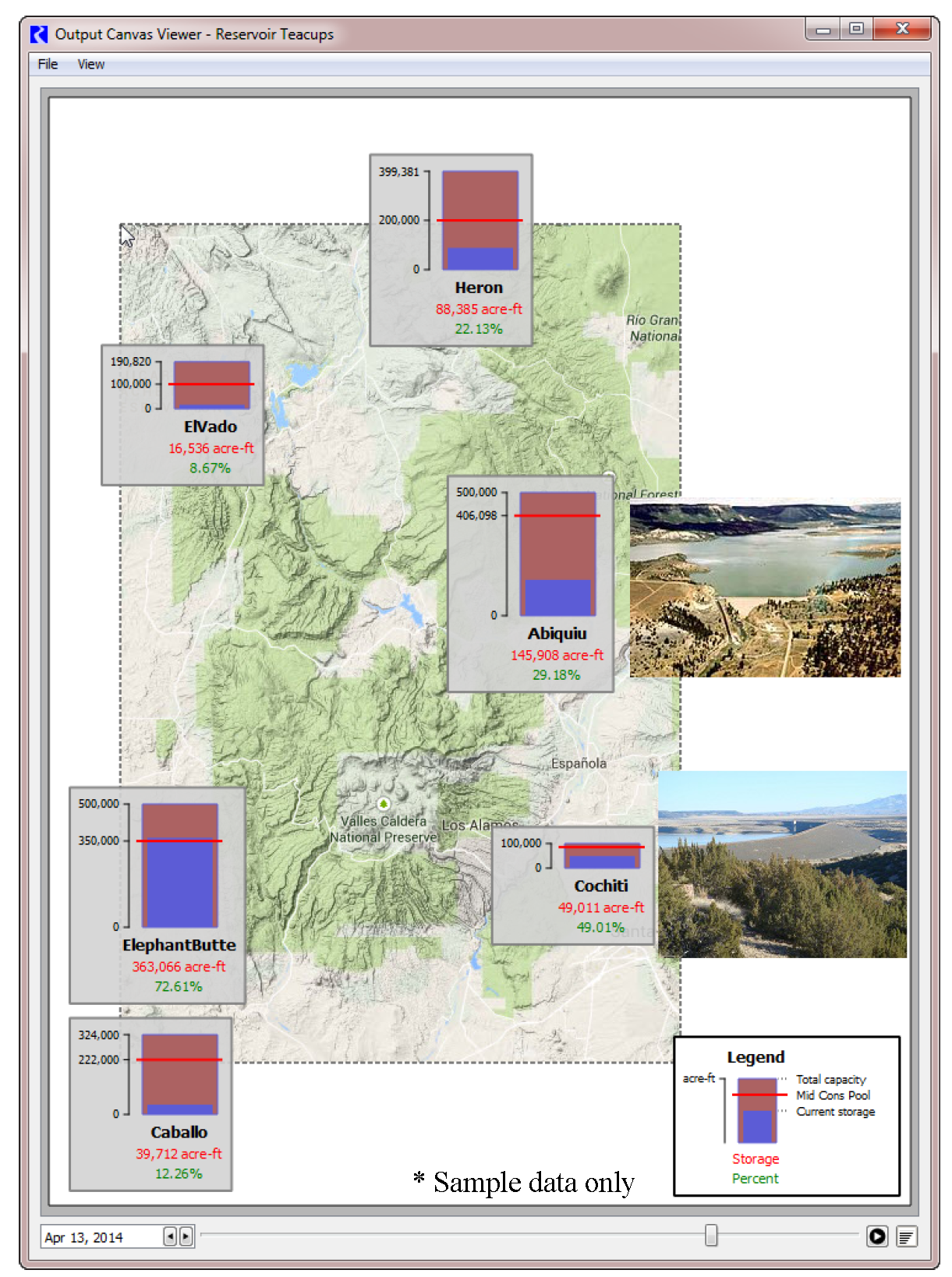
An Output Canvas is an output device that shows various data visualization tools. You can create Teacups that show the value (often storage) against some full value for that object (full reservoir). You can show multiple teacups in a group to display the relative fullness of many different items. Teacups can be rectangles or trapezoids. See Figure 6.1.
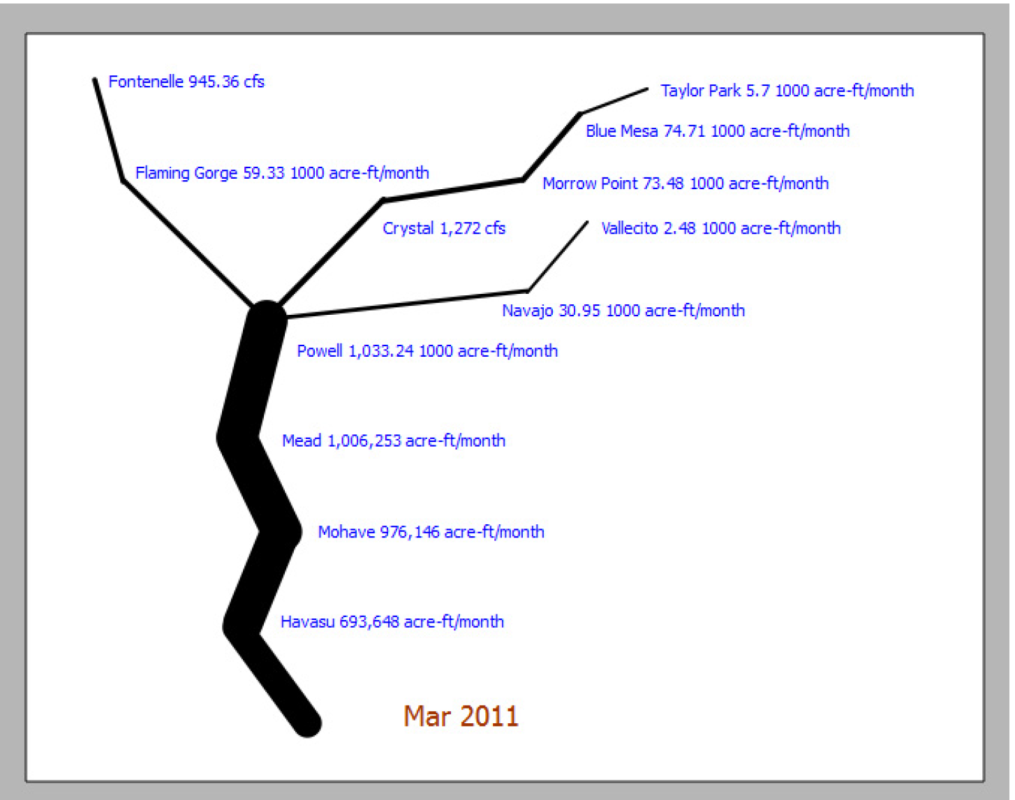
You can also create Flow Lines which often represent the flow of water in a river network. You can configure the flow lines to change thickness based on the flow compared to other values in a group and change color and line type as the flow crosses thresholds defined on each particular flow line. See Figure 6.2.
Figure 6.1 Output Canvas showing Teacups and a Chart
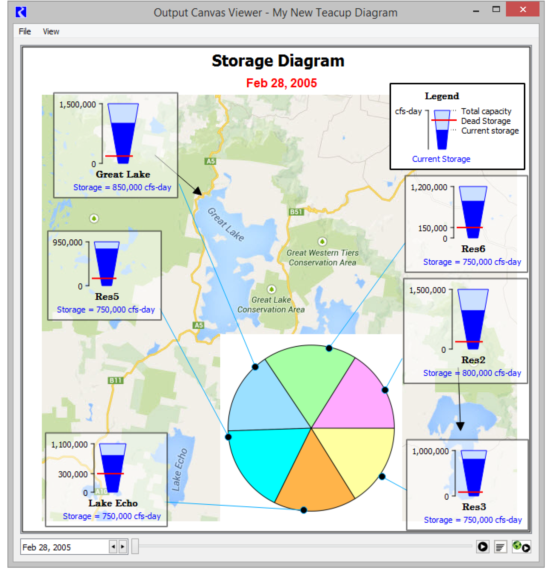
Figure 6.2 Output Canvas showing flow lines and Object Icons
Following are some features of the Output Canvas:
• You can show multiple groups of teacups that each contain multiple teacups. Within a group, consistent scaling is maintained for comparison.
• Data shown on a canvas is typically based on multiple objects (E.g. all the reservoirs in a basin); the data can be on the object itself or on an accompanying data object.
• On a Teacup, you can show marker lines and text values representing key levels.
• All colors and text fonts are user settings so they can be changed as desired.
• Bounding boxed and the Legend are optional components that you can configure.
• Flow Line groups can be created to represent a river network.
• Flow Lines get thicker as their values increase. The thickness is relative to the values in all Flow Lines in the group.
• Flow Lines change color and line type as the value crosses user defined thresholds. For example, a line could turn red if the flow drops below a minimum flow.
• RiverWare Object icons can be added to the canvas for reference. Labels and dynamic text can be added below them as well as bounding boxes.
• Images can be added to the canvas as Background or Foreground Images.
• Free standing configurable text can be added to the canvas. This text can be a string, reference a slot value (or two values), or show the current timestep.
• The data shown is typically for a specific timestep. Controls at the bottom of the device allow you to scroll through the timesteps or even animate the time range.
• The Output Canvas can be exported as an image for use in other applications or included as an image in a Model Report.
• The Output Canvas can be exported as a video/movie file. See “Export Video” for more information on exporting a video.
• Additional data visualizations will be made available on the Output Canvas in future releases.
The remainder of this section describes how to create, configure, and view the Output Canvas. See “Instructions to Create a Teacup Diagram” for instructions on creating a teacup diagram.
Creating a New Output Canvas
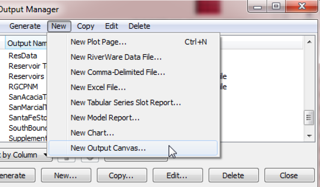
Output Canvas configurations are Output Devices (like Plot Pages or RiverWare Data Files, etc.). The Output Canvas is created within the Output Manager dialog. Use one of the following methods to create a new Output Canvas:
• From the RiverWare workspace menu, select the Utilities, then Output Management.
• From the Output Manager dialog menu, select the New, then New Output Canvas.
Configuring an Output Canvas
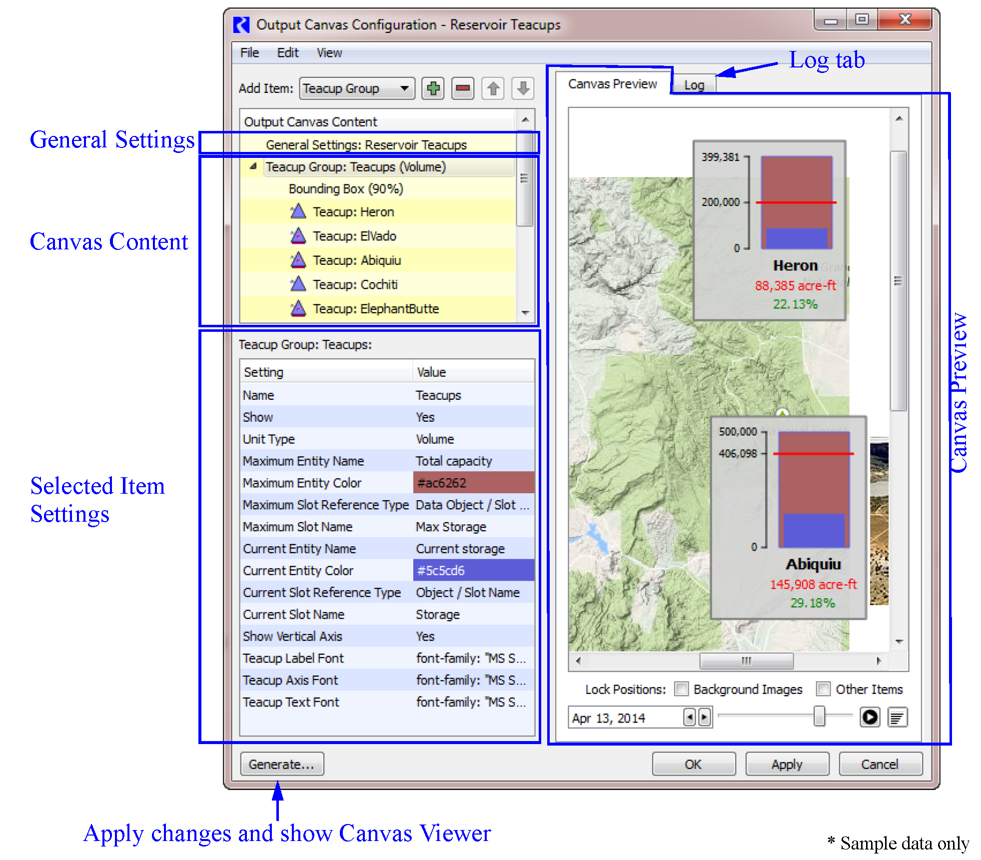
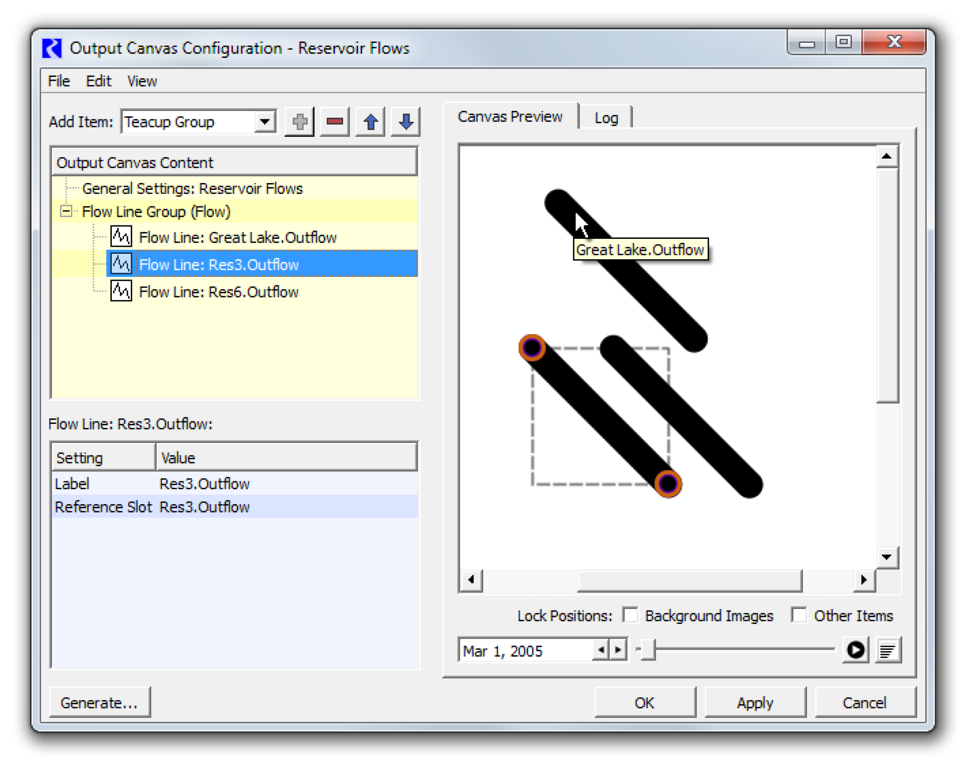
The Output Canvas configuration dialog allows you to create or change a canvas. It consists of the following areas, as shown in Figure 6.3.
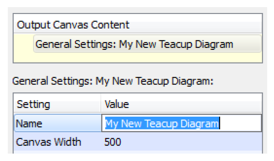
• General Settings: aspects of the configuration which apply to the entire Canvas, e.g., the name of the Canvas, the height and width, and the background color.
• Canvas Content: Specification of the content to be included in the Canvas.
• Selected Item Settings: Control of the Canvas formatting as specified on a per-item basis.
• Canvas Preview: View the Canvas to quickly see what it will look like and arrange the items as desired.
In the remainder of this section, each of these areas is described in more detail.
Figure 6.3
The following sections describe all the pieces of the Output Canvas.
General Settings
The General Settings item display settings apply to the entire Output Canvas. To change a setting’s value, select the appropriate value cell, enter the new value and press Return (or select outside the editing window). See “General Settings” for details.
Canvas Content
You control the content of the Canvas in the Canvas Layout area. This content is organized by items, and you specify the Canvas contents by indicating which items should be included. Table 6.1 gives a description of each item and lists all the features you can show on a Canvas.
Item | Description |
|---|---|
Settings which apply to the entire canvas. This is always shown and cannot be deleted. | |
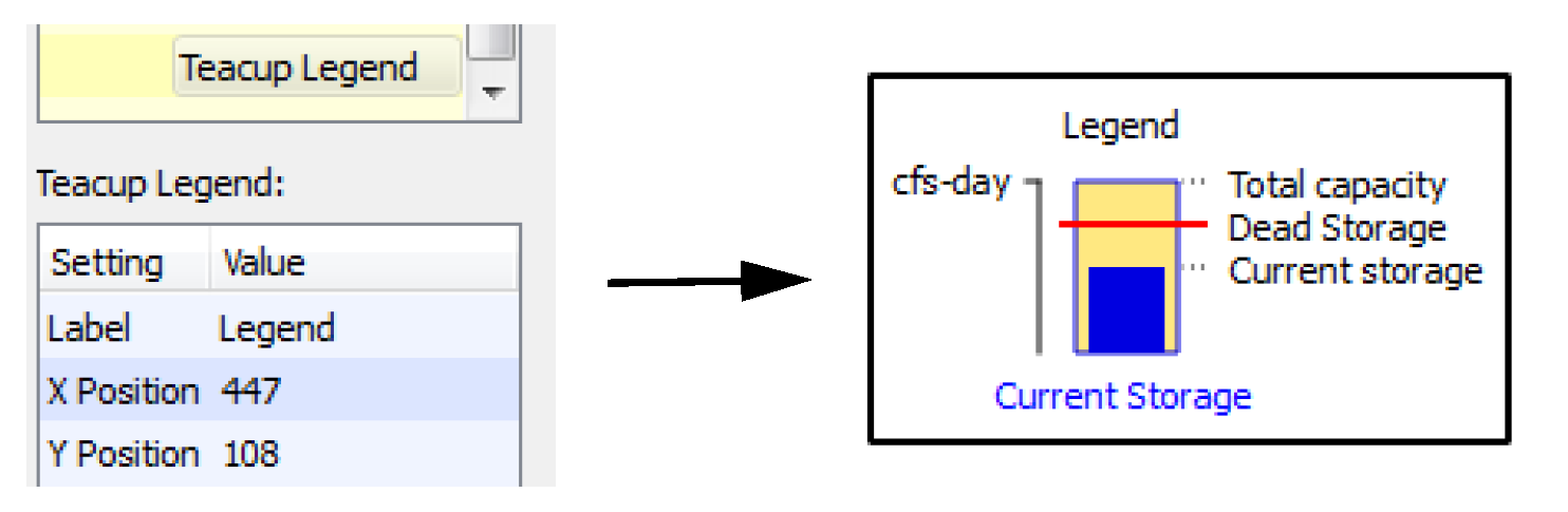
Teacups are shown in groups so that all data is consistent across the group. The Teacup Group defines the slots to use, where they are located, the size of the bars in the teacup, and the fonts for the label, axis, and text items. Teacup Groups can have bounding boxes, text items, and markers that are displayed for each teacup. In addition, a Teacup Group can have a Teacup legend to provide a key; see “Teacup Legend”. | |
A Teacup Legend is part of a Teacup Group and provides a key to the teacups. The maximum value, the current value, markers, text and the units are shown in the legend. | |
A teacup is shown for an object in the model. You can modify the name and change the corresponding data object, if necessary. | |
The Object Icon Group contains RiverWare icons representing the objects shown on the workspace. Object icons are shown in groups so that the text labels are consistent. Object Icon Groups can have bounding boxes and text items that are displayed for each Object icon. | |
The Object Icon specifies the Object to include in an Object Icon Group. You can also specify the labels to show and size for each icon. | |
Markers, representing a slot value, are horizontal lines shown on each teacup. Markers are added to the Teacup Group. You specify the line color, style and the slots to use. | |
A text group is a container for free standing text on the canvas. You can name the group and specify the font to use for all text items in the group. | |
There are two kinds of text items: 1. Free-standing text items are single-lines of text shown on the canvas. 2. Text items in teacup groups are single-lines of text shown below the teacup label of each teacup. Text items represent static text, one slot value, or the relationship of two slot values or a timestep. You specify the type of text you want and the corresponding slots. Also specify the color and any prefix or suffix text. | |
For better appearance, you may wish to add Bounding Boxes to Teacup Groups or Object Icon Groups so that a box is drawn around each teacup or icon. You can specify the color of the background and its opacity and the border color. | |
Flow Lines are shown in groups so that all data is consistent across the group. The Flow Line Group defines the unit type, minimum, and maximum values and their respective thicknesses along with the interval configuration. | |
The Flow Line item is part of a Flow Line Group. The Flow Line defines the specific slot to use along with the thresholds to use on that flow line. | |
The Flow Line Legend provides a key to the intervals and thicknesses of lines in the Flow Line Group. | |
The Canvas Line Group is a container for Canvas Lines. Canvas Lines in the group have the same thickness, color, symbol type and size. | |
Canvas Lines are used to create pointers or other line indicators on the canvas. Canvas lines are polylines with as many nodes as needed. | |
Image Groups are containers for Images. | |
You can add any jpg or png image to an image group. The image is then embedded in the output device. Also specify if it is on the foreground layer or background layer. | |
Chart Groups are containers for charts. | |
A Chart item is used to show a previously defined Chart within a Chart Group. |
The following operations allow you to create the Canvas layout and arrange its items as desired:
• Add Item 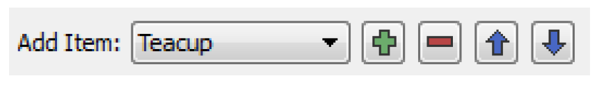 Use the menu to select an item to add to the layout. Select Plus
  to add the selected item. This button is active only when the item can be added. For example, Teacups must be added when a Teacup Group is selected.
Use the menu to select an item to add to the layout. Select Plus to add the selected item. This button is active only when the item can be added. For example, Teacups must be added when a Teacup Group is selected. • Select Minus  to delete an item from the list.
to delete an item from the list.• The Move arrows: These buttons can be used to move the selected item up or down when possible.
• Edit operations: The following standard edit operations can be accessed via the right-click context menu or the Edit Layout menu: Cut, Copy, Paste, Delete.
Selected Item Settings
The Selected Item Settings area allows you to control the appearance of individual Canvas items. This area lists the settings that apply to the item currently selected in the Output Canvas Content area, and allows editing by selecting the current setting value. See “Canvas Items Reference” for details.
Canvas Items Reference
This section provides details about the settings that apply to each type of Canvas item.
General Settings
These are settings that apply to the entire canvas. This is always shown and cannot be deleted.
Setting | Type | Notes |
|---|---|---|
Name | Single line text | |
Canvas Width | Value in pixels | |
Canvas Height | Value in pixels | |
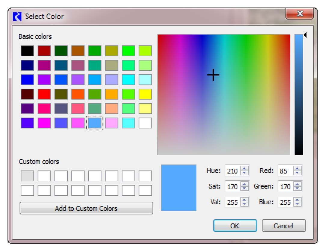
Background Color | Color Chooser | See “Color Chooser” for details. |
Timestep | Datetime Text | Usually the date shown is controlled by the date controls in the preview or on the canvas itself |
Show on Simulation View | Yes/No | Show supported items on the appropriate workspace view. See “Showing Canvas Items on the Workspace” for details. |
Show on Geospatial View | Yes/No |
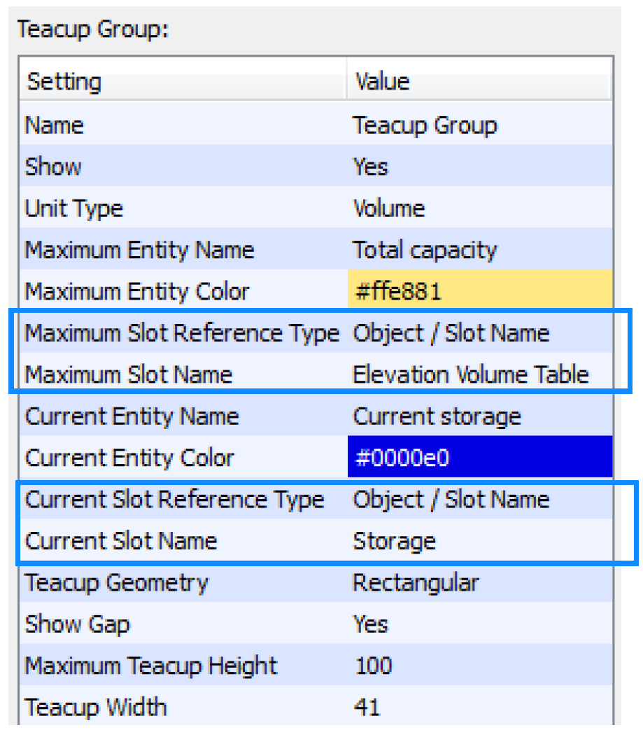
Teacup Group
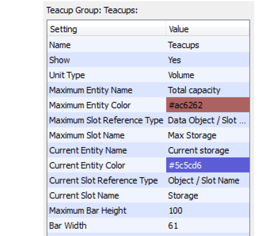
Teacup Groups are a container for Teacups so that all data is consistent across the teacups in the group. The Teacup Group defines the slots to use, where they are located, the size of the bars in the teacup, and the fonts for the label, axis, and text items. Teacup Groups can have bounding boxes, text items, and markers that are displayed for each teacup. In addition, a Teacup Group can have a Teacup legend to provide a key. See “Teacup Legend” and “Instructions to Create a Teacup Diagram” for additional information.
Setting | Type | Notes |
|---|---|---|
Name | Text | |
Show | Yes/No | |
Unit Type | Menu Selection | Values shown will use the Unit Scheme definition for the specified Unit Type. Select View, then Unit Scheme Manager to see the scheme. |
Precision | Selection | Select the precision of numeric values shown. See “Precision” for details. |
Maximum Entity Name | Text | |
Maximum Entity Color | Color Chooser | See “Color Chooser” for details. |
Maximum Slot Reference Type | Object/Slot Name or Data Object/Slot Name | Choose whether the specified Maximum slot is on the object itself or an accompanying data object. See “Slot Reference Type” for details. |
Maximum Slot Name | Slot Selection | The slot used for the larger bar on the teacup. See “Slot Selections” for details. |
Current Entity Name | Text | |
Current Entity Color | Color Chooser | See “Color Chooser” for details. |
Current Slot Reference Type | Object/Slot Name or Data Object/Slot Name | Choose whether the specified current slot is on the object itself or an accompanying data object. See “Slot Reference Type” for details. |
Current Slot Name | Slot Selection | The slot used for the smaller (current) bar on the teacup. See “Slot Selections” for details. |
Teacup Geometry | Selection | The shape of the teacups. Select either rectangular, trapezoidal congruent, or trapezoidal constant Top/Bottom. See “Teacup Geometry” for details. |
Show Gap | Yes/No | Specify if there is a horizontal gap between the current and maximum value. See “Show Gap” for details. |
Maximum Teacup Height | Number | Height of the largest teacup in the group. |
Teacup Width | Number | Width of all the rectangular teacup bars in the group. |
Teacup Bottom Width | Number | Width of the bottom of all the trapezoidal teacups. |
Teacup Top Width | Number | Width of the top of all the trapezoidal teacups (Constant Top/Bottom) |
Show Vertical Axis | Yes/No | |
Label Font | Font Selector | The font used for the teacup labels. |
Axis Font | Font Selector | The font used for the teacup axis. |
Text Font | Font Selector | The font used for all text items in the group. |
Teacup Legend
A Teacup Legend is part of a Teacup Group and provides a key to the teacups. The maximum value, the current value, markers, text and the units are shown in the legend.
Setting | Type | Notes |
|---|---|---|
Label | Text | The text used for the label on the legend. |
X Position | Number | See “Position” for details. |
Y Position | Number | See “Position” for details. |
Teacup
A teacup is shown for the selected objects. You can modify the name and change the corresponding data object, if necessary. See “Instructions to Create a Teacup Diagram” for details.
Setting | Type | Notes |
|---|---|---|
Label | Text | The text used for the label on the teacup. |
Reference Object | Object Selection | Use the selector to select the object for this teacup. Usually this is a Reservoir object. |
Reference Data Object | Object Selection | Use the selector to select the data object related to the reference object. This is usually located automatically if available. |
X Position | Number | See “Position” for details. |
Y Position | Number | See “Position” for details. |
Object Icon Group
The Object Icon Group contains RiverWare icons representing the objects shown on the workspace. Object icons are shown in groups so that the text labels are consistent. Object Icon Groups can have bounding boxes and text items that are displayed for each Object icon.
Setting | Type | Notes |
|---|---|---|
Name | Text | The name of the group as shown in the Output Canvas Content group |
Show | Yes/No | |
Precision | Selection | Select the precision of numeric values shown. See “Precision” for details. |
Label Font | Font Selector | The font used for all Object Icon Labels |
Text Font | Font Selector | The font used for all text items added to the Object Icon Group |
Object Icon
The Object Icon item specifies the Object(s) to include in an Object Icon Group. You can also specify the labels to show for each icon.
Setting | Type | Notes |
|---|---|---|
Label | Text | The label to use for the icon. |
Reference Object | Object Selection | The object for which you would like to show the icon |
Reference Data Object | Object Selection | Use the selector to select the data object related to the reference object. This is usually located automatically if available. |
X Position | Number | See “Position” for details. |
Y Position | Number | See “Position” for details. |
Scale | Number | Specify the relative scale of the icon. The valid range is from 20-200% |
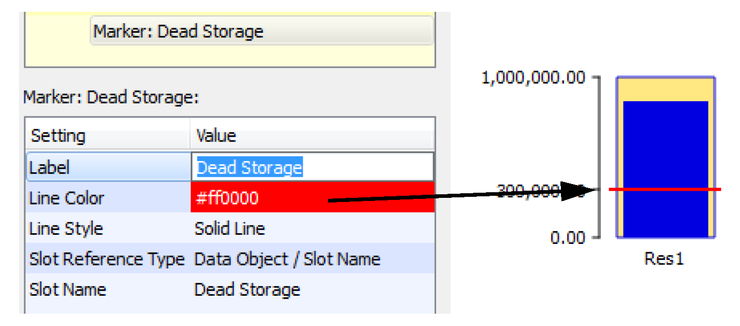
Marker
Markers, representing a slot value, are horizontal lines shown on each teacup. Markers are added to the Teacup Group. You specify the line color, style and the slots to use.
Setting | Type | Notes |
|---|---|---|
Label | Text | The text used for the marker on the legend. |
Line Color | Color Chooser | See “Color Chooser” for details. |
Line Style | Menu | |
Slot Reference Type | Object/Slot Name or Data Object/Slot Name | Location of the slot to use for the marker. See “Slot Reference Type” for details. |
Slot Name | Slot Selection | The slot used for marker. See “Slot Selections” for details on this selection. |
Text Group
A text group is a container for free standing text on the canvas. You can name the group and specify the font to use for all text items in the group.
Setting | Type | Notes |
|---|---|---|
Name | Text | This text is used to identify the group |
Show | Yes/No | |
Precision | Selection | Select the precision of numeric values shown. See “Precision” for details. |
Font | Font Selector | The font used for all Text Items in the group. |
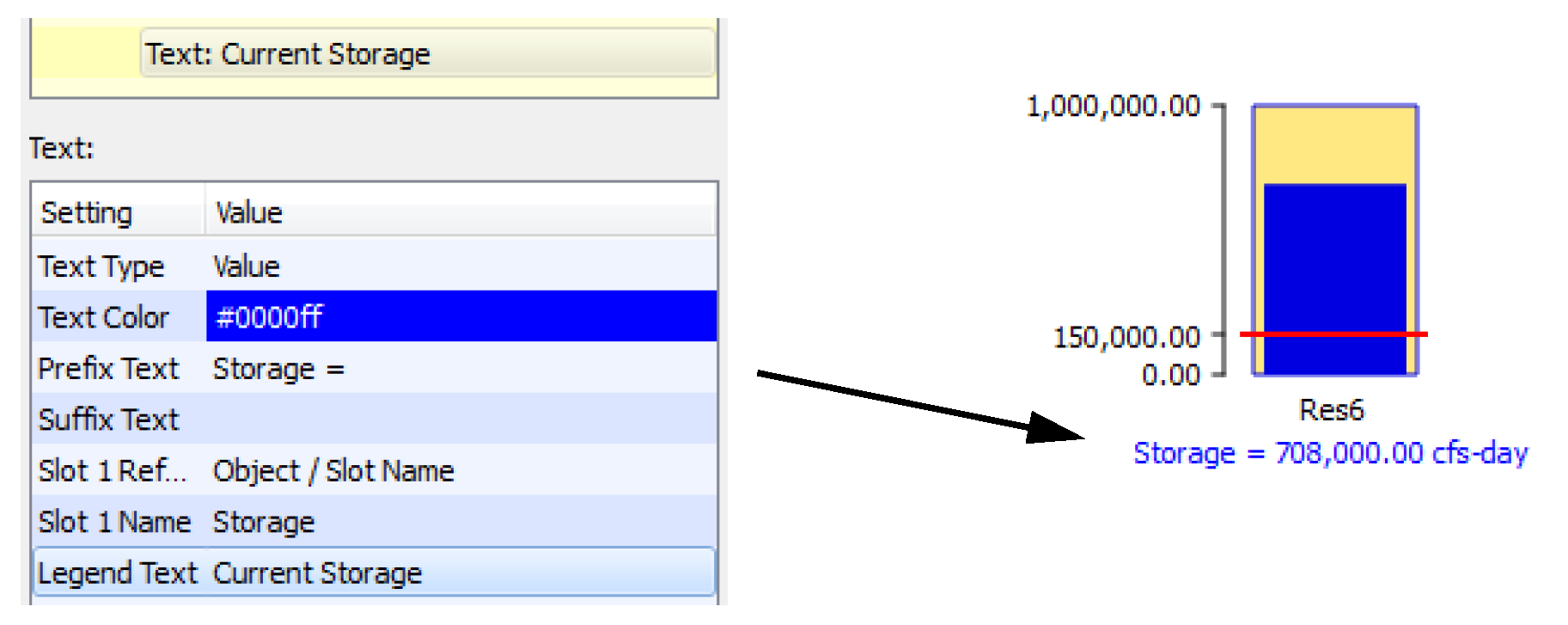
Text Item
There are two kinds of text items: 1. Free-standing text items are single-lines of text shown on the canvas. 2. Text items in teacup groups are single-lines of text shown below the teacup label of each teacup.
Text items represent static text, one slot value, or the relationship of two slot values or a timestep. You specify the type of text you want and the corresponding slots. Also specify the color and any prefix or suffix text.
Setting | Type | Notes |
|---|---|---|
Text Type | Menu Choice | Select one of the types of text. See “Text Types” for details. |
Text Color | Color Chooser | See “Color Chooser” for details. |
Prefix Text | Text | String to include before the Text Item |
Suffix Text | Text | String to include after the Text item |
Slot 1 Reference Type | Object/Slot Name or Data Object/Slot Name | Location of the slot to use for the text item. See “Slot Reference Type” for details. |
Slot 1 Name | Slot Selections | See “Slot Selections” for details. |
Slot 2 Reference Type | Object/Slot Name or Data Object/Slot Name | Location of the slot to use for the marker. See “Slot Reference Type” for details. |
Slot 2 Name | Slot Selections | For Text items that show or use two values, this is the second slot. It is only shown for Text items with two slots. |
Legend Text | Text | The text that is displayed on the legend. |
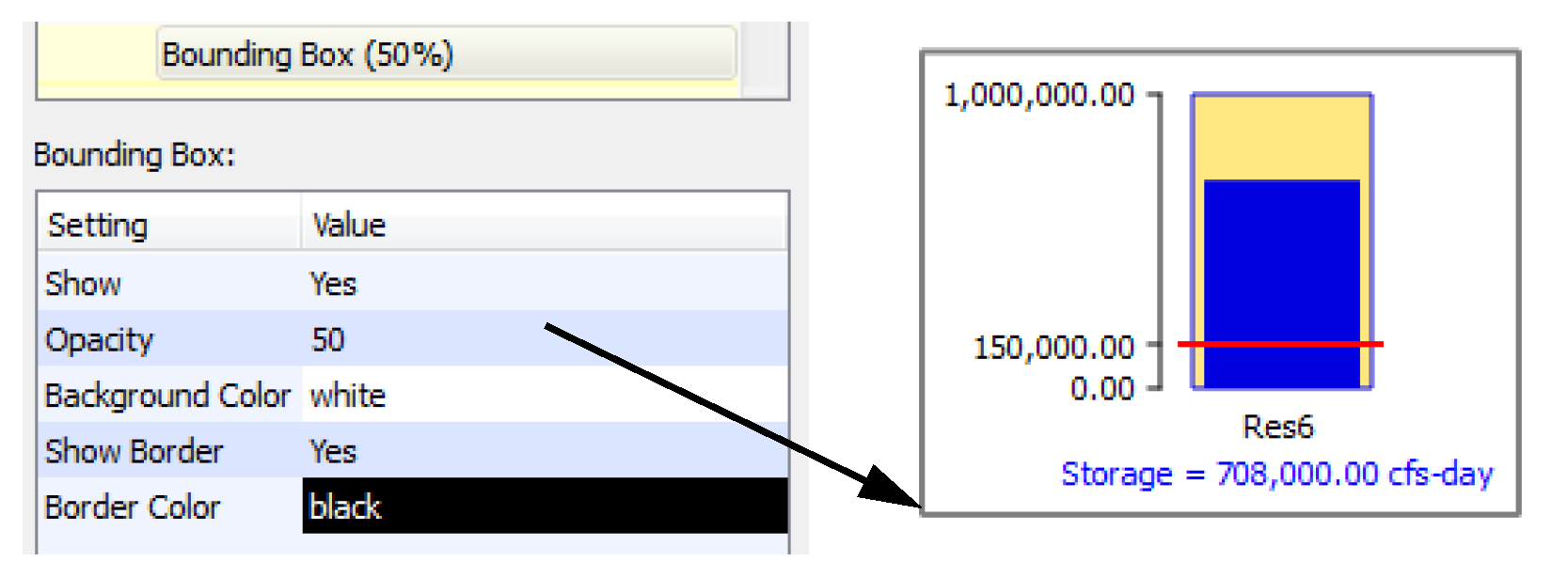
Bounding Box
For better appearance, you may wish to add Bounding Boxes to Teacup Groups or Object Icon Groups so that a box is drawn around each teacup or icon. You can specify the color of the background and its opacity and the border color.
Setting | Type | Notes |
|---|---|---|
Show | Yes/No | |
Opacity | Number | This value must be between 0 and 100, inclusive. |
Background Color | Color Chooser | See “Color Chooser” for details. |
Show Border | Yes/No | |
Border Color | Color Chooser | See “Color Chooser” for details. |
Flow Line Group
Flow Lines are shown in groups so that all data is consistent across the group. The Flow Line Group defines the unit type, minimum, and maximum values and their respective thicknesses along with the interval configuration. See “Instructions to Create a Flow Line Diagram” for details.
Setting | Type | Notes |
|---|---|---|
Name | Text | |
Show | Yes/No | |
Unit Type | Menu | The Unit Type to use for all flow lines in the group. |
Minimum Value | Number and units | The value representing the minimum. Any values less than this will be shown with the minimum thickness. |
Minimum Thickness | Number of pixels | The thickness corresponding to the minimum value. See “Flow Line Thickness” for details on thickness. |
Maximum Value | Number and units | The value representing the maximum. Any values greater than this will be shown with this thickness. |
Maximum Thickness | Number of pixels | The thickness corresponding to the maximum value. See “Flow Line Thickness” for details on thickness. |
Interval Definitions | Number of intervals | Select the button to open a dialog where the intervals are defined. See “Flow Line Color and Style” for details. When finished, the number of intervals is shown. |
Flow Line
The Flow Line item is part of a Flow Line Group. The Flow Line defines the specific slot to use along with the thresholds to use on that flow line. See “Instructions to Create a Flow Line Diagram” for details.
Setting | Type | Notes |
|---|---|---|
Label | Text | The flow line label. |
Reference Slot | Slot Selection | The Slot that provides the values for the Flow Line. |
Threshold 1 ... | Number and units | As configured in the Flow Interval Definition, each flow line will have the same number of Thresholds. Specify the value for each threshold. See “Flow Line Color and Style” for details. |
... Threshold 8 | Number and units |
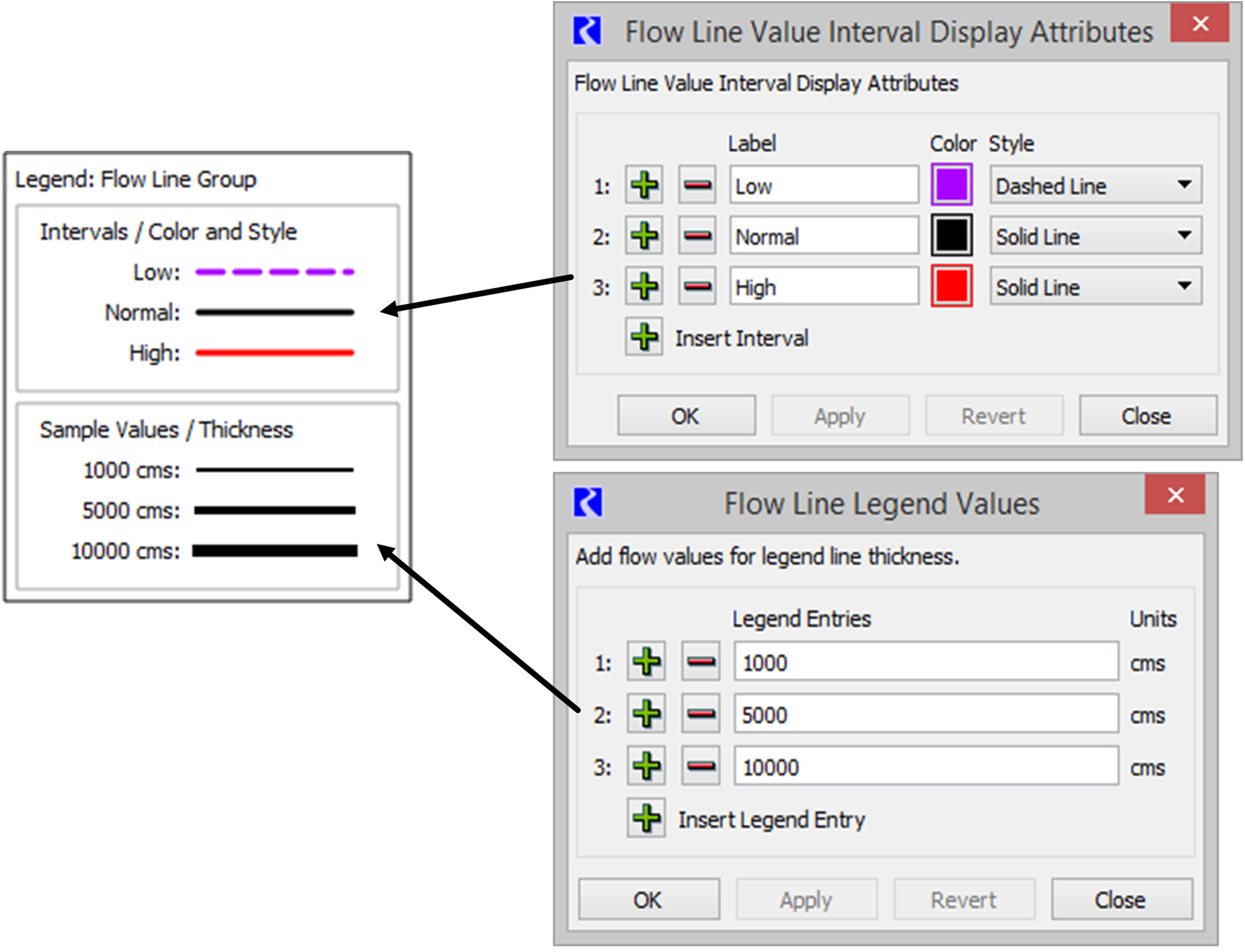
Flow Line Legend
A Flow Line Legend can be added to a Flow Line Group to provide a key that describes the intervals defined in a flow line group and show sample lines that represent the thickness at various values.
Setting | Type | Notes |
|---|---|---|
Flow Line Legend Label | Text | The label to show at the top of the legend. |
X Position | Number | See “Position” for details. |
Y Position | Number | See “Position” for details. |
Flow Line Legend Values | Number of Sample Values | Select the setting and then click the button to open a dialog in which you define the sample values. See below for details. When finished, the number of sample values is shown. |
As shown in Figure 6.4, the top part of the legend provides a key to the intervals defined on the Flow Line Group. The intervals are defined and labeled on the Flow Line Group through the Interval Definitions setting. See “Flow Line Color and Style” for details.
The bottom panel in the legend provides a key to the line thickness and the values they represent. You define which values you would like to show. In the Flow Line Legend Value setting, click the button to open the dialog. Use the plus and minus buttons to add/delete entries. For each sample defined, a solid black line will appear in the legend with the appropriate thickness with respect to the Flow Line Group's minimum and maximum flow values and their defined thickness.
Figure 6.4 Screenshot showing a Flow Line Legend and the configuration dialogs
Canvas Line Group
The Canvas Line Group is a container for Canvas Lines. Canvas Lines in the group have the same thickness, color, symbol type and size.
Setting | Type | Notes |
|---|---|---|
Name | Text | |
Show | Yes/No | |
Line Thickness | Number of Pixels | The thickness of the lines |
Line Color | Color Chooser | See “Color Chooser” for details. |
Symbol Type | Menu | Select either None, Arrow, Dot, or Triangle. The symbol is only shown on one end of the line. |
Symbol Size | Number | Specify the size of the symbol. |
Symbol Color | Color Chooser | See “Color Chooser” for details. |
Canvas Line
Canvas Lines are used to create pointers or other line indicators on the canvas. Canvas lines are polylines with as many verticies as needed.
Setting | Type | Notes |
|---|---|---|
Label | Text | The canvas line label. |
Image Group
Image Groups are containers for Images.
Setting | Type | Notes |
|---|---|---|
Name | Text | |
Show | Yes/No |
Image
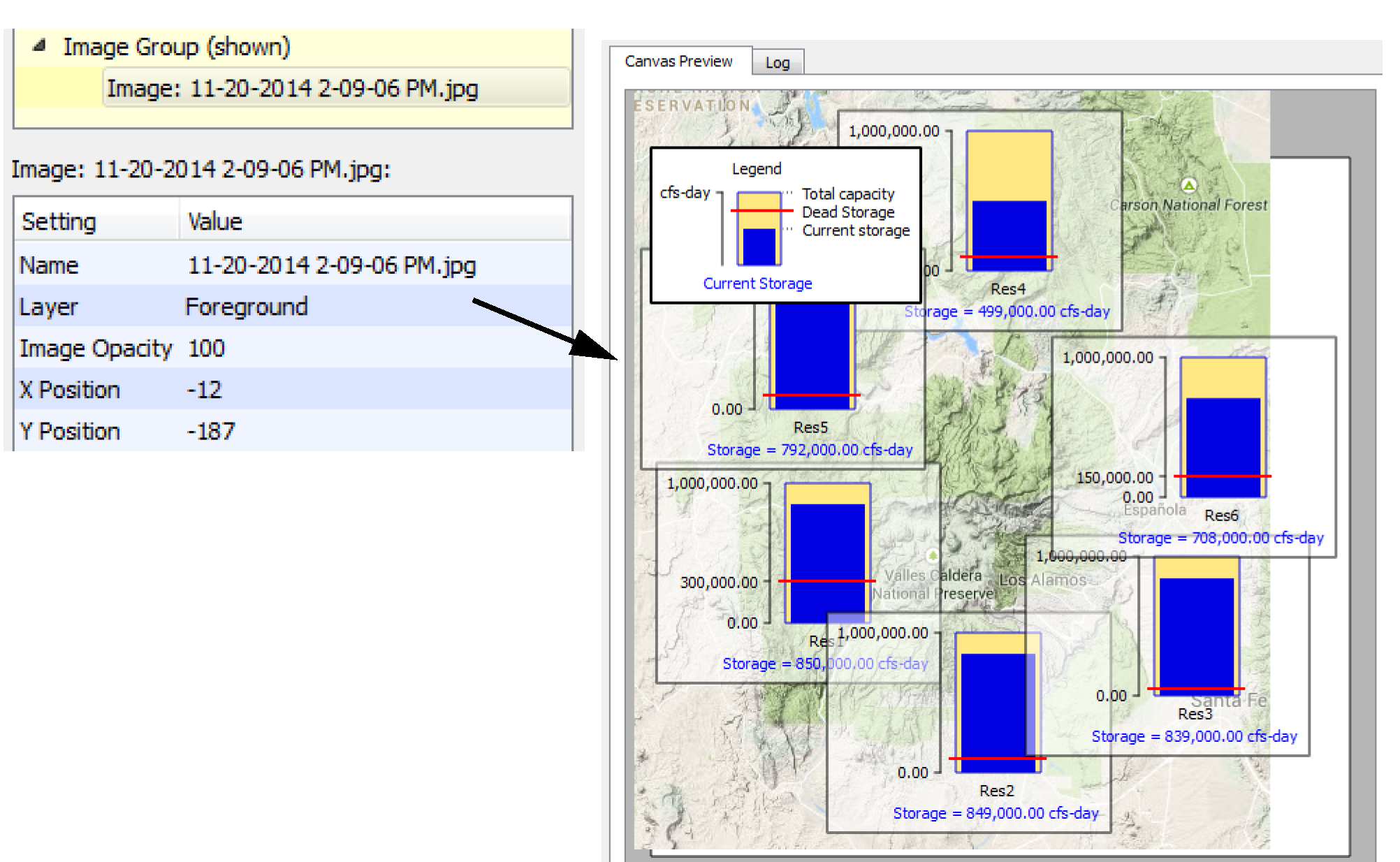
You can add any jpg or png image to an image group. The image is then embedded in the output device. Also specify if it is on the foreground layer or background layer.
Setting | Type | Notes |
|---|---|---|
Name | Text | By default, this is the original image file name. |
Layer | Foreground/Background | Select the layer on which the image lives. Background images can be separately locked into position on the Canvas Preview. |
Image Opacity | Number | This value must be between 0 and 100, inclusive. |
X Position | Number | See “Position” for details. |
Y Position | Number | See “Position” for details. |
Scale | Number | Specify the relative scale of the image. Either enter the number as a setting (20-400%) or drag the re-scale icon on the canvas to resize.  |
Chart Group
A chart group is a container for Chart items.
Setting | Type | Notes |
|---|---|---|
Name | Text | |
Show | Yes/No |
Chart
Chart items contain a reference to an existing Chart output device within the model. The chart is drawn with the canvas' reference timestep date/time. The canvas is drawn either with its native background color or with a background and frame specified by an optional “Bounding Box” added to the containing Chart Group. This is similar to the bounding box support for Teacups and Teacup Groups.
Setting | Type | Notes |
|---|---|---|
Chart Name | Selection | Select the name of the previously configured chart device. |
Width | Number | The width of the chart in pixels. See “Chart Configuration” for details on chart sizing. |
Height | Number | The height of the chart in pixels. See “Chart Configuration” for details on chart sizing. |
Scale | Percent | Scaling factor; must be less than or equal to 100%. See “Chart Configuration” for details on chart sizing. |
X Position | Number | See “Position” for details. |
Y Position | Number | See “Position” for details. |
Additional Information on Certain Settings
The following sections provide additional information that is shared among one or more settings.
Color Chooser
For all of the colors settings on the canvas, the settings allow you to specify the color in a number of ways. Usually you should use the color selector to specify the desired color. You can select the color from the palette, specify RGB values, or specify Hue/Sat/Val from the dialog. From the text setting, you can also type the hexadecimal color or type in an HTML color name.
Position
For all of the X and Y Position Settings, you can do the following:
• Specify the coordinates on the canvas as the number of pixels from the top left. This provides a fine level of control over the positions.
• Drag the item on the canvas. (preferred)
When either the number is changed or the item is dragged on the canvas, the other updates accordingly.
Precision
For Teacup, Text, and Object groups, select the precision of numeric values shown. Choose from a fixed precision 0-6 or use the precision defined on the Unit Scheme. Select View, then Unit Scheme Manager to see the scheme.
Slot Reference Type
For all of the Slot Reference Type settings, choose whether the slot is on the reference object or its accompanying data object. Object/Slot Name is for the specific object. Data Object/Slot Name is for the accompanying data object. The Output Canvas will try to find an accompanying data object by searching for the object’s name and the string “Data”. You can modify the data object to use if it is not correctly found. See “Output Devices for Aggregated Values” for details on creating aggregated data for display in this or other output devices.
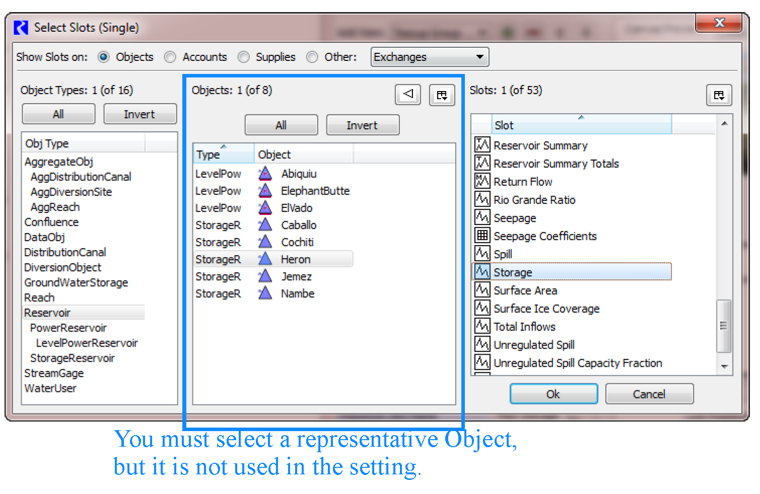
Slot Selections
Specify the slot name or use the selector to select a representative slot. For these, you are choosing the slot only, but to do this, you must select a specific object first. The Object part is removed and only the Slot Name is used.
Figure 6.5
Following are some special provisions regarding the slots:
• When a multiple-column slot is selected, the slot's first column matching the Teacup Group's unit type is used.
• For the Maximum slot:
– When a Series Slot or Periodic Slot is used, the maximum value found within the slot column is used. With this in mind, you can pick the same series slot for both Maximum and Current teacup values, i.e. Storage. Then the teacup will show current Storage compared to largest Storage in that series.
– When a Table Slot is used, the value in the last row is used. This allows use of Reservoirs' Elevation Volume Table for the maximum Storage value.
Text Types
The Text Item allows you to show text or values on each teacup, object icon, or on the canvas. Specify the type of text using the Text Type setting. Table 6.2 shows the possible values and gives a description of each.
Note: Prefix and suffix settings are available for all except the Plain Text. In the Example column, the prefix and suffix are normal text while the filled in value is Bold.
Text Type | # of Slots | Notes | Example |
|---|---|---|---|
Plain Text | 0 | Static text. Prefix and Suffix are not supported. Edit the text in the in line text editor or use the dialog for longer text. Line breaks are supported. | CURRENT RESERVOIR CONDITIONS |
Value | 1 | Display the value of a slot. | Storage = 454,323 acre-feet |
Value (Priority) | 1 | Display the value of a slot and its priority. | Storage = 454,323 acre-feet (Priority 32) |
Value / Value | 2 | Display the value of a two slots separated by “/”. | Big Res has 5,342 m3 / 6000 m3 possible |
Percent | 2 | Display the computed percent of the two slot values. | Storage = 89.0% full |
Percent Maximum | 1 | Display the computed percent of the current value to the maximum value found in the slot. These are only available for text items in Teacup Groups | Storage = 73.1% of modeled maximum |
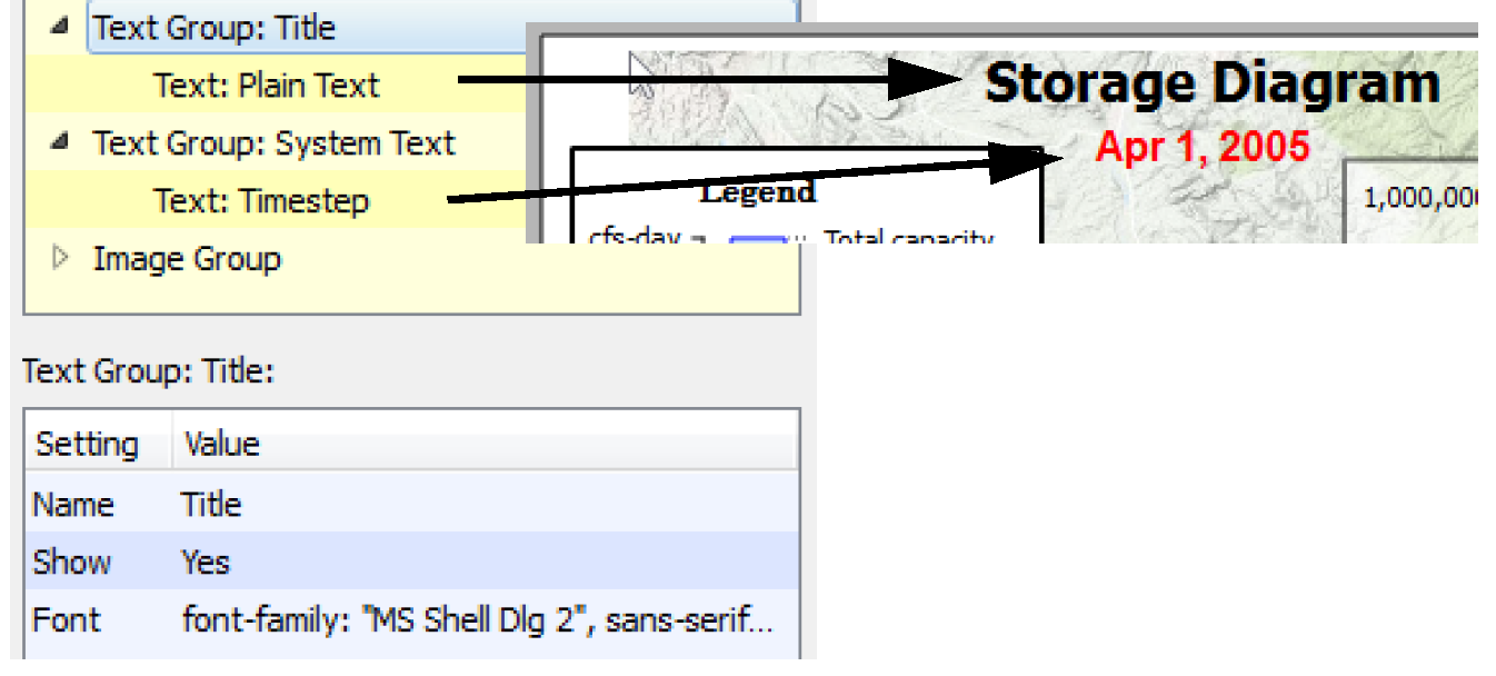
Timestep | 0 | Display the canvas’ timestep as a text label. This is particularly useful when exporting the canvas to an image or a Model Report where the timestep controls aren’t shown. | Timestep: Feb 14, 2013 |
Fitting Teacups and Object Icons
If you want your teacups and object Icons to match the general layout of your simulation view, you can select Edit, then Fit Teacups using Simulation View positions. This rearranges all existing Teacups and Objects with respect to the positions of the corresponding simulation objects within the simulation view.
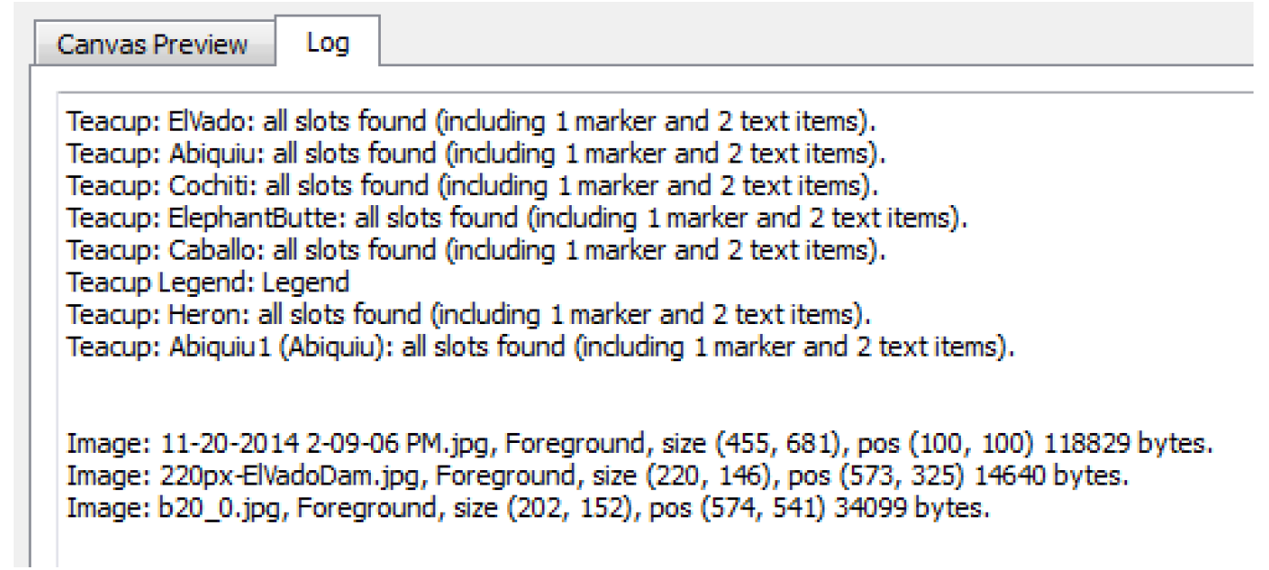
Log
This tab provides a textual description of the Canvas generation process. The log contains details such as whether slots were found or not and image size and position. When a problem occurs during generation, the details will be reported here.
Teacup Configuration
This section describes additional configuration options for Teacups, particularly the geometry and appearance.
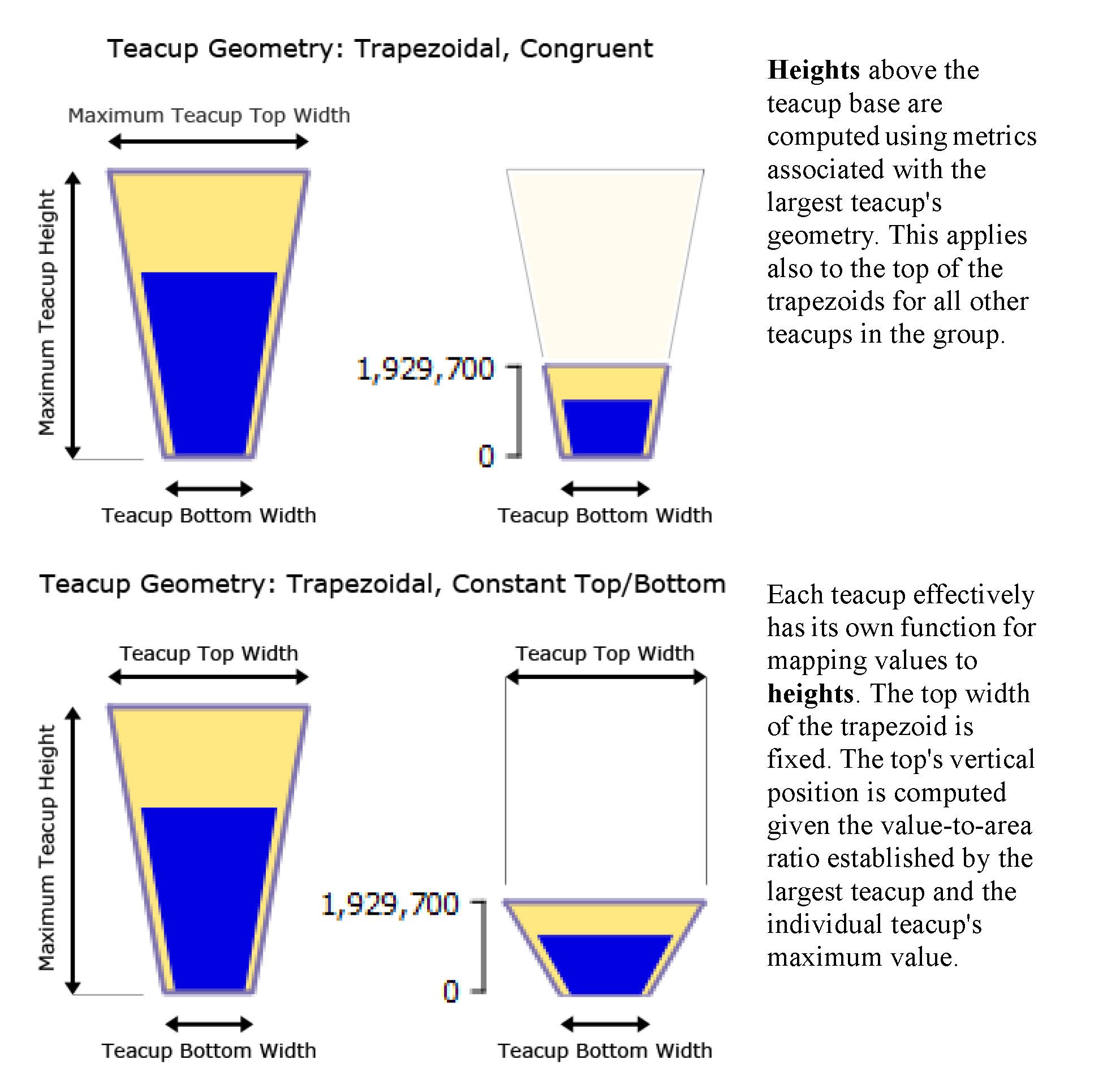
Teacup Geometry
For any particular teacup group, you can choose between the following Teacup Geometry options.
• Rectangular: Each teacup is shown as an equal width rectangular bar.
Figure 6.6
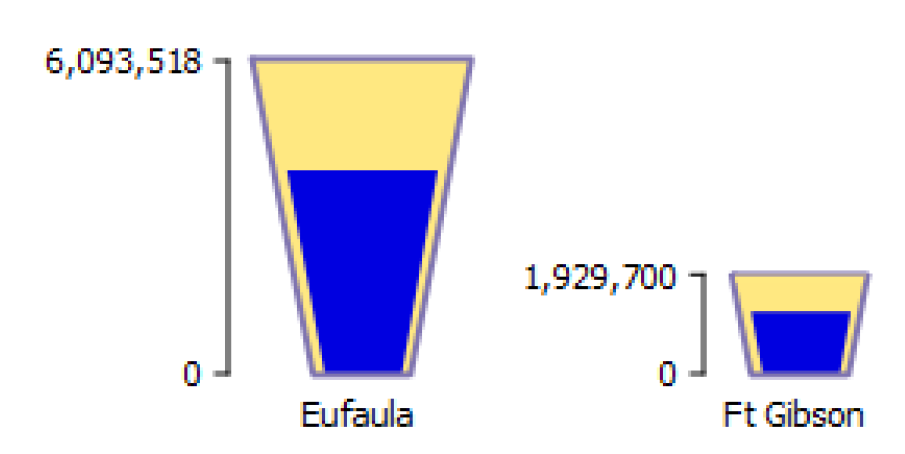
• Trapezoidal, Congruent: The Maximum Teacup Top Width setting is used for the teacup having the largest maximum value. The top widths of all other teacups in the group are computed to make the trapezoid congruent to the largest teacup. The side slope of all teacups is constant.
Figure 6.7
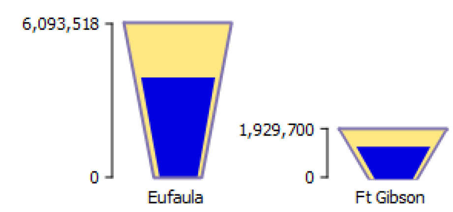
• Trapezoidal, Constant Top and Bottom Widths: Each teacup has the same top and bottom width. The side slope of teacups is not the same among teacups in the group.
Figure 6.8
The Maximum Teacup Height applies to the teacup having the largest maximum value. The height of the teacups is computed as follows:
• In the Rectangular geometry, all other teacup values are mapped to a vertical position above the teacup's base, proportional to the value-to-vertical-pixel ratio defined by the largest teacup.
• For both Trapezoidal geometries, a value-to-area ratio is computed from the largest teacup. That computed value-to-area ratio is then used for computing geometries within all teacups within the teacup group.
Figure 6.9 shows these geometries, as applied to the largest teacup in the group and another teacup in the same group.
Figure 6.9
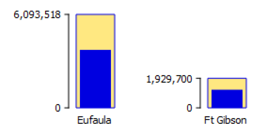
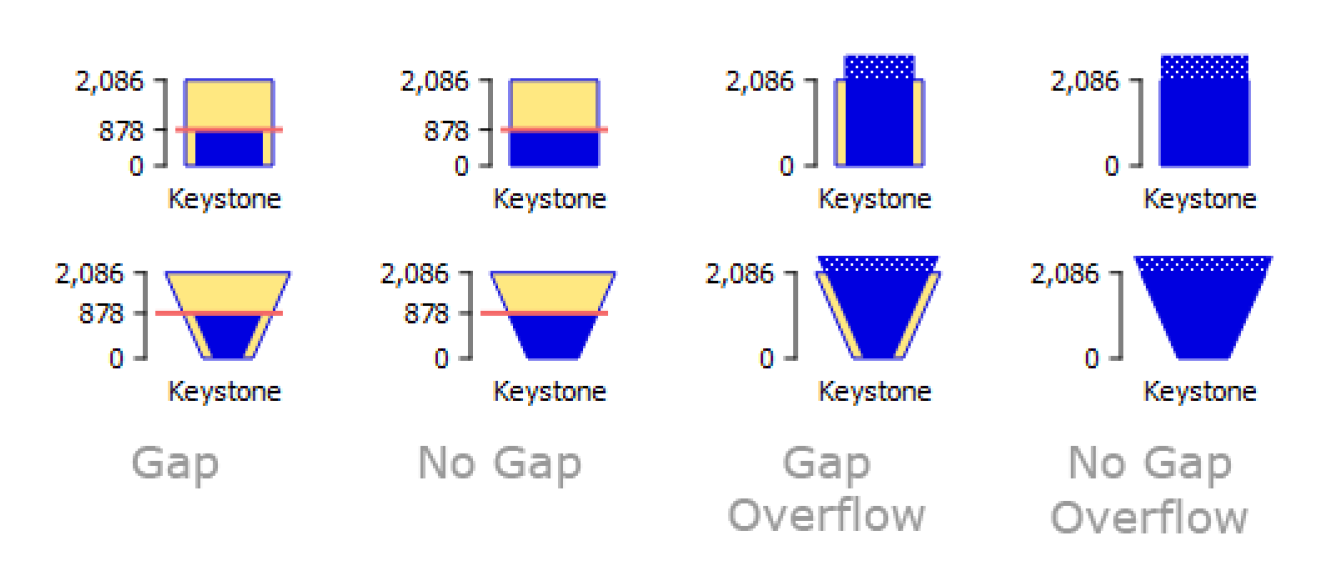
Show Gap
The Show Gap configuration option shows or hides the horizontal gap between the inner current rectangle (or trapezoid) and the outer maximum rectangle (or trapezoid). Figure 6.10 shows examples.
Note: Overflow values are shown with a dotted region.
Figure 6.10
Flow Line Configuration
Flow lines have a few additional configuration options that are described in the following section. See “Instructions to Create a Flow Line Diagram” for details.
Flow Line Thickness
Each flow line's thickness is an interpolation based on minimum and maximum values and thicknesses. The maximum value should be devised in relationship to the maximum values amongst all flow lines in the group.
A flow line's thickness is computed from value and thickness interpolation settings defined within the containing flow line group.
At the reference timestep, when a flow line's value is... | ... the flow line is drawn with |
|---|---|
Equal to or less than the Minimum Value | the Minimum Thickness. |
Between the Minimum and Maximum Values | Linear interpolation between Minimum and Maximum Thicknesses. |
Equal to or greater than the Maximum Value | the Maximum Thickness. |
Note: There is no expectation that all encountered values will be within the Minimum and Maximum Value range. Flow line thickness for values outside that range will be shown at the respective Minimum or Maximum Thickness.
Tip: Sample flow lines and the subsequent thickness can be shown on a Flow Line Legend. See “Flow Line Legend” for more information.
A reasonable minimum value is 0.0. The maximum value should be chosen which exceeds most slot values among all flow lines in the flow line group in the full time series. One way to determine a good maximum value for a flow line group is shown in Figure 6.11. This involves the following steps.
Figure 6.11
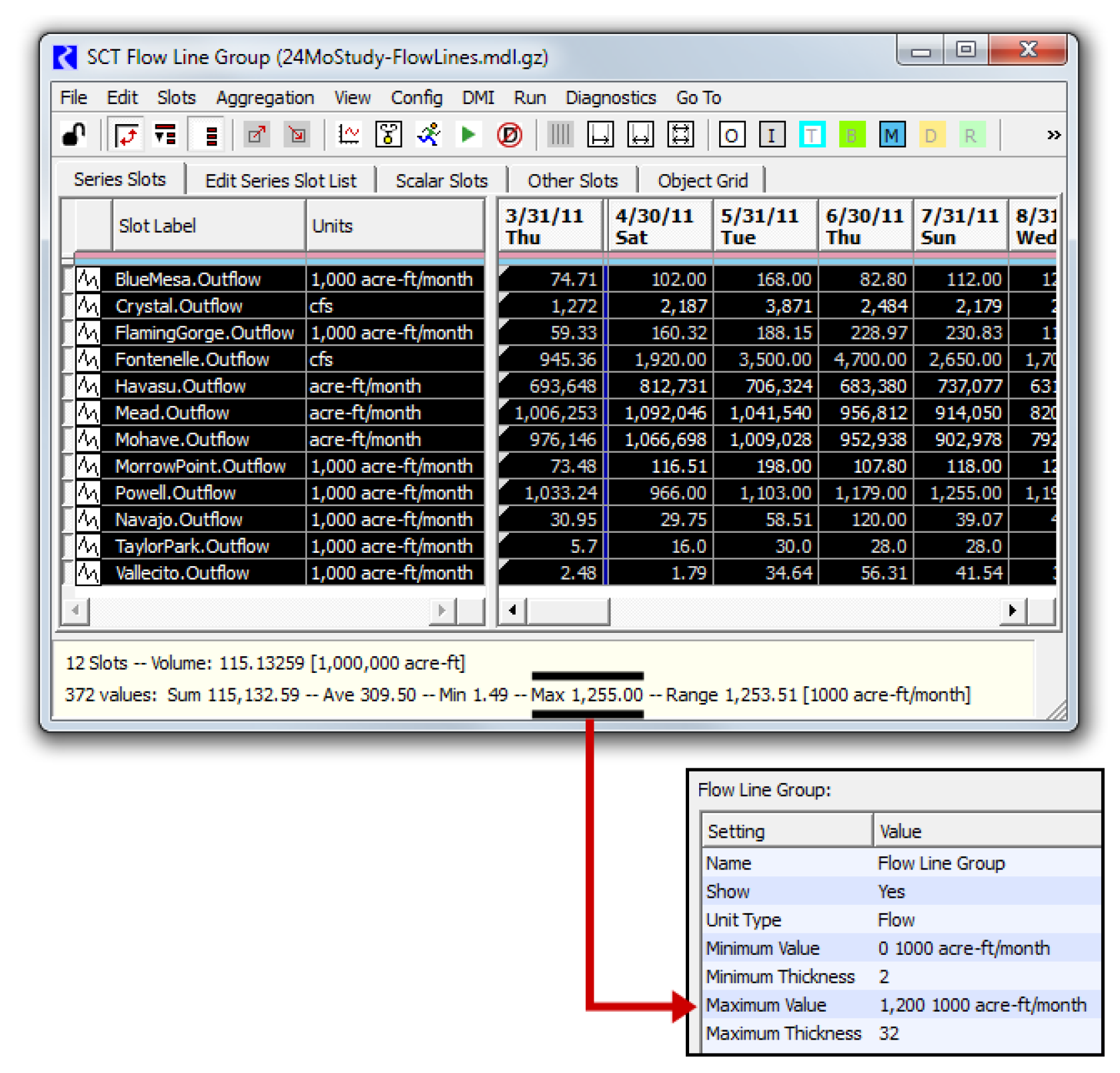
1. Right-click any of the flow lines within the flow line group and select: Flow Line Group, then Show Slots in new SCT.
2. In the resulting SCT, select all cells. (This can be done with a single select the top-left corner of the series data table).
3. In the selection statistics along the bottom of the SCT, notice the Max value.
4. Enter a number slightly larger in the Flow Line Group's Maximum Value settings.
Flow Line Color and Style
A flow line's color and style are based on the flow line's current value and where it falls within the defined intervals. The intervals are defined for the group while the thresholds are defined on each flow line. The following section describes the Interval definitions, then the threshold specification.
For a Flow Line Group, the Interval Definitions setting item indicates the number of intervals currently defined. Double-clicking that item presents Click to edit and More. Select More to show the Flow Line Value Interval Display Attributes editor dialog as shown in Figure 6.12.
Figure 6.12
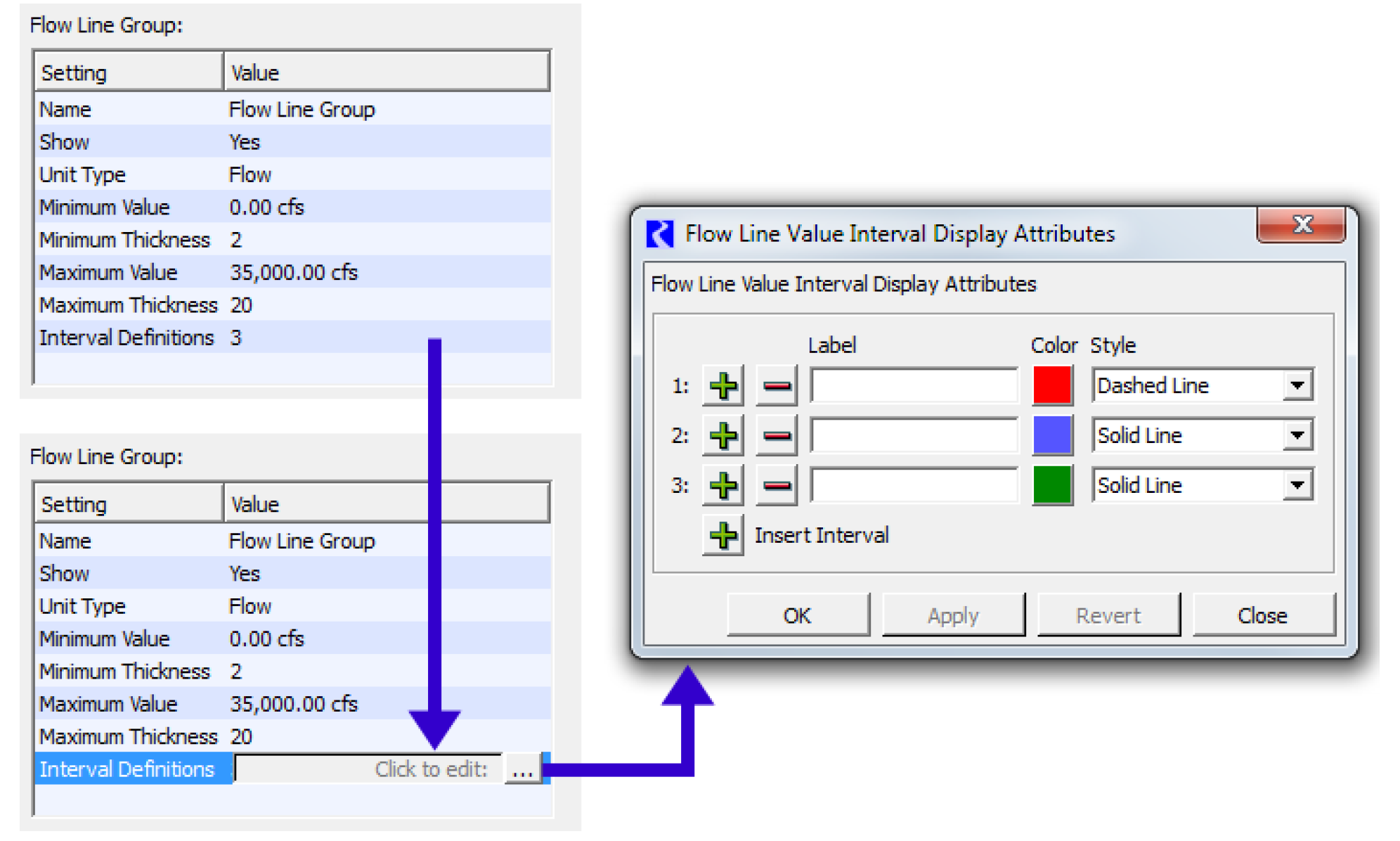
Using the Plus + button, specify up to nine intervals (Eight Thresholds). The top interval row is for the lowest flow values -- i.e. not exceeding any of a flow line's threshold values. Each interval definition has a text label (used in a Flow Line Legend), a color, and a line style.
Note: In the current implementation, the non-solid line styles look best with thin flow lines, as the size of the dash or dot is a function of the line thickness.
Once the intervals are configured and you have created flow lines, now you can specify the threshold values for each Flow Line, specify the thresholds in the Threshold 1 through Threshold N settings. Threshold 1 should be a lower flow than Threshold 2, and so forth. Figure 6.13 shows a flow line group with Two thresholds and three Intervals. The values for each threshold are specified on the individual flow lines.
Tip: The labels and specified color and style for each interval can be shown on a Flow Line Legend. See “Flow Line Legend” for more information.
Figure 6.13
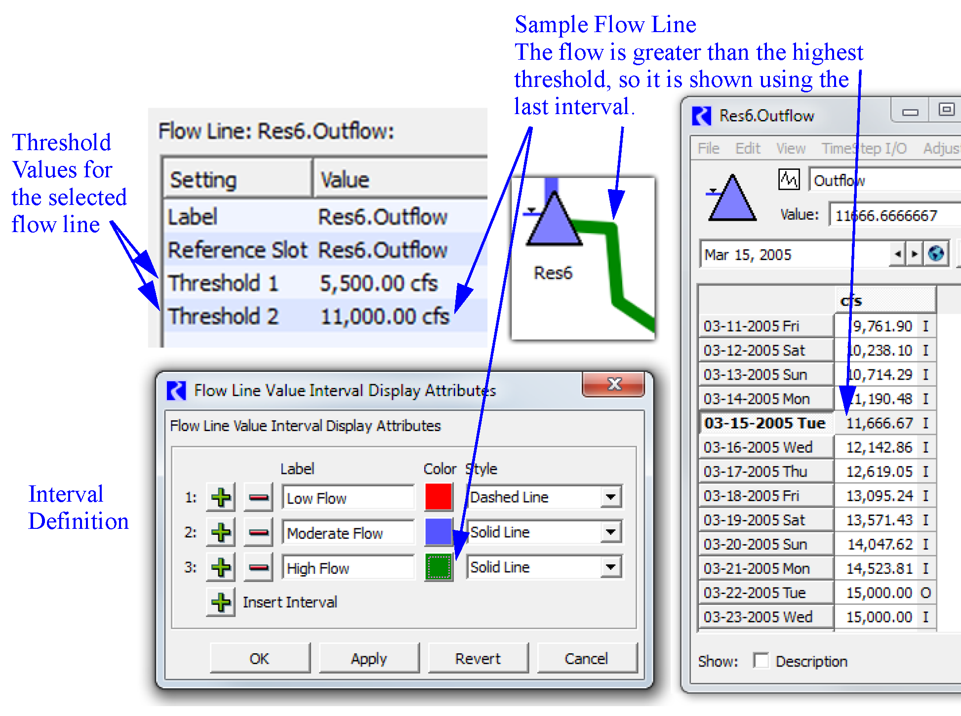
Chart Configuration
When adding a Chart to a Chart Group, the Chart selector is immediately shown.
For Chart items, you can specify the height, width, and a scaling factor either as numerical settings or by dragging on the canvas.
The chart has two dragable points which appear near the bottom-right corner.
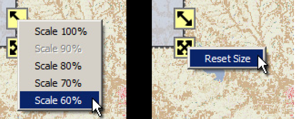
• Scale Chart:  change scale percent, 10% to 100%. This is percentage is applied to the given height and width.
change scale percent, 10% to 100%. This is percentage is applied to the given height and width.• Resize Chart:  change the shape and size by adjusting the width and height graphically.
change the shape and size by adjusting the width and height graphically. These icons can be dragged with the mouse. The drag can be aborted by pressing the ESC key. They also support the illustrated context menu operations.
In addition, the chart can only be reduced in width and height to a certain point at which clipping will occur. If you resize it smaller, then the chart will resize to the minimum. A Reset Size operation will also resize the chart to the minimum size. The “Minimum Size” is found iteratively where the chart grows until all components fit on the chart.
Figure 6.14
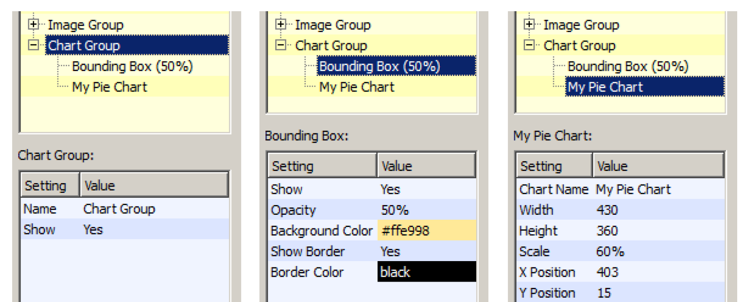
The settings supported on Chart Groups, Bounding Boxes, and Charts are illustrated in Figure 6.15.
Figure 6.15
Figure 6.16
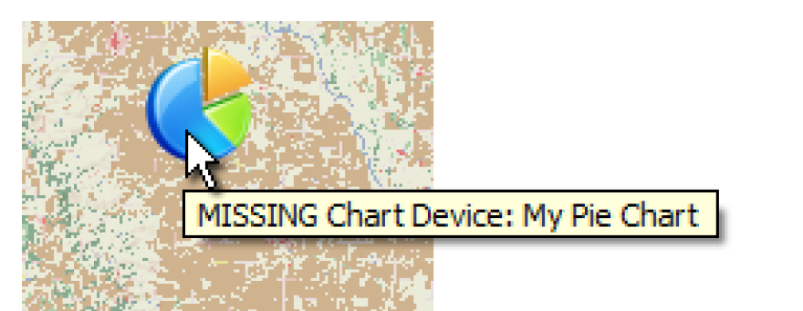
If the Chart (output device) referred to from the Chart item is missing (E.g. if the Chart output device was deleted or renamed), the placeholder icon in Figure 6.17 is shown with a tooltip indicating that the chart device is missing.
Figure 6.17
Note: Nearly all chart display and configuration changes (i.e. colors and slots shown) are made from the Chart Configuration dialog, accessible from the Output Manager.
Note: Pie Charts with labels shown in a separate legend look better on an output canvas than those with labeled wedges.
Units
All numeric values are displayed in the units associated with the Teacup Group's unit type, according to the currently active unit scheme. Select View, then Unit Scheme Manager to show the Unit Scheme Manager dialog. Precision of values is typically controlled by unit scheme but can be overridden on Teacup Groups, Text Groups and Object Icon Groups.
Canvas Preview Tab
The first tab of the panel on the right side of the dialog provides a live preview of what the output Canvas will look like when generated. In fact, this Canvas Preview should be used to define the layout of all of the items added to the canvas. Drag any item to the desired location. The X and Y Positions will update automatically in the settings.
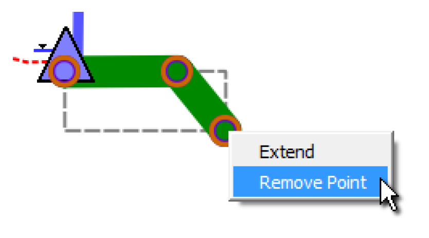
For Flow lines, anchor points are shown on the single selected flow line. These lines support a context menu with the following operations:
• Insert Point: Add an anchor point within a flow line at the selected position.
• Extend: Add an additional point beyond the selected end-point. This is available only on the flow line's two end-points.
• Remove Point: remove the anchor point This is enabled only when the flow line has three or more points.
Figure 6.18
By adding many anchor points, you can use flow line to connect two reservoirs, two teacups, or even follow the river channel on the background image.
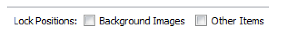
You can lock items using the checkboxes at the bottom right. Those images that are set to be background layer are controlled by the Background Images checkbox. All other items are locked by selecting the Other Items checkbox.
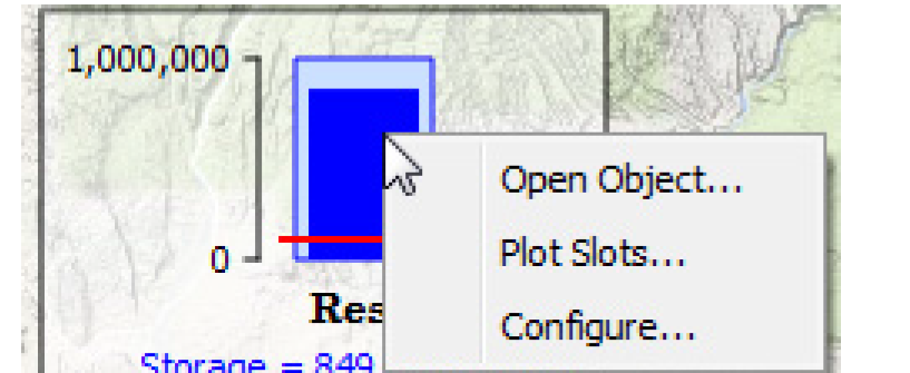
Right-click any item on the preview to get a Configure menu. This scrolls the content settings on the left to that section’s settings. Additional right-click context-specific menus are available where appropriate.
Figure 6.19
Canvas Viewer
The Output Canvas Viewer dialog is shown when the Output Canvas is generated. You can generate from the Output Manager or directly from the Output Canvas Configuration by selecting Generate. On the Viewer, the position of all items is locked and cannot be changed. Animation controls at the bottom allow you to manually or automatically scroll through the run timesteps as described in the next section.
From the viewer, the canvas can be:
• Exported to a movie/video by selecting File, then Export Video. See “Export Video” for more information.
• Exported to an image by selecting File, then Export Image. This saves the canvas as an image file.
• Copied as an image to the clipboard by selecting File, then Copy Image. This copies the canvas image to the system clipboard. From there, you can paste it to other applications.
In addition, an image of the canvas can be included in a Model Report. See “Report Layout Area” for details.
Figure 6.20
Printing
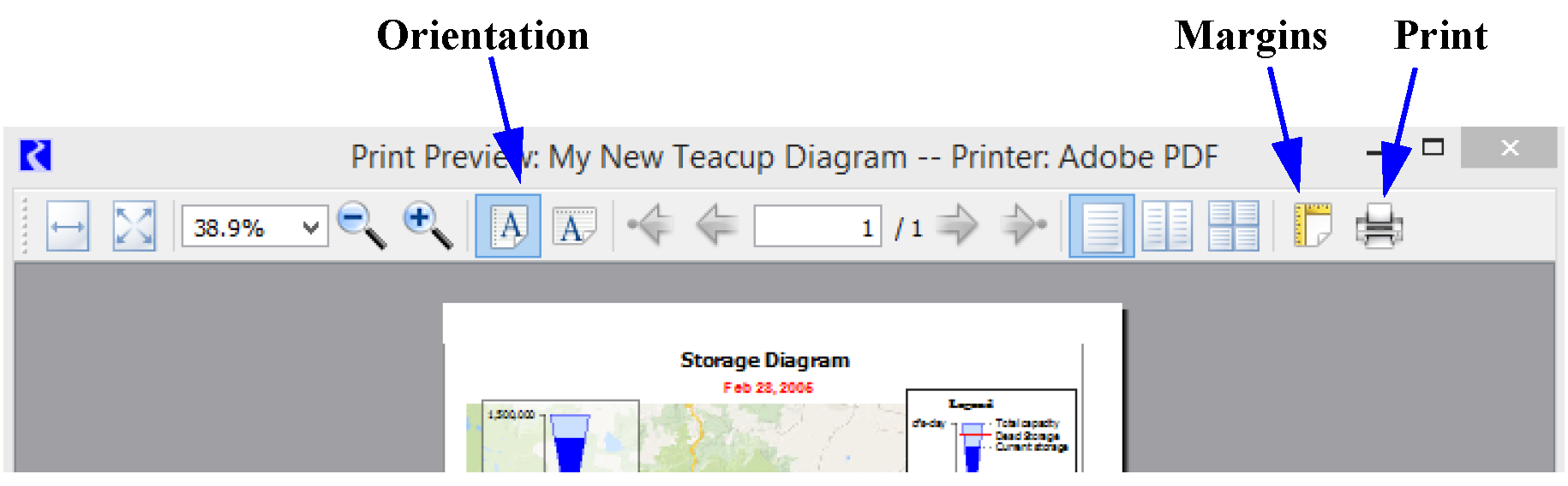
From the Canvas Viewer, you can print the Output Canvas to a printer or to a PDF file (with appropriate drivers). Select File, then Print Preview, then Choose Printer to select the printer to use. Then select File, then Print Preview, then Print Preview to preview the print. Within the preview, you can set orientation, margins, and then select Print to send it to the printer. Figure 6.21 labels these options. Or, select File, then Print to get to the Print dialog directly.
Figure 6.21
Note: A small canvas is printed at approximately full size; it is not enlarged. A large canvas is printed by scaling down the canvas to fit on the configured page (including margins). Regardless, a light black border is drawn around the canvas.
Animation
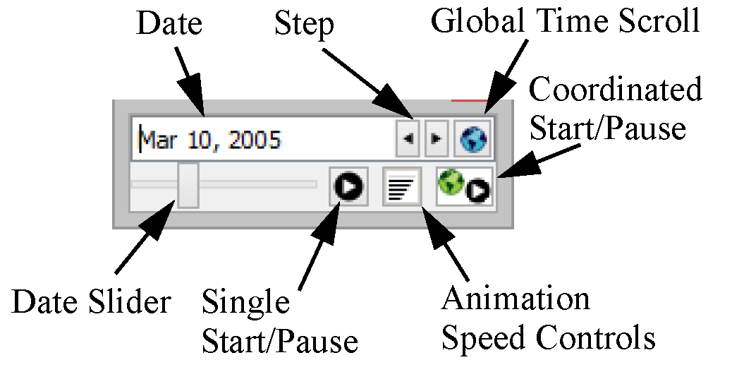
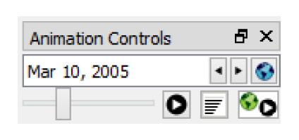
A date selector appears below the canvas in both the preview and generated canvas, as shown in Figure 6.22. It allows the display to be stepped forward and backward through the timesteps. Select Single Start to animate through time (this dialog only). Use the date slider to see where you are in time and the animation speed controls to change the speed (seconds per frame). On the generated canvas, select Coordinated Start/Pause to animate all opened Charts and Output Canvas at the same time. When in coordinated animation mode, you can stop all animations from any dialog. But, from the dialog in which you started the global animation, you can select Single Pause to pause all dialogs. Then use the slider to move the date for all dialogs in a coordinated way. Select Coordinated Start/Pause to end the coordinated animation.
Figure 6.22
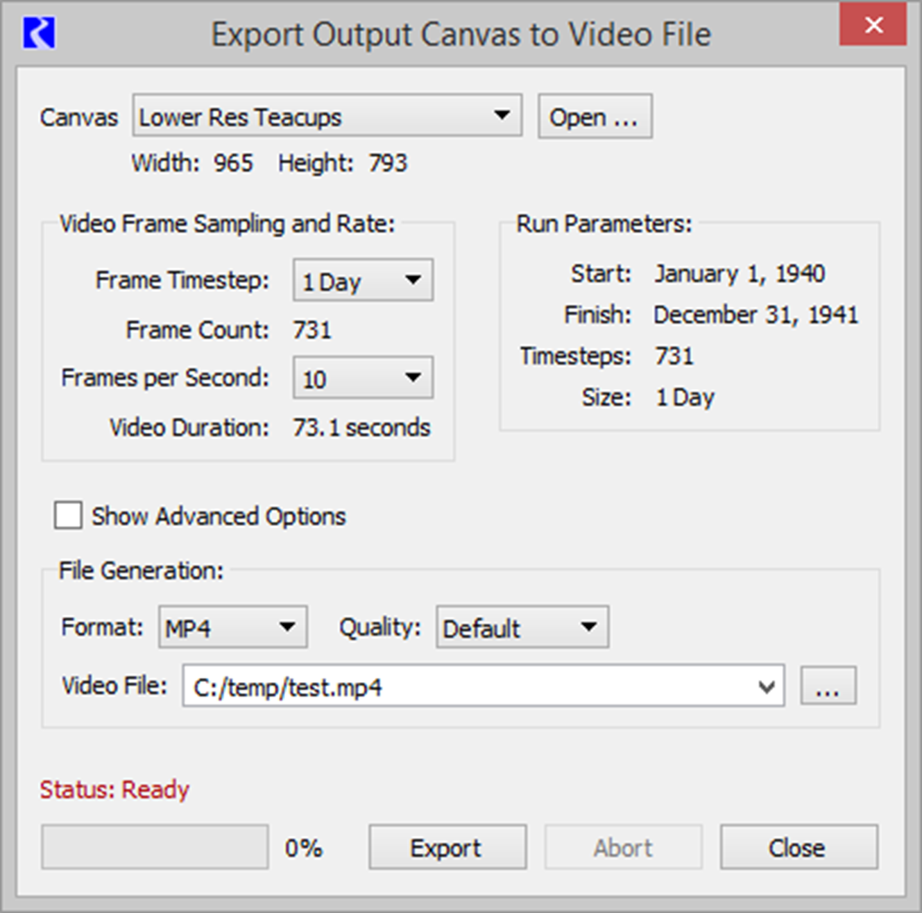
Export Video
Use the Export Video menu to generate a video file of the output canvas animation.
This tool works by creating images of the output canvas at specified intervals as the output canvas is animated. The images are then combined into a movie file using an external process. You have control over both the sampling of the animation and the creation of the output file.
Figure 6.23 Screenshot of the Export Output Canvas to Video File dialog
Output Canvas
First specify the desired output canvas if it is not the one used to open the dialog. The height and width is based on the dimensions of the Output Canvas Viewer. It can be changed from the Output Canvas viewer, but not from this dialog.
Video Frame Sampling and Rate
In this area, you specify how the Output Canvas animation is sampled including the timestep size to use and the speed of the animation in Frames per Second.
For reference, the right side shows the Run Parameters including Start and Finish Timesteps, number of timesteps in the run, and timestep size.
In the left portion, you select the timestep size, either the run timestep size or select a larger timestep size for sampling the animation. The total number of frames is computed based on the run parameters and the timestep size.
Also specify a frame rate for the animation. 5 frames per second is a good starting point.
The video duration is computed based on the frame count and frame rate.
File Generation
File generation can have complicated configuration options because of all the moving parts that must work together. As a result, the dialog provides two ways to configure the output file. The default basic configuration is usually sufficient for most users. Those who want more control over the options can Show Advanced Options to see advanced configuration.
Basic Configuration
The basic configuration provides three configuration options:
• Format: Select from one of the four supported formats. See Table 6.3 for descriptions of the formats and the quality.
• Quality: Select Default, Higher, Moderate, or Lower. This option is not available for GIFs or WEBM.
• Video File: Specify the file to create. Either type it in (include the file extension) or use the file chooser to navigate to the desired directory.
Format | Description and usage |
|---|---|
MP4 | This format displays well in PowerPoint and external players like widows media player. |
WEBM | This format works well when displayed in modern browsers like Firefox or Chrome. It cannot be shown in PowerPoint without an extension. |
WMV | This format displays well in PowerPoint and external players like widows media player. |
GIF | This format is very simple and shows the images repeating over and over, usually in a browser. There are no controls to start/stop/pause the video. Image quality is not as good as other options |
Advanced Options
When you select Show Advanced Options, you have full control over all aspects of the video file generation. Following are descriptions of the elements of advanced configuration.
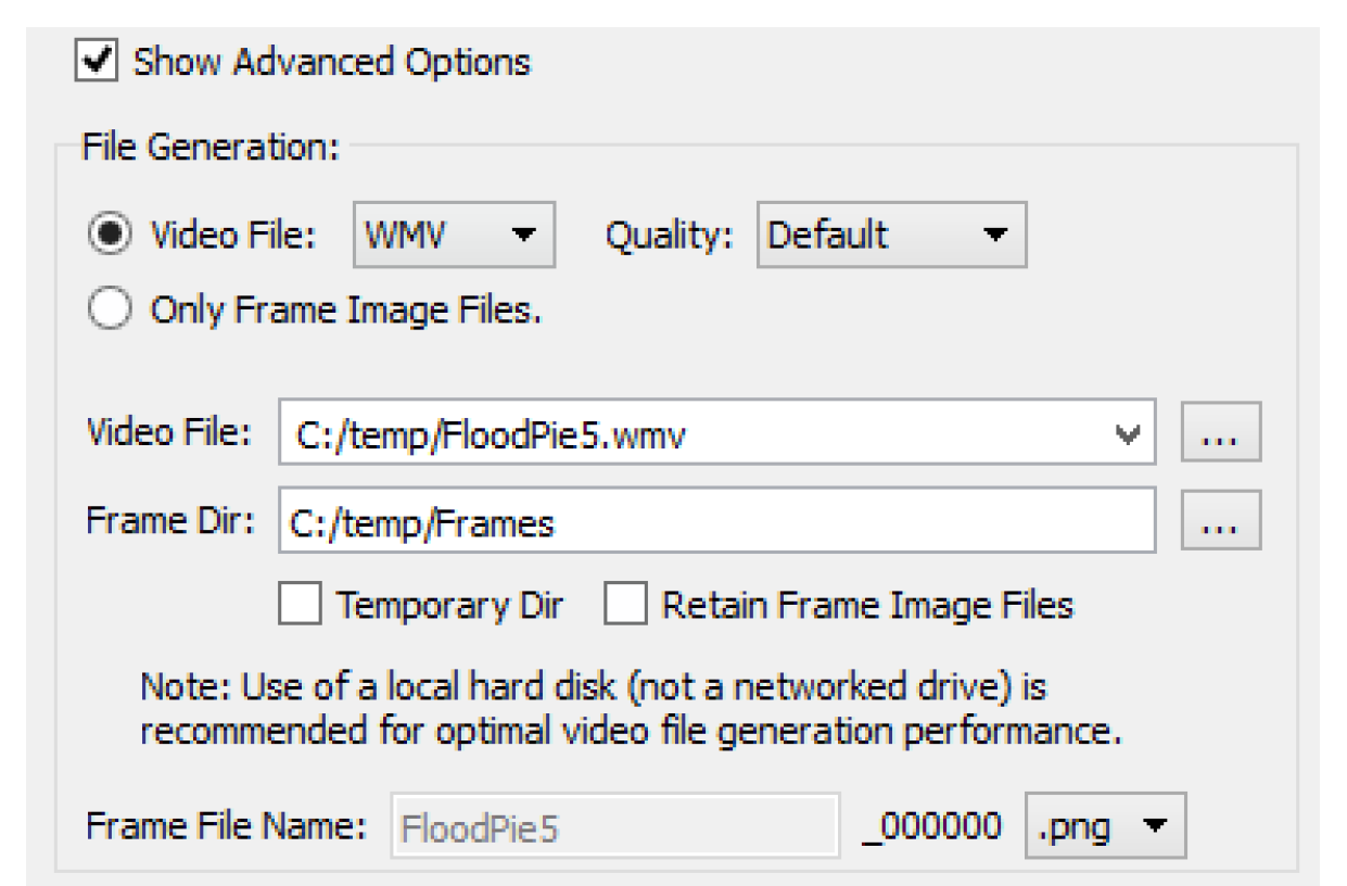
1. Choose whether you want to generate a Video File or generate only the Frame Image Files.
– Video File: Select the Video File format and Quality. See Table 6.3 for descriptions of the formats and the quality.
– Only Frame Image Files: The utility will create only image files at each timestep. They will not be combined into a video file. This option is useful if you have an alternative program that you want to use to assemble the images into a video. When this option is selected, there is no need to specify a Video File name.
2. Specify the location on the file system for the following:
– Video File: The location and name of the video file to create.
– Frame Dir: This shows the directory where the images files will be created. By default, this is the user’s temporary directory. If you deselect the Temporary Dir box, then you can specify any other directory.
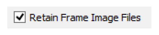
3. If generating a video file, you can specify if you would like to retain the created image files by checking the Retain Image Frame Files. If not checked, they will automatically be deleted after the video file generation is complete.
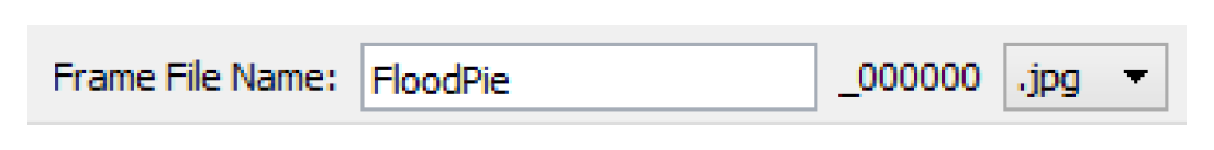
4. If you have selected Only Frame Image Files described above, you can also specify an alternative filing naming convention in the Frame File Name field. You can also choose to use JPG or PNG files.
5. The lower half of the configuration has options for Video File Creation Program Command. This optional panel allows you to further tweak or modify the arguments and commands that are passed to the external program. You can specify either or both of the following elements.
– Extra Global and Input File Options: These options are added to the input side, before the image files are specified. No further information is provided on available options.
– Extra Output File Options: These options are added on the output side, right before the output file specification. No further information is provided on available options.
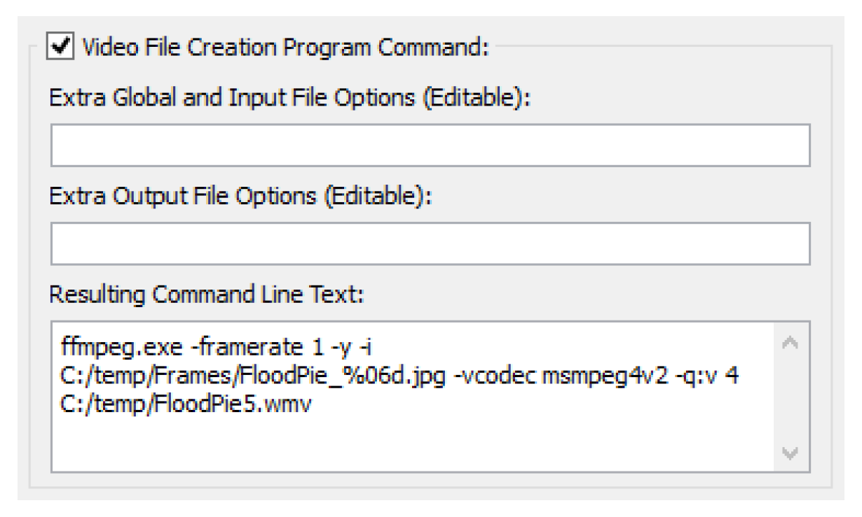
6. The resulting command line is shown in the Resulting Command Line Text field. This shows you exactly what will be executed. Copy is available if necessary.
Creating the Video File
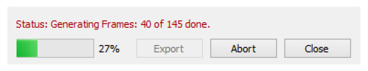
When you choose to create the file by selecting Export, a dialog shows a confirmation before starting the generation. You should not close or resize the Output Canvas dialog during video file generation or the process will be terminated.
Select OK to generate the video file. The dialog shows the status of the export.
When finished, it shows the following status.
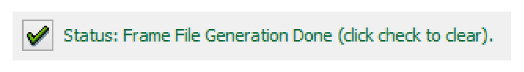
You can now navigate to the directory where the file was exported and view the file in the appropriate application. In addition, a log file is produced in that same directory with further debugging information on the generation process.
Showing Canvas Items on the Workspace
Although the Output Canvas Viewer is the best place to see your Output Canvas, sometimes it is desirable to see certain supported Output Canvas items on the Workspace views. Settings on the Output Canvas Configuration provide the option to show eligible canvas items on the Geospatial View and/or the Simulation View. See “General Settings” for details.
Eligible canvas items are as follows:
• Teacup Groups and Teacups
• Chart Groups and Charts
• Text Groups and Text
• Flow Line Groups and Flow Lines
• Canvas Line Groups and Canvas Lines
Note: All items of these types will be shown on the specified workspace view; limiting or selecting certain items is not supported
Figure 6.24
When first added to either view, the items are placed in the bottom left of the workspace in an arrangement mimicking that of the output canvas. After they are added, each item may be dragged individually into place. The right-click context menus on the workspace view have the same options as though they were on the Output Canvas. This includes an option to Configure the item, which opens the Output Manager Configuration with that item selected.
Note: All editing of Canvas Items is performed from the Canvas Configuration. Placement is performed on the workspace views.
For Flow Lines and Canvas Lines, the number of points and relative placement originally comes from the Output Canvas. But, from that point forward, the number of points and location is maintained separately for the Simulation View, Geospatial View and the Output Canvas itself. You can add, remove, or move points as necessary in each view. Thus, you can add more points to a flow line on the Geospatial View than on the simulation view to show more detail, as may be required by the map. All other configuration including colors, line widths, line types, etc are made on the Output Canvas.
In addition, when shown on the workspace, Animation controls are shown in a panel in the lower right part of the workspace. These provide controls to advance the timestep shown on the canvas items through time. See “Animation” for details.
Instructions to Create a Teacup Diagram
Following are instructions to create a teacup diagram from scratch. These are the bare minimum instructions; you’ll want to modify fonts, colors and label text to make the diagram look great.
1. From the Output Manager dialog menu, select the New, then New Output Canvas.
In general, to create a new Canvas, select General Settings, then Canvas Layout to define what you want to have in the Canvas. Select Selected Item Settings to configure each item in the Canvas.
2. In the General Settings, specify the Name.
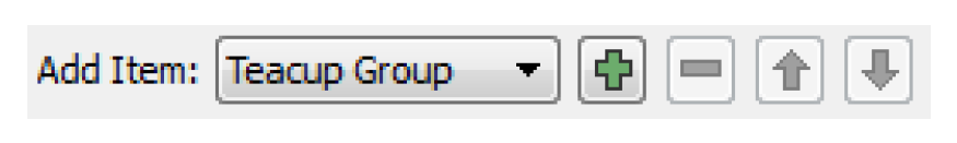
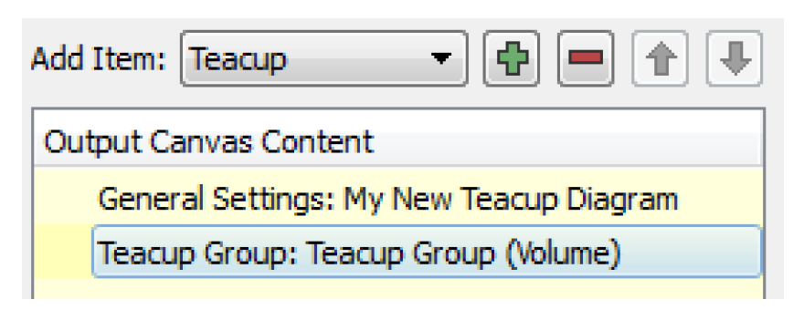
3. Add a Teacup Group by selecting it from the Add Item menu and selecting +.
4. Specify the slots to use for the Current Entity and Maximum Entity by selecting Maximum Slot Name, Reference Type, Current Slot Name, and Reference Type.
5. Specify the Teacup Geometry (rectangular or trapezoid) and whether you would like to Show Gap on the side of each teacup.
6. Add Teacups to the group. First select the Teacup Group, then select Teacup from the Add Item menu. Select +.
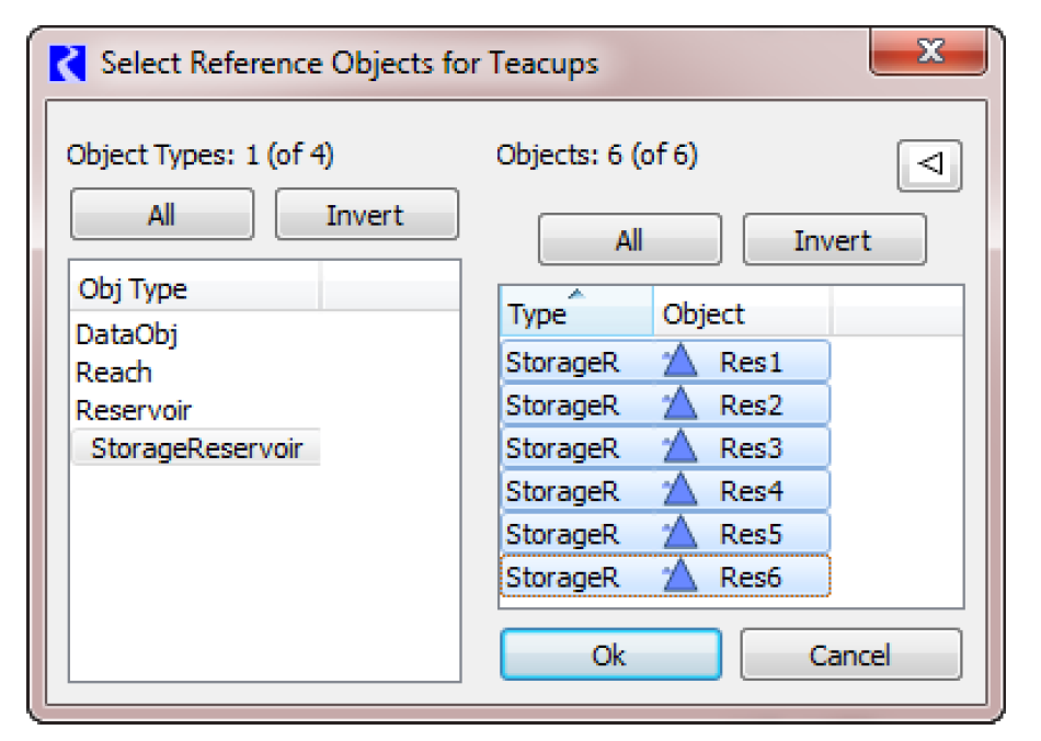
7. Select the objects you wish to use. Make sure to select all the objects you want. One teacup will be created for each object.
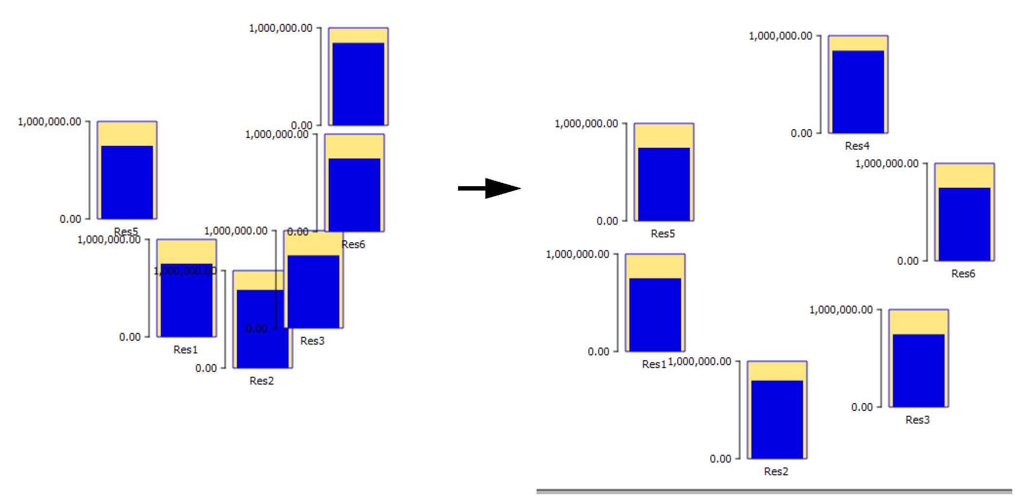
8. This will create a set of teacups and show them on the preview canvas. The initial placement uses the positions of the objects on the Simulation Workspace.On the Canvas Preview, drag the teacups to the desired location.
9. In the teacup group, modify the dimensions of the teacups. For rectangular teacups, specify the width of all teacups and the height of the largest teacup in the Settings panel. For trapezoids, specify the bottom width, maximum height, and top widths of the largest teacup. All other teacups will be scaled accordingly.
10. Add Markers to the Teacup Group: First select the Teacup Group, then select Marker from the Add Item menu. Select +.
11. Specify the Slot (series, scalar, periodic) to use for the marker and its location. Specify a better label if desired. This will be shown later on the legend.
12. Add a Text item. First select the Teacup Group, then select Text Item from the Add Item menu. Select +.
13. In the settings, specify the type of text. For this example, we will add text showing the current storage. Select Value for the Text Type setting. Specify the prefix, suffix, slot reference, slot name, and Legend Text.
14. If desired, add a Bounding Box to the Teacup Group to create a border around each teacup. Select the Teacup Group, then select Bounding Box from the Add Item menu. Select +. Modify the colors or opacity if desired.
15. Add a legend so all of the units, markers, and text values are clearly annotated. Select the Teacup Group, then select Teacup Legend from the Add Item menu. Select +.
16. Add background images and foreground images if desired. Select the General Settings, then select Image Group from the Add Item menu. Select +. Select Image from the Add Item menu. Select +. A file chooser opens. Select the desired jpg or png file.
17. At this point, your teacups and images may not fit on the canvas. Following are some possible solutions:
– Enlarge the canvas by selecting General Settings for width and height.
– Shrink the teacups by selecting Maximum Bar Height in the Teacup Group settings.
Then drag the teacups and images to fit them on the canvas as desired.
18. Add one or more Text Groups and free-standing Text Items. Use these to create a title, show the timestep, or show a system-wide summary variable. Add a Text Group by selecting it from the Add Item menu and selecting +. Specify the desired Font.
19. Add Text Items to the group. First select the Text Group, then select Text Item from the Add Item menu. Select +. Figure 6.25 shows two Text Groups that each contain one Text Item. The first is Plain Text, while the second is the Timestep.
Figure 6.25
20. Modify the colors and fonts to make the canvas look pretty.
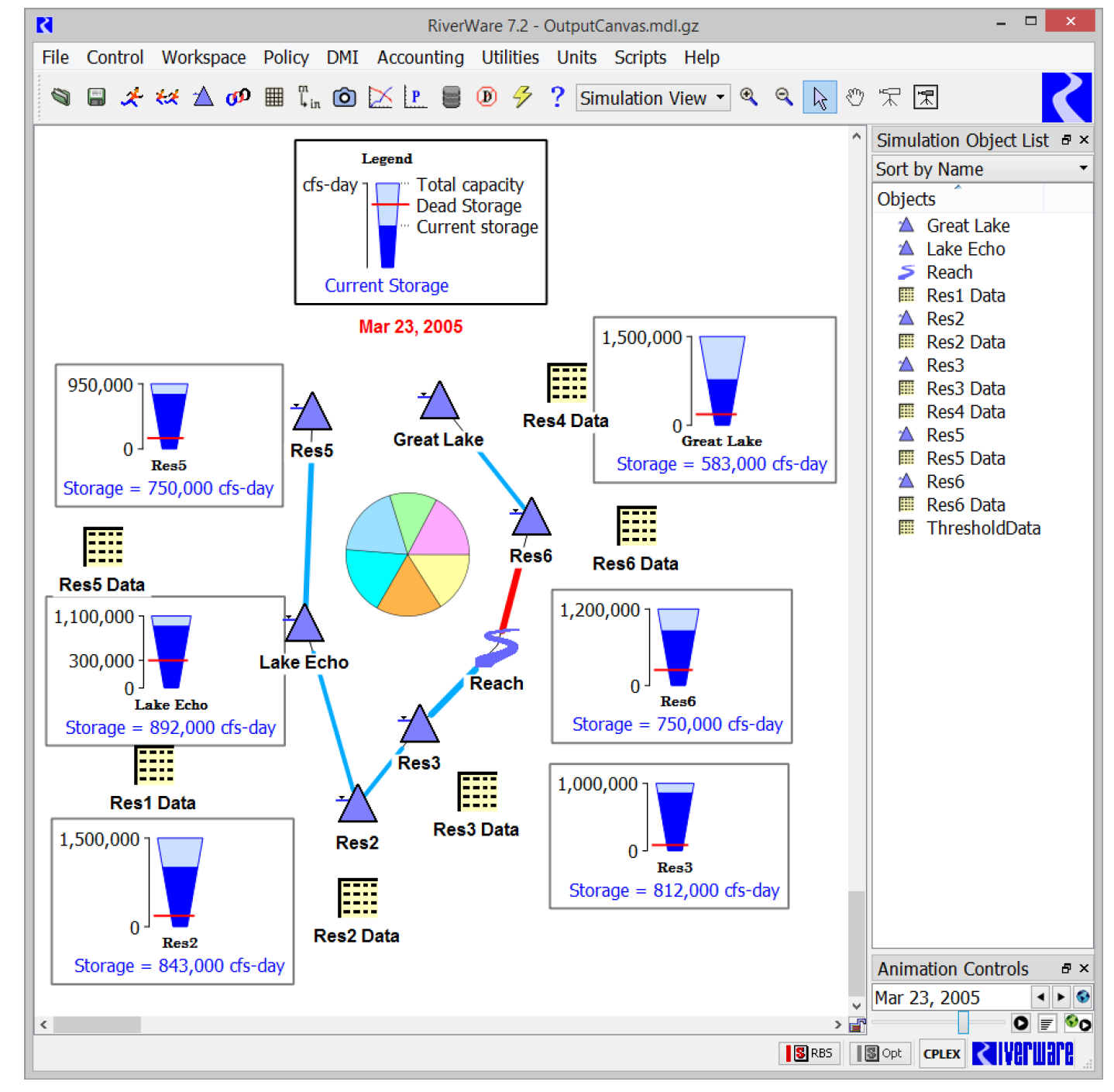
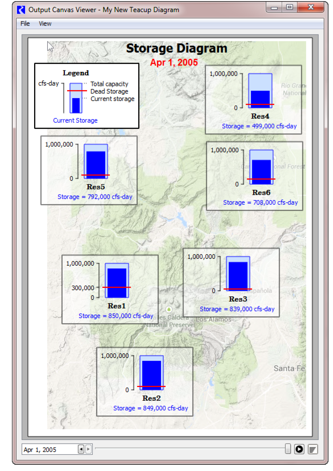
21. Select OK to save the canvas and then generate the device from the Output Manager. Use the animation controls to watch the teacups change through time. Figure 6.26 shows our result.
Figure 6.26
Instructions to Create a Flow Line Diagram
1. Create a new Output Canvas. See Step 1. and Step 2. in “Instructions to Create a Teacup Diagram” for instructions.
Note: You can add flow lines to an existing canvas that also shows teacups, object icons, or other items.
2. With the Flow Line Group item selected, select Plus (+).
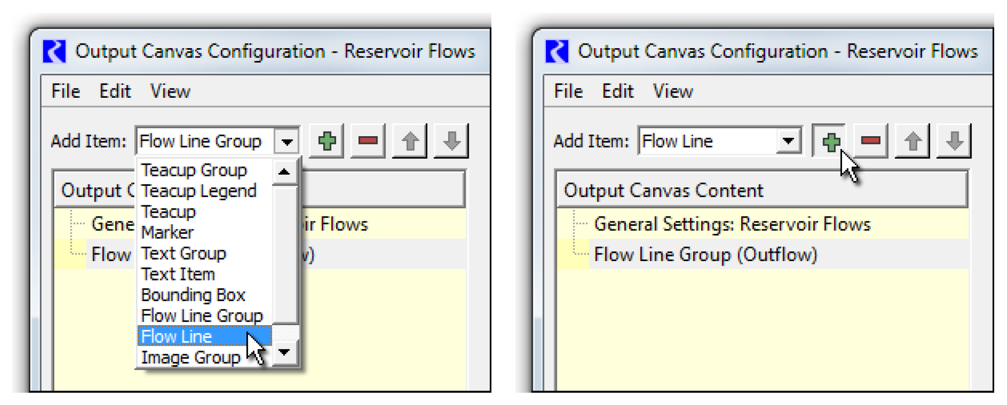
3. The slots associated with the flow lines within a flow line group must have the same unit type. Double-click the Unit Type value to show a unit type menu. Select the desired unit type; generally Flow will be appropriate (the default).
4. With the context menu on a Flow Line Group tree item: Add Item, then Flow Line.
5. Using the selector, select the slots representing the flow lines. Multiple slots can be selected at once and a flow line item will be created for each. They will place on the canvas at a heuristically devised location based on their location within the simulation view.
6. Select a flow line either in the Output Canvas Content tree or within the canvas preview to see the flow line's anchor points. The flow line may be repositioned by dragging the anchor points or the flow line itself. Additional flow line points can be created, and existing points can be deleted, with right-click context menu operations on the flow line and flow line anchor points.
7. Select the Flow Line Group in the Content panel. In the settings panel, define the Minimum and Maximum Thickness and Minimum and Maximum Value.
9. Select each Flow Line in the group and provide a value for each Threshold. Remember Threshold 1 is the lowest flow. Threshold 8 is the highest flow.
10. Optionally, add a Flow Line Legend to provide a key to the intervals and line thicknesses. See “Flow Line Legend” for details.
11. Optionally add an Image (like a map) as a background or as supporting images.
12. Optionally add Object Icons and/or Teacups to provide context for your flow lines. Creating Object Icon Groups and then adding icons to it is analogous to creating Teacup Groups and adding teacups to it, but there is less configuration involved as Object Icons don’t change over the run. This is described in the steps above.
13. Reposition any item as desired.
14. Add Text groups and text to annotate or label your flow lines, provide the timestep, and a title to your canvas. See Step 18. and Step 19. in “Instructions to Create a Teacup Diagram” for instructions.
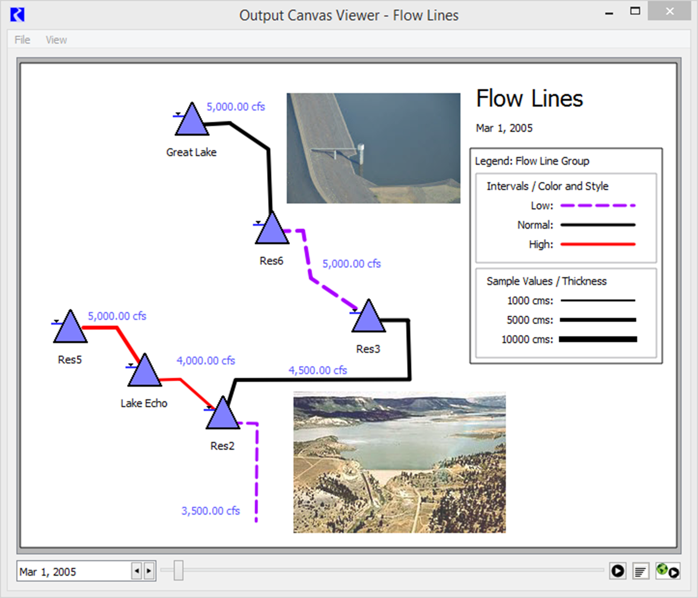
15. Select OK to save the canvas and then generate the device from the Output Manager. Use the animation controls to watch the flow lines change through time. Figure 6.27 and Figure 6.28 show completed sample flow line diagrams.
Figure 6.27
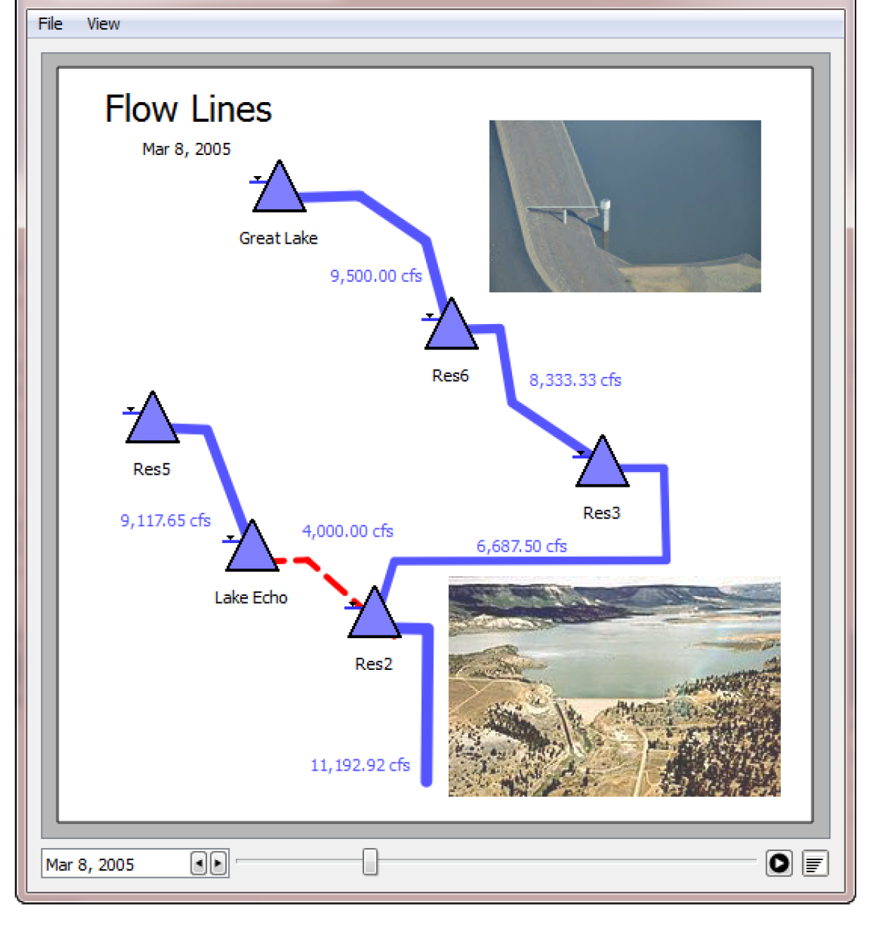
Figure 6.28
Revised: 11/11/2019