
Plot Page Editor
The Plot Page Editor is used to edit and configure the layout, appearance, and data shown. In this section we describe how to use the Plot Page Editor to configure a Plot Page.
Accessing the Plot Page Editor
There are a number of ways to access the Plot Page Editor, as follows:
• From the main workspace, select Utilities, then Plot Page, or select Plotting  .
.
. If there are no pre-configured plots saved in the model, this opens the Plot Page Editor. If there are pre-configured plots already saved in the model file, this will open the Plot Page dialog with the most recently selected plot displayed.
• From the Plot Page dialog, select New in the bottom right corner to open a blank Plot Page Editor. Select Edit to open the Plot Page Editor for the currently selected Plot Page.
• From the Plot Page dialog, select Edit, then Create New Plot from the menu bar to open a blank Plot Page Editor. Select Edit, then Edit Selected Plot to open the Plot Page Editor for the currently selected Plot Page.
• From the Output Manager, select New, then New Plot Page Alternatively, select an existing Plot Page in the list of output devices, and then select New. This will open a blank Plot Page Editor.
• From the Output Manager, select an existing Plot Page in the list of output devices, and then select Edit. This will open the Plot Page Editor for that Plot Page. Alternatively, double-select the Plot Page name to open the Editor, or select Edit, then All Plot Pages.
• From the Open Object dialog, highlight one or more slots and select Slot, then Plot Slots or select the plot icon.  This opens the Plot Page Editor with the selected slot(s) already plotted.
This opens the Plot Page Editor with the selected slot(s) already plotted.• From the Open Slot dialog, select File, then Plot or select the plot icon.  This opens the Plot Page Editor with the slot plotted.
This opens the Plot Page Editor with the slot plotted.• From a SCT, highlight one or more slots and select Slots, then Plot Slots or select the plot icon. 
Editing a Plot Page
All configuration for a Plot Page is carried out in the Plot Page Editor. You can plot series slots, table slots, scalar slots, and periodic slots. Series slots can be plotted with time on the x-axis, or two series slots can be plotted against each other. Multiple curves can be plotted on the same plot (set of axes), and multiple plots can be shown in different panels of a Plot Page.
Note: You must either give the Plot Page a name and select Apply or OK in the Plot Page Editor or save the Plot Page using File, then Save As to preserve the Plot Page configuration. Otherwise, when you close the Plot Page Editor, the Plot Page changes will be lost.
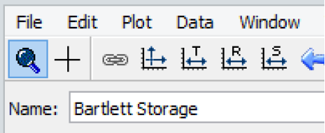
Give each Plot Page a name in the Name field near the top left of the Plot Page Editor. This is the name that will appear in the Plot Page Selection list in the Plot Page dialog and in the Output Manager.
All editing of a Plot Page in the Plot Page Editor applies to the configuration of the Plot Page (e.g., the slots associated with the plots, layout, and line and color choices). Because plots are automatically updated with new slot information (after a new run or after user input values have been changed), a saved Plot Page does not preserve the results of a particular model run. Snapshots can be used to preserve the results of model runs; see Snapshots for details.
Plot Page Layout
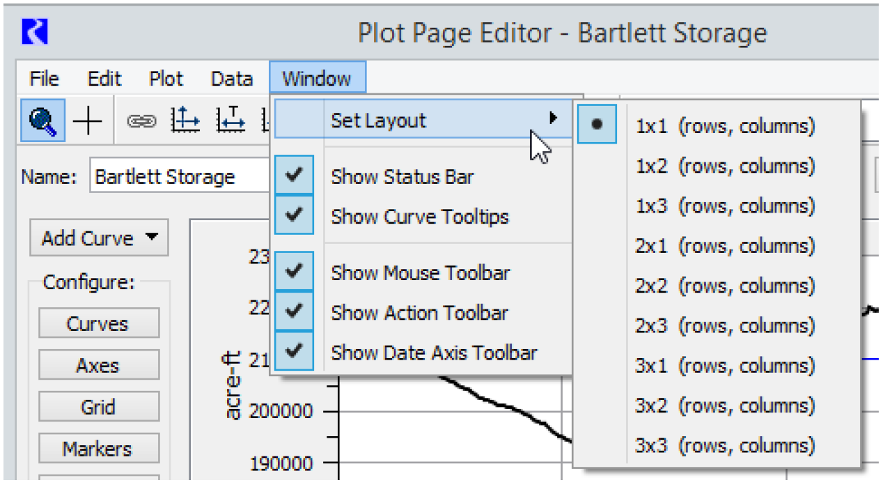
Plots can be added to a Plot Page in the Plot Page Editor by selecting Window, then Set Layout. Alternatively, select the Plot Layout dropdown menu near the top right of the Plot Page Editor.
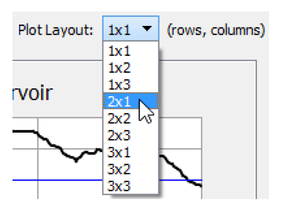
From either of these layout menus, you can choose the number of plots that appear in the Plot Page. You may change the Plot Page from a 1X1 array of plots to as many as a 3X3 array. When the display size of the Plot Page dialog changes, the plots are automatically updated to occupy the new dialog size. Figure 2.3 is a sample.
Figure 2.3 2X1 Plot Page
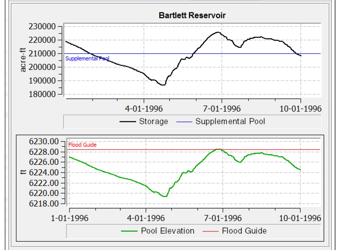
Whenever more than one plot is displayed, configuration changes will apply to the selected plot, which has a black outline around it.
Adding a Curve or Marker to a Plot
There are several methods to add a new curve to a plot. Descriptions for adding a series curve follow. The steps are similar for adding other types of curves and Markers. See Types of Curves and Marker Configuration for additional information.
• Select the Add Curve menu near the top left of the Plot Page Editor, and select Series.
• Select Data, then Add Series Curve
• Right-click the blank plot area and select Add Series Curve
• Select Data, then Membership, and select Add Series Curve.
Note: From the Add Curve and similar menus you can directly add a curve for a Snapshot slot associated with a slot on the selected plot. See Adding Associated Snapshot Curves for additional information.
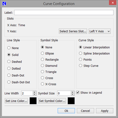
Curve Configuration
In the resulting Curve Configuration dialog, select Select Series Slot to bring up the Slot Selector. After selecting the desired slot and setting the curve configuration options, select OK in the Curve Configuration dialog to add the curve to the plot.
Alternatively, it may be more convenient to quickly plot a slot directly from the Open Slot dialog, Open Object dialog or SCT.
• From the Open Object dialog, highlight one or more slots and select Slot, then Plot Slots or select the plot icon. 
• From the Open Slot dialog, select File, then Plot or select the plot icon. 
• From a SCT, highlight one or more slots and select Slots, then Plot Slots or select the plot icon. 
The Curve Configuration dialog can be opened to edit an existing curve in any of the following ways:
• Select Curves on the left side of the Plot Page Editor dialog.
• Select Edit, then Curve Configuration from the menu bar of the Plot Page Editor.
• Right-click a curve label in the legend and select Configure.
• Right-click the plot area, and then in the resulting context menu select Configure, then Curves.
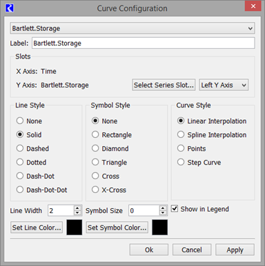
The slot associated with a curve can be changed. Select Select Series Slot to display a Slot Selector and select the desired new slot.
Use the drop down menu to choose to which axis it should be shown. Both the Left Y Axis and Right Y Axis can be used for series slot data. Currently, only the Lower X Axis can be used for series slot data. For table and other data, both Y axes can be used and both X axes can be used if the unit types differ.
The name for the curve displayed in the plot legend can be modified in the Label field. By default the Object.Slot name is used.
The Curve Configuration window offers a selection of line and symbol styles. It lets you select how you want individual curves to be calculated/displayed. Options include the following:
• Linear Interpolation: Connect points with a line
• Spline interpolation: Use a “natural cubic spline” to fit a curve to the data. The curve is actually a series of spline interpolated points connected by lines. The algorithm creates three times the number of data points for use in the spline curve.
• Points: Only show the points.
• Step Curve: Show horizontal lines to the left of each data point in the series. These interval values are then connected by vertical lines to create a step. A step curve is the default curve style for slots involving units of flow since flow is an average value over a timestep.
To choose from one of several basic colors, or customize and save colors, select Set Line Color or Set Symbol Color. This opens the Set Color dialog. Use this dialog to choose one of several pre-defined colors, or to create and save special colors from an interactive palette. To create a custom color, move the cursor over the palette to find and select a desired color tone and hue. In the lower-right of the dialog, select Save to Custom Colors to save the curve within Custom Colors. To change the color properties of any custom color, select that particular color and make adjustments with the palette. Although you make adjustments to the pre-determined colors in the same manner, the changes are not saved unless you have entered them as custom colors.
The Curve Configuration also allows you to specify whether the curve should be shown in the Legend. Select the Show in Legend checkbox. You can also remove a curve from the legend by right-clicking the item in the legend and choosing Remove From Legend.
To delete a curve from a plot, right-select the curve name in the plot legend. Then in the resulting context menu select Delete Curve.
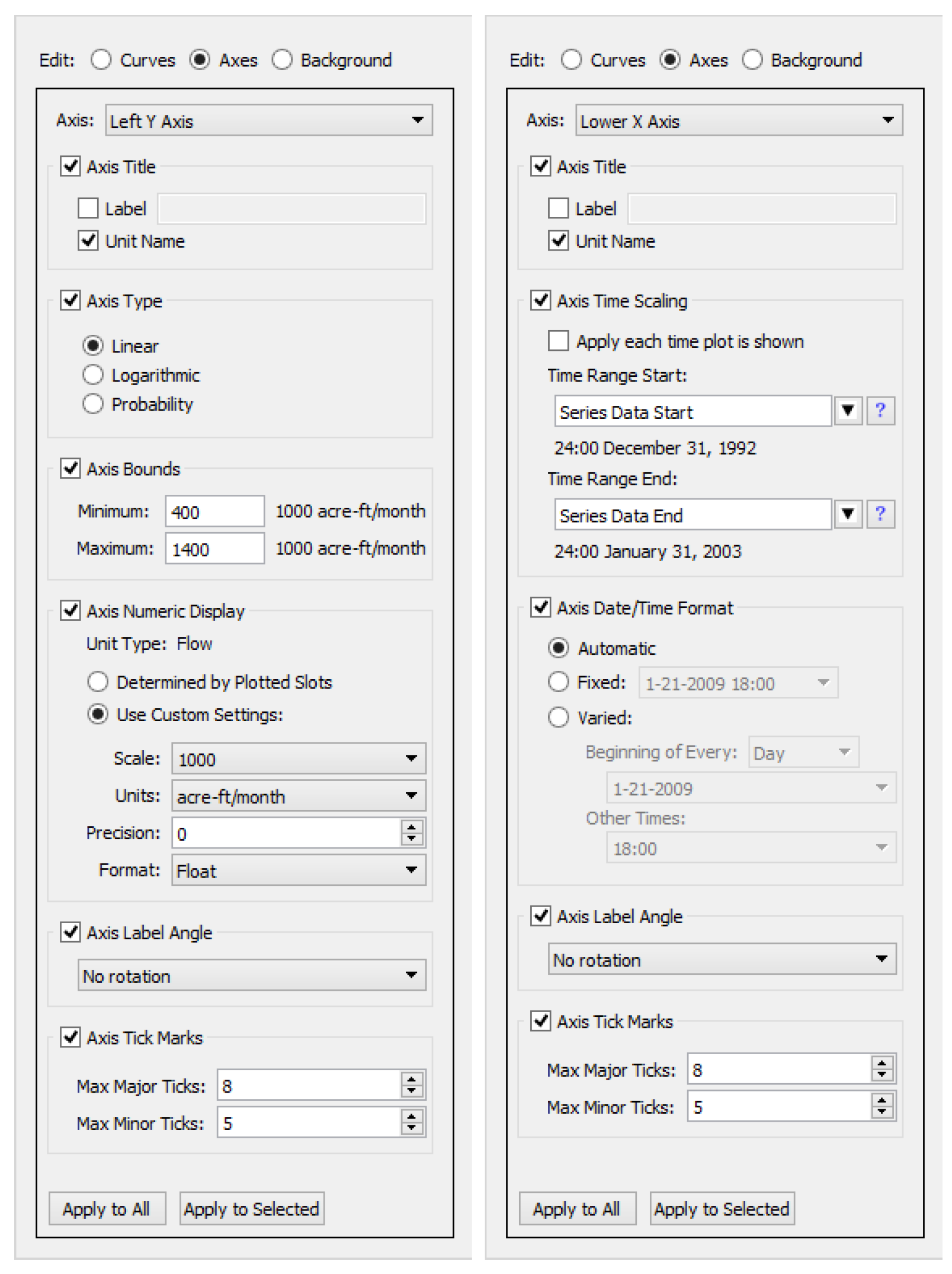
Axis Configuration
Access the Axis Configuration dialog in one of the following ways:
• Select Axes on the left side of the Plot Page Editor dialog.
• Select Edit, then Axis Configuration from the menu bar of the Plot Page Editor.
• Right-click the plot area, and then in the resulting context menu select Configure, then Axes.
Use the Axis Configuration to control the appearance of the axes. First select the desired Left Y, Right Y, Lower X or Upper X axis. The configuration options are different for numeric data versus time series data. First described are common settings and then the settings that are unique for numeric axes, then below for time axes.
Common Configuration
The following configuration options are common to numeric and time axes.
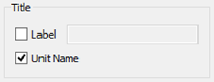
• Title: The axis label can be combinations of a user-supplied Label and the Unit Name. By default the unit name is used as the axis label.
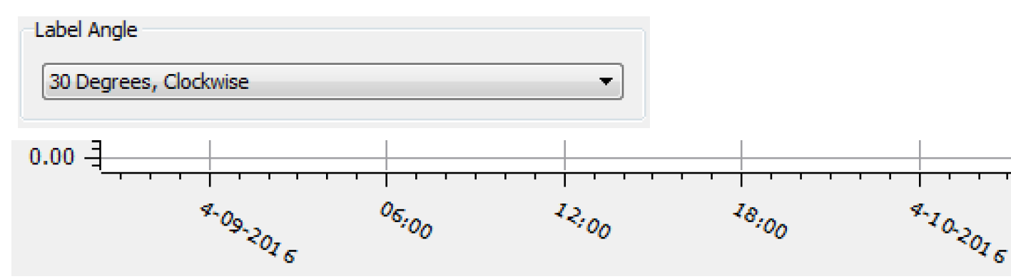
• Label Angle: Use the Label Angle menu to choose from one of the seven rotations.
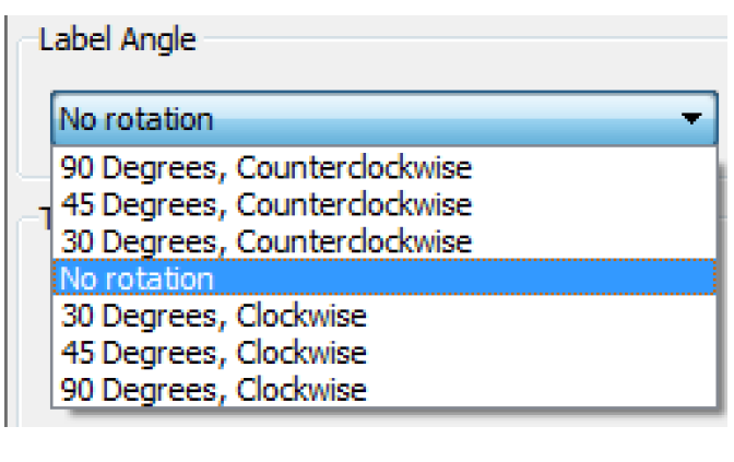
Figure 2.4 is an example of one of the options and the resulting axis labels.
Figure 2.4
Numeric Axis
The following configuration options apply to numeric axes only.
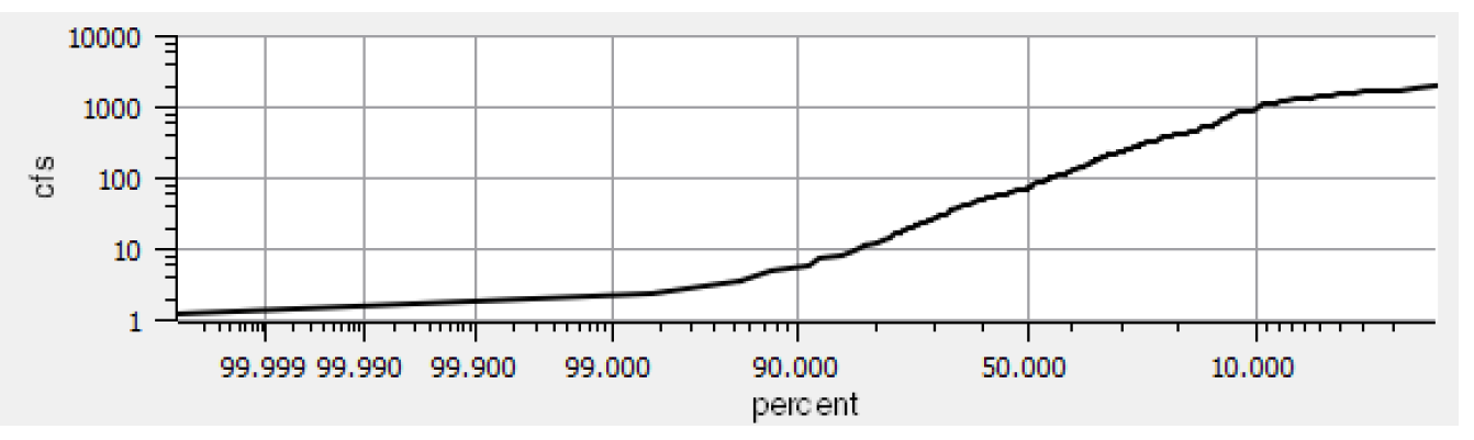
• Numeric Scale: You can configure numeric axes to use a Linear or Logarithmic scale. If the units displayed are percent, you also have the option to select a Probability scale as you would see on normal probability paper. On such a scale, normally distributed values will plot as a straight line. Figure 2.5 is a sample.
Figure 2.5
• Bounds: Set the Minimum and Maximum bound, the plotted range on each numeric axis. Figure 2.6 shows the options for both bounds.
Figure 2.6 Axis bound configuration
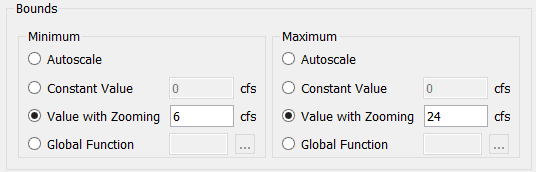
The options are as follows:
– Autoscale: Automatically determine the bound to contain the values, often with some padding.
– Constant Value: Use a constant value when the plot is shown. Zooming or panning in the Plot Editor will not be remembered the next time the plot is shown.
– Value with Zooming: Use the value shown but any zooming or panning on the Plot Editor, when applied, will be used as the new value.
– Global Function: Specify a global function that returns a numeric value in the axis unit type.
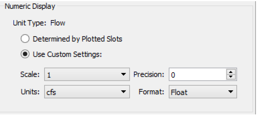
• Numeric Display: Set the format of the numeric display using the options. Select one of the following options:
– Determine by Plotted Slots: The axis will use the display settings for the first slot assigned to the plot. These are based on the Unit Scheme rules for that slot.
– Use Custom Settings: Specify the settings for this axis. Change the Scale, Precision, Units, or Format. Format choices include Float (the default), Scientific (e.g. “1.046 E4”), or Scientific/Float. The Scientific/Float format uses Float format if the number is within a specific range, beyond which, the Scientific format is used.
• Tick Marks: Specify the Max Major Ticks and Max Minor Ticks to show.
Note: This is the maximum possible; often there will be fewer tick marks shown.
Time Series Axis
Time series axes have alternative controls for the configured range and format. Time scales are always plotted linearly. The number of tick marks are computed automatically. Major and minor ticks are placed at reasonable time intervals based on the amount of time shown on the plot. For example, if you are plotting a year of data, the ticks will be on the start of each month. If you are plotting a month of data, the ticks will be on each day.
The Time Scaling panel includes the following fields:
• The Apply each time plot is shown checkbox. If this is selected, the configured time range is shown every time the plot is generated (regardless of the last zoom/scaling). In addition, with this on, the graph is also automatically re-scaled when the model's Run Range is changed.
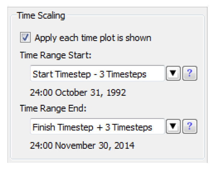
• Time Range Start and Time Range End editable selectors to define the time range.
These time controls are editable text and use the same symbolic datetime representation as RPL DATETIMES; see DATETIME in RiverWare Policy Language (RPL) for details. Text below the editor field indicates the actual datetime of the entered symbolic time text (if it is valid), or “undefined.” You can also use the drop-down menu to specify one of the common datetimes. Some of these are expressions which must be edited to become valid, e.g. by replacing “N” with a nonnegative integer and the HH:00 MMM DD, YYYY formula, where you substitute the hour, month, day and year.
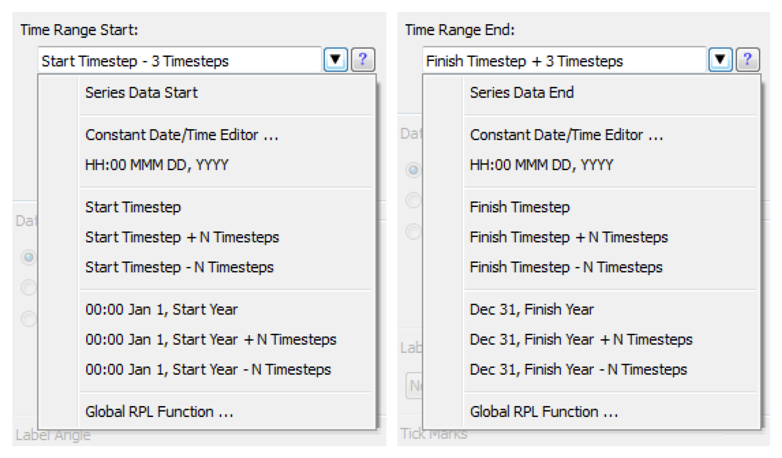
The Series Data Start and Series Data End represent the earliest and latest datetimes based on data within the plot’s series curves.
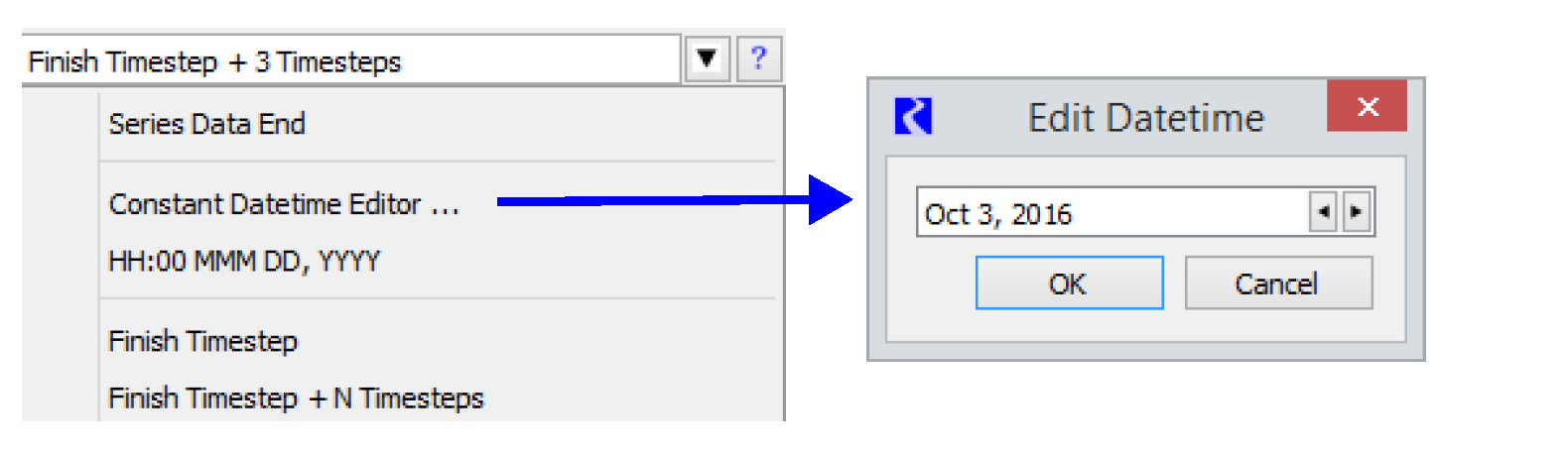
The Constant Datetime Editor selection opens a separate dialog to specify the datetime using a selector configured for the model's timestep size.
The choices with 00:00 Jan 1, and Dec 31, specify the beginning and end of a year expression, optionally plus or minus a specified number of timesteps.
The Global RPL Function opens a Function Selector to select a RPL function in a Global Function Set. The selected function must have a return type of DATETIME, and must not have any arguments.
Select Help (question mark icon) on the right side of the symbolic datetime editor to show a description of symbolic datetime representations.
Alternatively, enter any RPL fully specified DATETIME expression; see DATETIME in RiverWare Policy Language (RPL) for details.
For time series (i.e. lower x axis typically), you can specify the Date/Time Format.
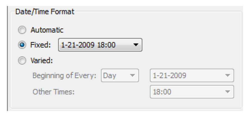
• Automatic mode supports the traditional format. Date labels on the time axis are presented based on the overall time range of the plotted series data:
– Time range > 3 days: 1-21-2009
– Time range < 3 days: 01-21-2009 18:00
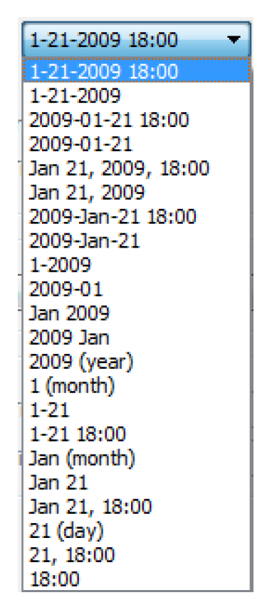
• Fixed mode provides a single format for all labeled tick-marks.
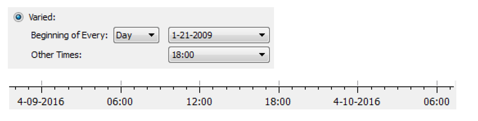
• Varied mode displays date/time axis label text in two different selected formats:
– One format for date/times starting at the beginning of every Year, Month, or Day, and
– A different format for all other date/times.
For example, Figure 2.7 shows a varied format, with the full date at the beginning of the day and just the time for all other labels. The resulting axis is shown.
Figure 2.7
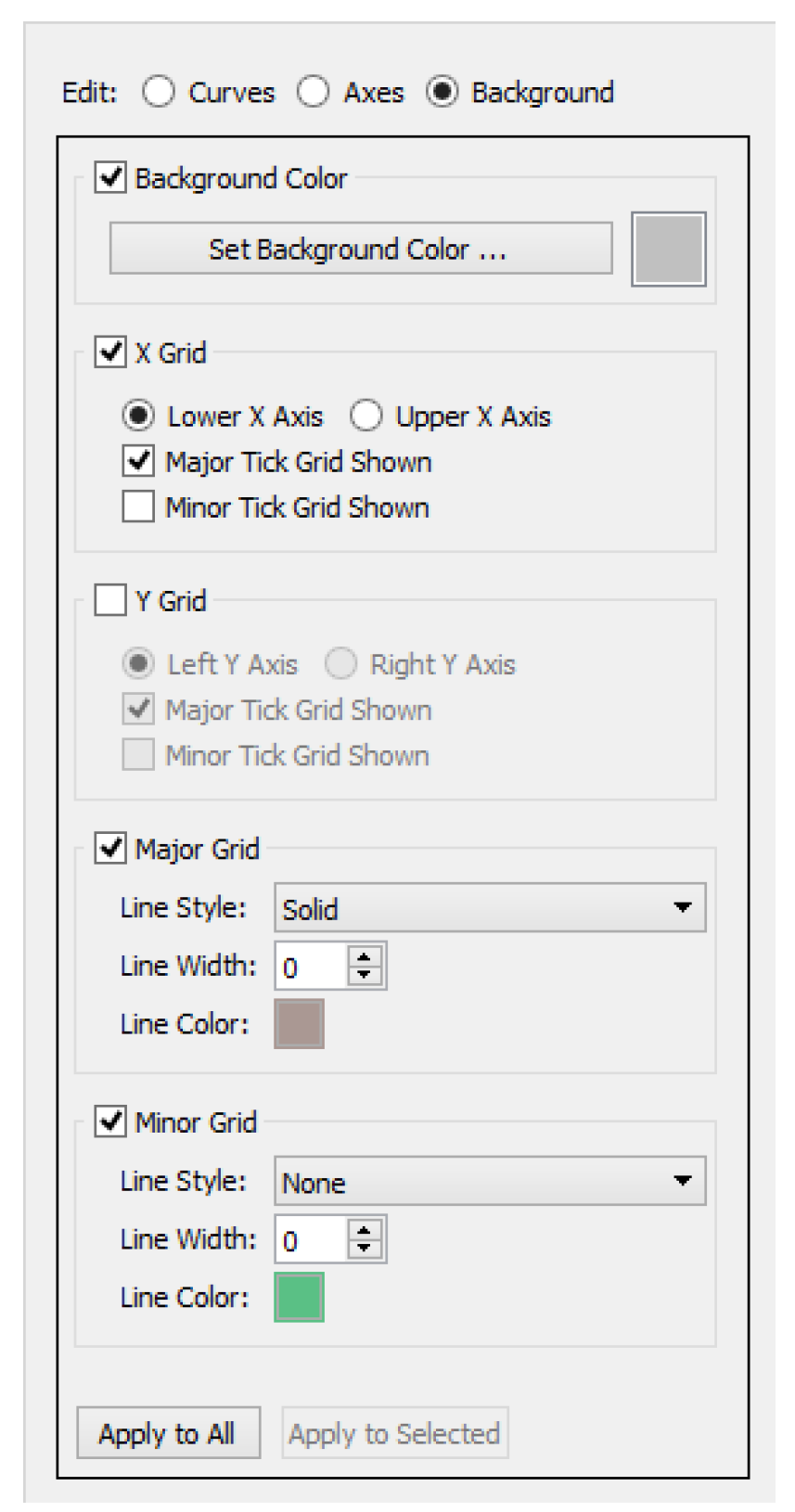
Grid Configuration
Access the Grid Configuration dialog in one of the following ways:
• Select Grid on the left side of the Plot Page Editor dialog.
• Select Edit, then Grid Configuration from the menu bar of the Plot Page Editor.
• Right-click the plot area, and then in the resulting context menu select Configure, then Grid
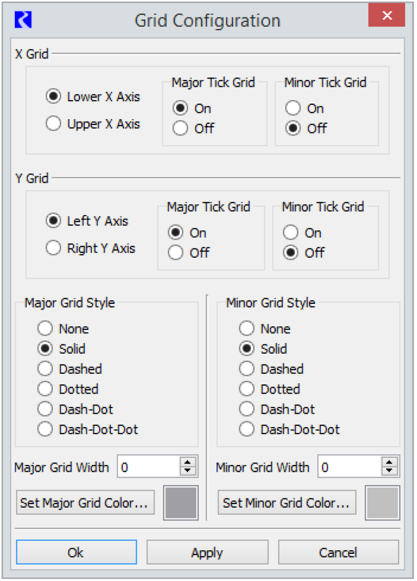
In the Grid Configuration dialog you may select whether major and minor grid lines are visible on each axis. You also select from this dialog the grid line style and color.
Marker Configuration
Markers allow you to add horizontal or vertical lines on a plot marking some important threshold or boundary. You can add, delete or edit markers from the Marker Manager. Access the Marker Manager in one of the following ways:
• Select Markers on the left side of the Plot Page Editor dialog.
• Select Edit, then Marker Manager from the menu bar of the Plot Page Editor.
• Right-click the plot area, and then in the resulting context menu select Configure, then Markers.
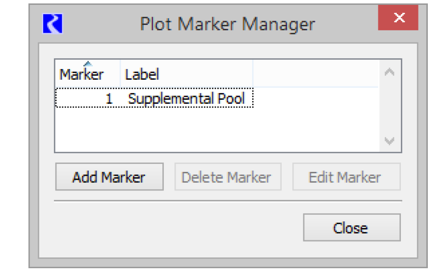
Add a marker by selecting Add Marker in the Marker Manager. To edit the marker, highlight the marker in the Marker Manager and select Edit Marker.
The Marker Configuration dialog box provides marker configuration options.
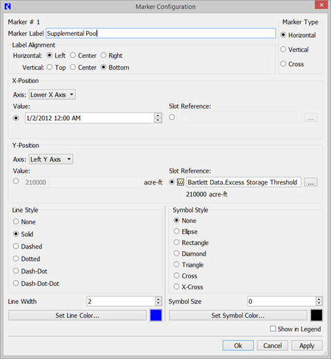
In the upper-right, under Marker Type, select the axis/axes in which the marker appears. The horizontal marker creates a line at a specified Y value, the vertical marker creates a line at a specified X value, and the cross marker creates both a horizontal and vertical line. Optionally, add a label to the marker in the Marker Label field, and its position can be set by selecting the appropriate Horizontal and Vertical Alignment option.
Next, select the location of the marker on each axis, in the X-Position and Y-Position regions. Select the desired axis (Lower X or Upper X / Left Y or Right Y) and then specify either:
• Value: Enter a static value in the axis units. For an X-axis displaying time, toggle through timestep intervals, using the arrows or type in the text.
• Slot Reference: Use the button to open a slot selector and select a scalar slot that holds the marker value. Once chosen, the value will be shown. The slot must be a scalar slot (regular scalar or scalar with expression) and have the same unit type as the axis. Use this option if the value referenced by the marker will change via DMI, Initialization Rule, Script or user input.
Also, in the Marker Configuration, specify the Line Type, Line Width, Line Color, Symbol Style, Symbol Size, and/or Symbol Color.
Specify whether to display a legend entry for the marker by selecting the Show in Legend checkbox. You can also remove a marker from the legend by right-clicking the item in the legend and selecting Remove From Legend.
Set Plot Title
A separate title can be given to each plot in a Plot Page. Access the Plot Title Editor in one of the following ways:
• Select Plot Title on the left side of the Plot Page Editor dialog.
• Select Edit, then Set Plot Title from the menu bar of the Plot Page Editor.
• Right-click the plot area, and then in the resulting context menu select Configure, then Title.
In the resulting Plot Title dialog, provide a customized name for the plot. Then select OK or Apply. The font for the plot title can be changed in the Plot Settings; see Plot Page Settings. However, the font is a user setting and will apply for all plot titles in RiverWare for that user.
Set Background Color
Access a color selector for the plot background in one of the following ways:
• Select Background on the left side of the Plot Page Editor dialog.
• Select Edit, then Set Background Color from the menu bar of the Plot Page Editor.
• Right-click the plot area, and then in the resulting context menu select Configure, then Background Color.
Select the desired background color from the color selector dialog.
Reorder Legend
Access the Reorder Plot Legend dialog in one of the following ways:
• Select Legend on the left side of the Plot Page Editor dialog.
• Select Edit, then Reorder Legend from the menu bar of the Plot Page Editor.
• Right-click one of the legend items in the plot, and then in the resulting context menu select Reorder Legend.
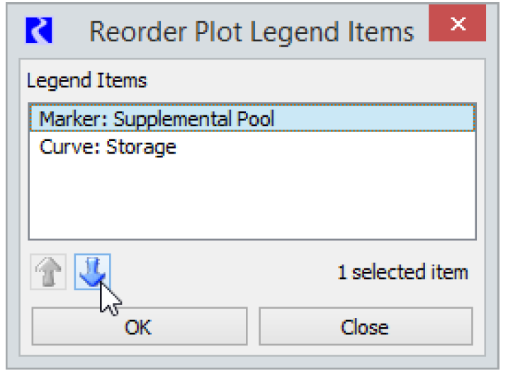
Select one or more curves or markers and use the Up and Down arrows to re-arrange the order. Curves or Markers in the italics font are not shown in the legend (based on their Curve/Marker configuration) but are still listed in the Reorder dialog.
Plot Page Editor Menus
Following is a description of each menu in the Plot Page Editor.
File Menu
The File drop-down menu offers options for saving Plot Pages in the model, creating templates or similar Plot Pages, exporting the Plot Page to a file, and exporting or printing plot images. Following are descriptions of the available selections.
• Save As: Select Save As to save the Plot Page with a name if it does not already have one (same as entering a name in the Name field of the Plot Page Editor and selecting Apply). If the Plot Page has already been saved with a name, the Save As selection can be used to save a copy of the Plot Page with a new name. In both cases the new name will be added to the Plot Page Selection List in the Plot Page dialog. Saving a Plot Page will preserve the configuration of the Plot Page (e.g., the slots associated with the plots, layout, and line and color choices). Because plots are automatically updated with new slot information (after a new run or after user input values have been changed), a saved Plot Page does not preserve the results of a particular model run. Snapshots can be used to preserve the results of model runs; see Snapshots for details.
Note: You must either save a Plot Page using Save As or give the Plot Page a name and select Apply in the Plot Page Editor to preserve a Plot Page configuration. Otherwise, when you close the Plot Page Editor, the Plot Page is lost.
• Save As Template allows you to save the current Plot Page as a template. See Plotting Templates for details on creating and using templates.
• Create Similar Plot Pages allows you to directly create Plot Pages similar to the existing Plot Page using different objects, accounts, slots, or supplies depending on which sub-menu is selected. See Creating Similar Plot Pages for details.
• Import Plot Page Configurations allows you to import Plot Page Configurations that have been exported to a file. Select a desired import file from the resulting File Chooser dialog and select Open. An informational dialog is displayed that summarizes the devices that were imported. Unique names are created (via a numbered suffix) for any Plot Pages with names that already exist as Plot Pages in the model.
Note: This is the same import capability that is available through the Output Manager; see Exporting and Importing Output Devices for details.
Note: If Plot Pages are exported from one model and imported into another one that does not have the same objects and slots, the curves of the plots will not have valid slots associated with them.When you generate the Plot Pages, the curves will appear in the legend of the plots, but without data for the curves. You can then select new slots using the curve configuration section; see Curve Configuration for details.
• Export Plot Page Configuration allows the selected Plot Page configuration to be exported to a file. Select or enter a desired file path and name in the resulting File Chooser dialog, and select Save. All Plot Page configuration information is saved to the file.
• Export Image allows saving of the image of a selected plot or all plots on the Plot Page to a graphics file. The graphics file can be in one of a number of image formats. Other options include the export image’s size (number of pixels) and resolution (low-medium-high). See Printing and Exporting Plots for additional information.
• Print Preview will show of preview of the plot as it would appear on the specified printer. See Printing and Exporting Plots for additional information.
• Print will send a selected plot or all plots on the plot page to your printer. See Printing and Exporting Plots for additional information.
Edit Menu
The Edit menu lets you access several configuration options.
• Copy Plot Image copies the plot or plot page as an image for pasting to a document or email. See Copy Plot as an Image for additional information.
• Configure Multiple Curves and Plots has the same behavior as selecting Multiple. See Curve Configuration for details.
Plot Page Settings
Select Edit, then Plot Page Settings menu to display the Plot Page Settings dialog which allows you to change settings for fonts, and how tools behave. Plot settings are saved with a user account on a particular machine rather than with the Plot Page or model file. This allows you to restore your default settings as desired.
Figure 2.8
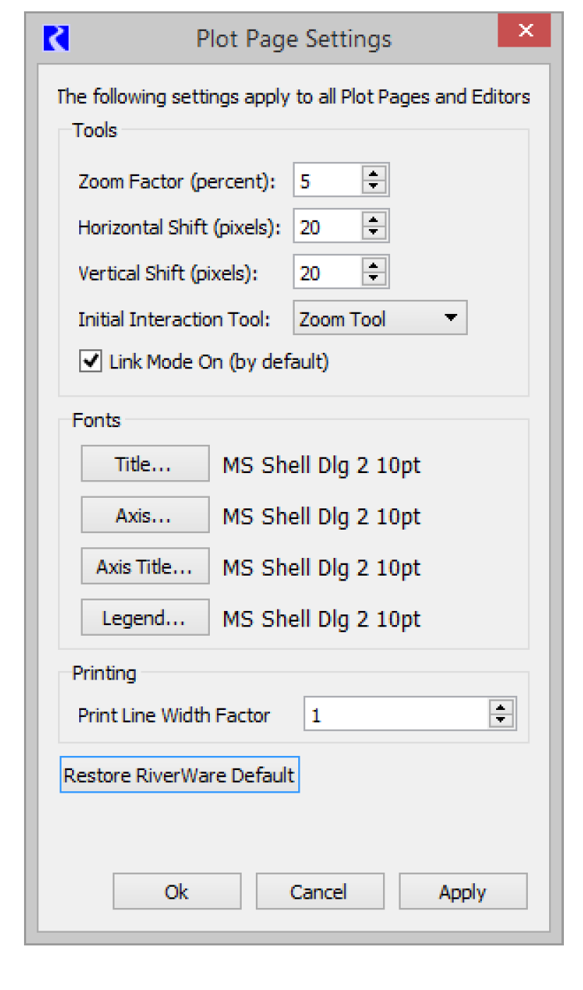
The top of Plot Dialog Settings controls the tools that appear on the plot dialog. Selections at the top of this dialog box let you determine
• Zoom Factor: the extent to which the plot size is enlarged or decreased when you select the Zoom tool.
• Shift: here is also a function that lets you set the number of pixels to which the plot is moved along either axis with the translate tool. You can enter these values manually or toggle them with the arrows adjacent to each window.
• Initial Interaction Tool: select whether the default tool zooms or centers the plot.
• Link Mode On: whether the link mode is on or off by default. In the event that there is more than one plot in a Plot Page at any given time, use the link mode. Having the link mode on causes any manipulation, such as zooming or translating along an axis, to be carried out by all of the plots in the Plot Page.
The Plot Dialog Settings has options to customize the fonts used for the plot Title, Axis, Axis Title, and Legend separately. There are options for various font sizes, styles and types. The font characteristics are stored per user—not as part of the model file. This eliminates potential problems with loading plots on machines that may not have the same set of available fonts.
Note: Changes to the settings and fonts in the Plot Page Settings will apply to all existing plots.
The Print Line Width Factor is used to specify how wide you would like printed lines on paper or PDFs. During printing, all of the slot curves' and markers' line widths are increased using a function of this factor in order to give the lines a proper appearance when printing. Default is 1, but you can increase it as needed.
Select Restore RiverWare Default to restore the system defaults; as shown in Figure 2.8. For Fonts, MS Shell Dlg 2 is used as the RiverWare default for all fonts. This selected font essentially tells the system to decide which font to use. In most cases, the Tahoma font is displayed.
Configuration Defaults
The Edit, then Configuration menu opens the Plot Defaults for curves, axes, grids, and background color. These configuration options set the defaults for new plots.
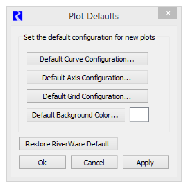
• Default Curve Settings sets default line, symbol, and curve styles.
• Default Axis Settings sets defaults for the axes, including the following:
– Format for the numeric display on the axes.
– Time scaling used when the plot is created. See Time Series Axis for additional information on use of this format.
– Default Date/Time Format
– Major and minor tick mark settings.
– Two-column table slot defaults. This setting allows table slots with length units in the first column to be shown with the length unit as the vertical axis. This overrides the default behavior. See Table Curves for additional information.
• Default Grid Settings sets default major and minor grid styles, width and color.
• Default Background Color sets the color used by default for the plot background.
Select Restore RiverWare Default restore the system defaults. These include a white background, curve line thickness of 2, major grid line thickness of 1, with dotted grey line type. There are no minor grid lines.
Plot Menu
The Plot menu displays options that deal with an individual plot or panel including zoom and scaling capabilities. For easy access, many of the functions listed here also appear on the toolbar and the plot right-click context menu, or you can execute them using key commands. These include the Auto-scale, Zoom-In, Zoom-Out, and Move commands. Next to each command are displayed keyboard shortcuts for each action.
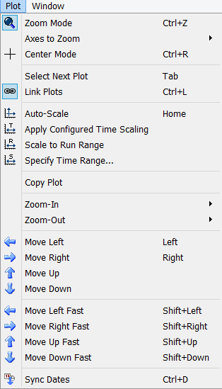
Following is a description of each command in the Plot menu.
Zoom or Center Mode

The Zoom Tool and Center Tool features determine the function when you select a rectangle or point on the plot area. The Zoom tool displays a magnifying glass cursor, which lets you select a zoom rectangle by click-and-dragging on the plot area.The Center tool displays a crosshairs icon and causes the plot to be centered around the selected point on the plot area.
Axes to Zoom
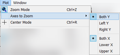
When in Zoom Mode, specify the axes in which to zoom. For Y, choose either Both, Left Y, or Right Y. For X, select Both, Lower X, or Upper X. Zooming on Both is the default. This setting only affects the Zoom Tool when drawing a rectangle on the plot area. It does not affect the Zoom-In or Zoom-out tool bar buttons or menus.
Note: This setting affects all plots on the plot page, but is not saved in the plot or even for the RiverWare session.
Select Next Plot
Selects the next plot, shortcut: Tab key. In a multi-column layout, the next plot is the one to the right, then down.
Link Plots 
If there is more than one plot in the Plot Dialog the Link Plots tool is active, letting you do manipulation operations on all of the plots in unison (including AutoScale, the Shift Tools, the Zoom Tools, Date Spinner, and Date Center). If Link is off, you manipulate the currently selected plot (selected by selecting the plot or by using Tab to toggle). If you are using only one plot, this function is not available. You may not link plot customization operations—they must be performed on individual plots.
Auto-Scale 
The Auto-Scale feature scales and translates the plot to include the entire range of data.
Apply Configured Time Scaling 
The Apply Configured Time Scaling feature scales and translates the plot to the range configured on the axis. This can be a symbolic or absolute time range. In addition, you can configure the plot to always use this configured time range when opening the plot. See Time Series Axis for more information.
Note: This operation does not affect the y axis scaling.
Scale to Run Range 
The Scale to Run Range scales the x axis to the run range defined on the run control. It is available only for times series plots. The y axis display is not affected.
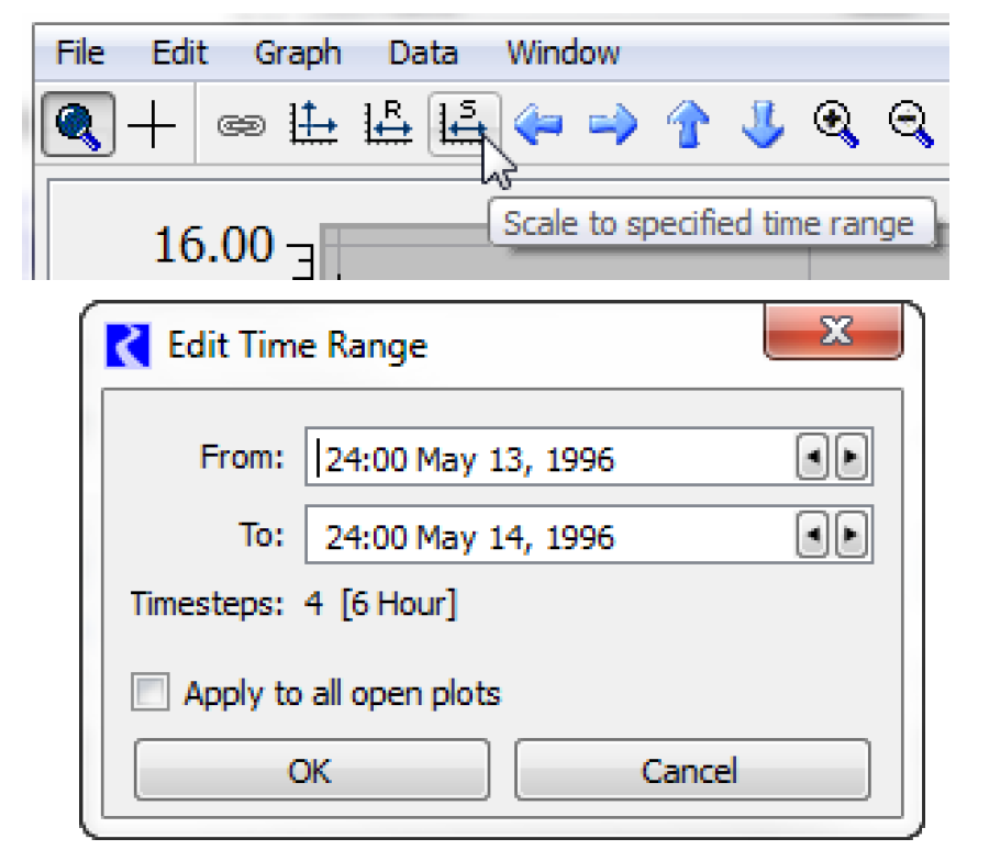
Specify Time Range 
The Specify Time Range operation scales the plot to a range that you specify in the dialog. This operation does not affect the y axis scaling. There is also the option to Apply to All Open Plots. This sets the visible range of all open plots to the specified range. Each Plot Page would need to be saved to preserve that range.
Copy Plot / Paste Plot
The Copy Plot menu item allows you to copy the selected plot to the plotting clipboard and then the Paste Plot menu item allows you to paste that plot to a new location. These two menus allow you to quickly combine or separate multi-layout Plot Pages. For example, you may have two great 1X1 Plot Pages configured as desired. Now you wish to combine those individual plots into a 2X1 Plot Page so that you can see them on a linked x axis. Select one of the plots, and copy it. Then create a new 2X1 Plot Page and paste the first plot onto one of the empty plot panels. Repeat the copy for the second plot, and then paste it into the empty plot panel in the 2X1 layout.
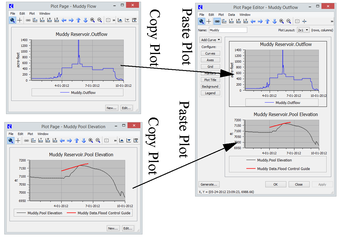
Note: This option is used to copy the plot for use in another plot. If you want to copy the plot as an image and paste it in a document, use Edit Copy Plot Image. See Copy Plot as an Image for details.
Zoom Tools

The Zoom feature zooms in or out on the center of the plot dialog.
Note: See Mouse Button Actions for additional information on using the middle mouse wheel to zoom in/out on either the plot area or an axis.
Move Tools
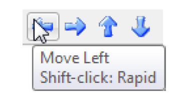
The Move tools shift the plot in either the X or Y direction. You set the magnitude of the move from the Plot Page Settings. There are also options to do a rapid move. Use the arrow keys as shortcuts. Use the Shift-Arrow or Shift-select to do a rapid move.
Note: Click the middle mouse button/wheel to pan the plot area. See Mouse Button Actions for additional information.
Sync Dates 
The Sync Dates feature synchronizes the dates on all plots in the selected column. If there is only one plot on the Plot Page, this function is not available.
Plots can be autoscaled individually or together. To autoscale or manipulate multiple plots in unison, they must first be linked. Plots can be linked by selecting Plot, then Link Plots or select Link Plots. Autoscaling the plots is then achieved by selecting Plot, then Autoscale or selecting Autoscale.
Data Menu
The Data menu is used to add data or markers to the plot.
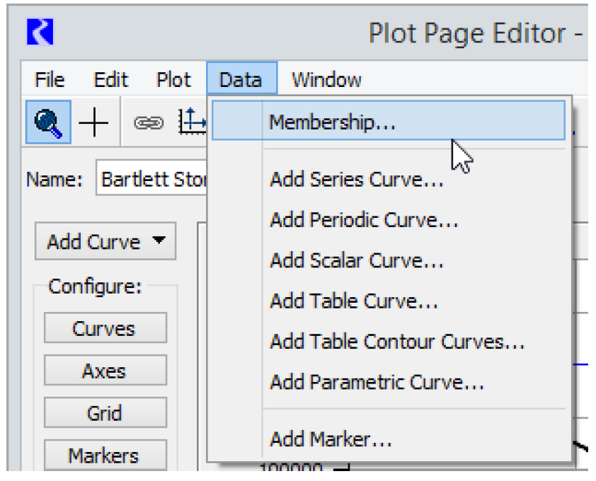
Membership
From the Data, then Membership menu, the user can add or view the various types of plots.
Add Curve Functions
The Data drop-down also lets you select each slot type individually with the Add Series Curve, Add Periodic Curve, Add Scalar Curve, Add Table Curve, Add Table Contour Curves, and Add Parametric Curve items. Selecting one of these commands prompts the Curve Configuration dialog for the specific curve to appear.
Add Marker
Lets you insert a marker into the plot.
To insert a marker into the plot: Select Add Marker. The Marker Manager dialog appears. See Marker Configuration for details.
Window Menu
Set Layout
In the Window, then Set Layout drop-down menu of the Plot Page Editor, you select the number of plots that appear in the plot dialog. To change the dialog from a 1X1 array of plots to as many as a 3X3 array: Select the Set Layout menu item.
When the display size changes, the plots are automatically updated to occupy the new dialog size.
You can then copy and paste individual plots by selecting Plot, then Copy Plot and Plot, then Paste Plot. See Copy Plot / Paste Plot for details.
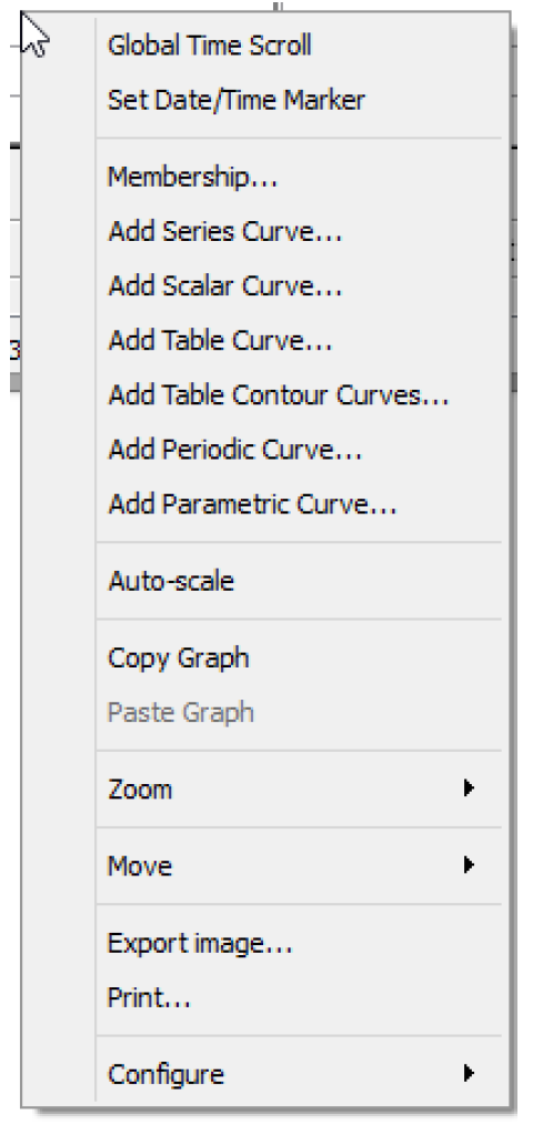
Context Menus
The plotting dialog allows the concept of context sensitive right-click functions. This lets you manipulate, configure, and export or print a plot using the menus. Global Time Scroll allows you to move all dialogs in the model (including future ones) to the date at which you selected. This is especially useful for debugging. When the Global Time Scroll is activated on a plot, a dotted red vertical marker line can be shown on the plot. This line can be hidden by selecting the Date Spinner in the toolbar. See Toolbar Actions for additional information.
Types of Curves
There are six types of curves described in the following sections: Series, Scalar, Table, Table Contour, Periodic, and Parametric.
Series Curves
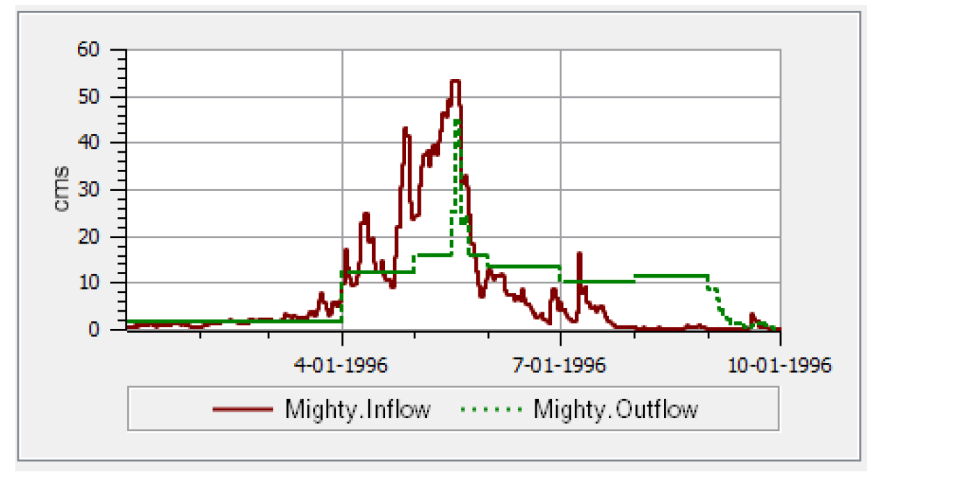
A Series Curve plots a timeseries of data from a Series Slot. The x-axis is time and the y-axis is the value. Multiple series can be plotted on one curve and can have multiple axes. Figure 2.9 is an example of two series curves.
Figure 2.9
The displayed time range of the plot is initially taken from the setting in the axis defaults. To view or modify the setting, in any Plot Dialog, select the Edit menu’s Configuration Defaults item (see Configuration Defaults). This brings up the Plot Defaults dialog. In the Plot Dialog Settings dialog, select Default Axis Configuration. This displays the Axis Default Configuration Settings dialog. To specify the initial time range shown, select the desired start and end range of the plot. See Time Series Axis for descriptions of the options.
Scalar Curves
A Scalar Curve plots a single value from a Scalar Slot on a time series plot. Usually, the x-axis is time and the y-axis is the value. The only exception is if the scalar slot has the datetime unit type. In which case, the scalar curve is plotted as a vertical line. Figure 2.10 shows two elevation scalar slots plotted as horizontal lines along with one datetime scalar slot plotted as a vertical line.
Figure 2.10
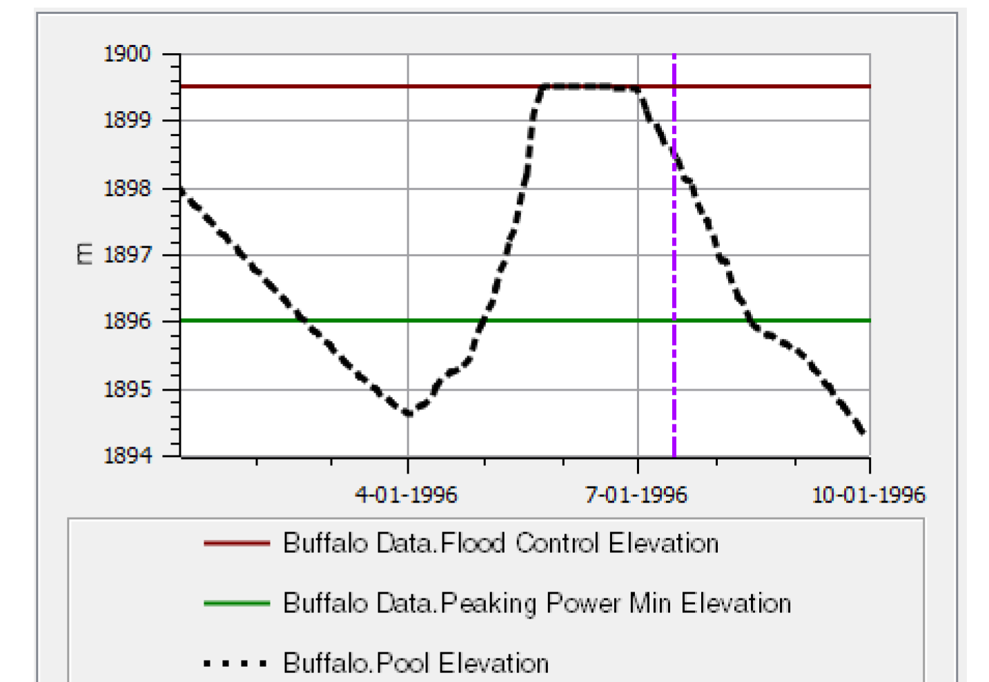
Table Curves
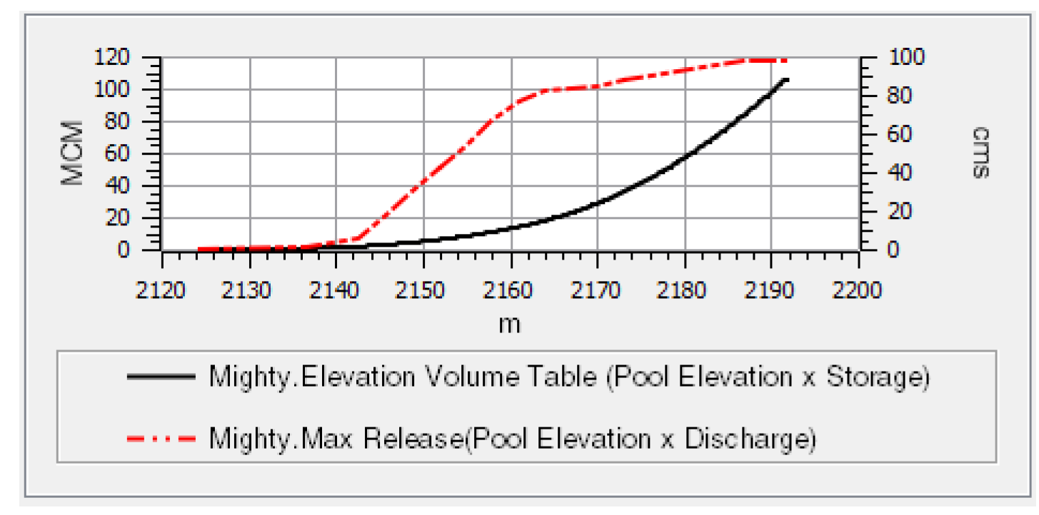
A table curve plots two sets of data from a table slot. Multiple table curves can be shown on one plot using one or more sets of axes. Figure 2.11 is a plot with two table curves and two y-axes.
Figure 2.11
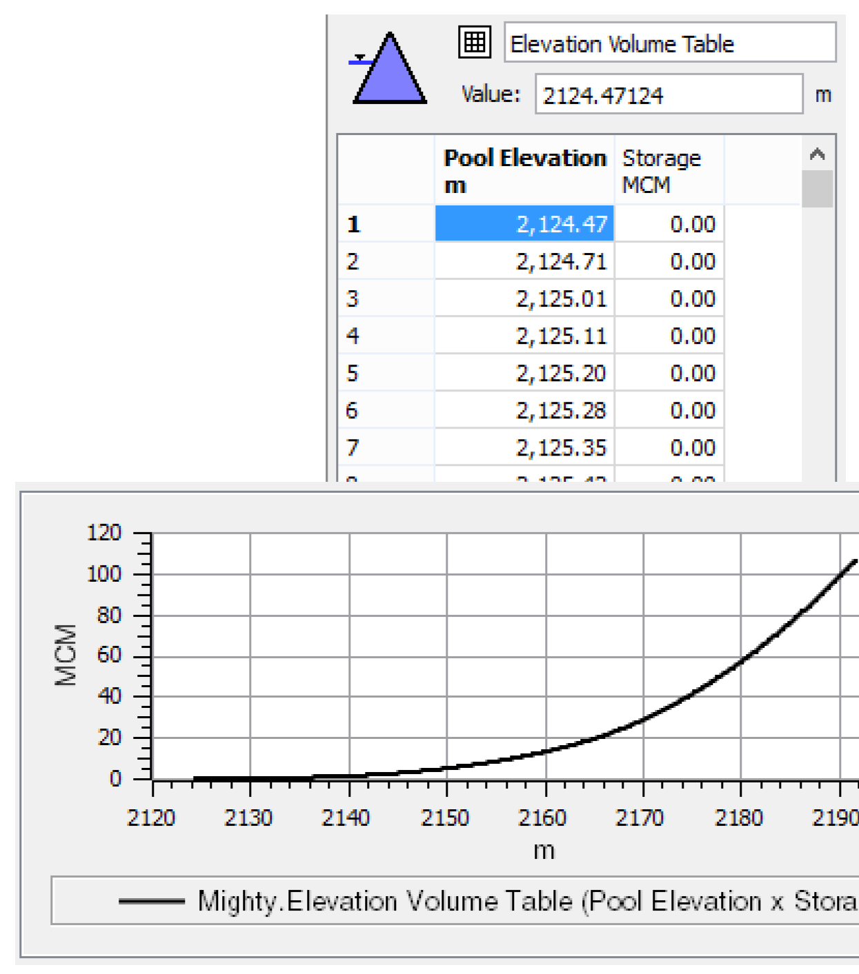
When plotting a Table Slot with more than two columns, the user has the opportunity to pick particular columns for the X and Y axes.
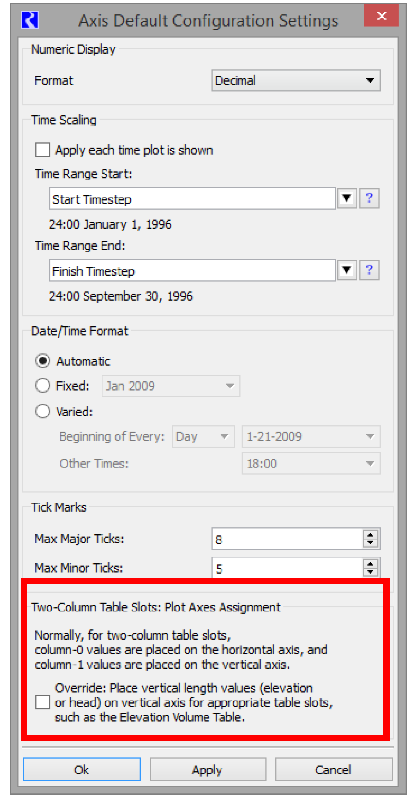
When plotting a two-column Table Slot, the numeric values from the first column are plotted along the horizontal (“X”) axis, and the values from the second column are plotted along the vertical (“Y”) axis, by default. See Figure 2.12. This can be changed within the configuration. The default configuration is often not ideal for elevation plots where the length unit would more naturally be on the Y axis. To override this, use the Two-Column Table Slot: Plot Axes Assignment Override checkbox in the defaults described in the remainder of this section.
Figure 2.12
To view or modify this setting, in any Plot Page Editor, select Edit, then Configuration Defaults item (see Configuration Defaults). This brings up the Plot Defaults dialog. Select Default Axis Configuration. This brings up the Axis Default Configuration Settings dialog.
The setting is represented by the Override checkbox in Figure 2.13.
Figure 2.13
This setting is associated with the RiverWare model file rather than with user-login based configuration.
Note: This differs from other defaults related to plot configuration—these are generally stored as user-login based configurations.
The automatic switching of plot axes is applied at the time of creation of the plot -- so changing the setting of this toggle does not effect plots already created and saved with a RiverWare model file.
When the toggle is checked and a new plot is created, the standard mapping of two-column Table Slot columns to the plot axes is reversed on certain Table Slots. The plot axes reversal will occur if the following criteria are true:
• Column 0 is determined to be a “vertical distance”, and
• Column 1 is determined to NOT be a “vertical distance”
A Table Slot column entity is regarded as a “vertical distance” if both of these are true:
• The unit type of the column is LENGTH, and
• The column label is blank OR the column label contains the substring “ELEV” or “HEAD”, in either upper case, lower case or mixed case.
When these conditions are met, the plot will be created with reversed axes. In Figure 2.14, the second image depicts an axes reversal of the plot on the left as a result of this setting.
Figure 2.14
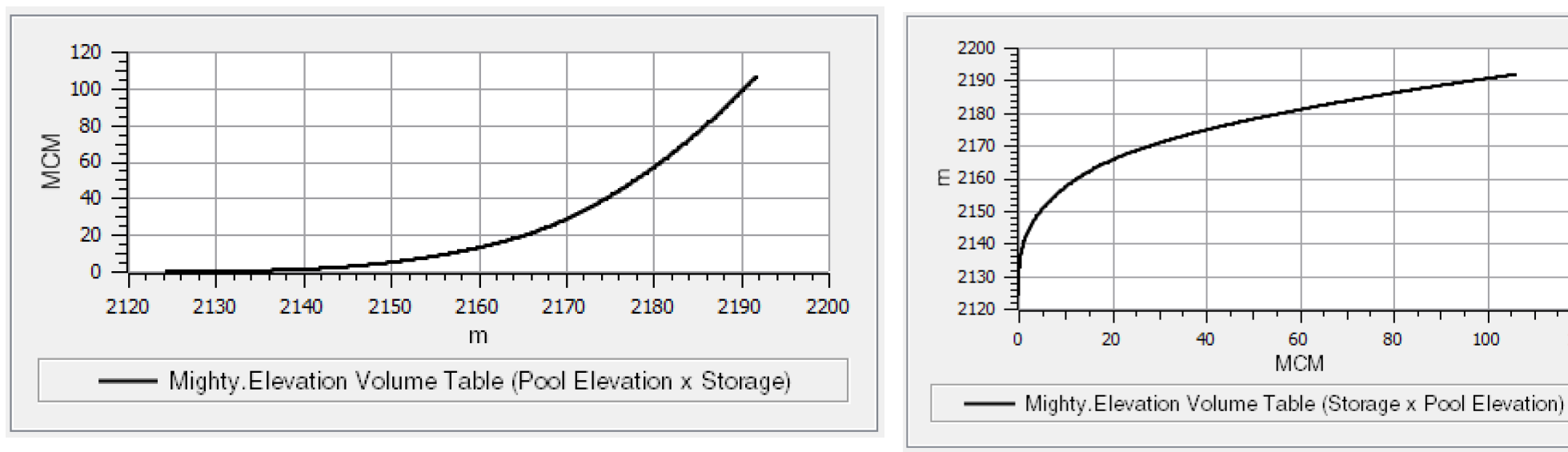
Table Contour Curves
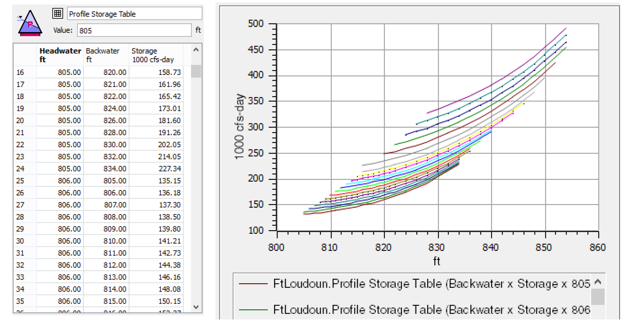
A table contour curve is used to plot a three dimensional table. Figure 2.15 is an example of a table contour curve representing the headwater backwater, storage curve. Each curve represents a given Headwater.
Figure 2.15
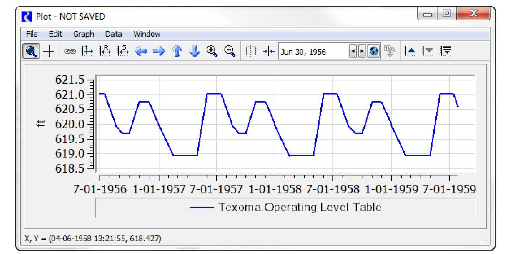
Periodic Curves
A periodic curve is used to plot a column of a periodic slot (y-axis) versus the time on the x-axis. The user is able to specify the column to plot. The curve is shown for whatever time range is plotted. If there are not other plots on the curve, it defaults to the run length. Select Scale to Specified  to enter your desired range of dates.
to enter your desired range of dates. Figure 2.16
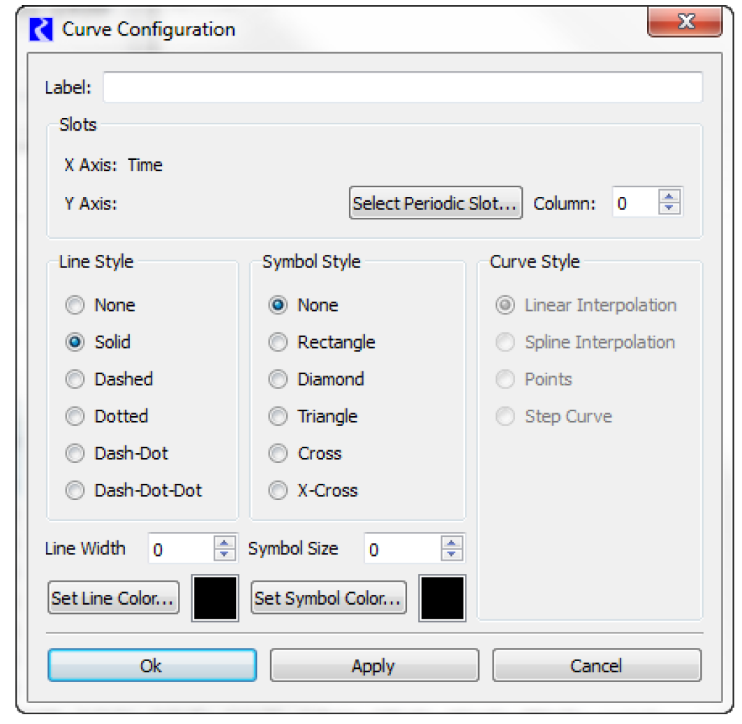
Figure 2.17 is a plot of one of the levels from an operating level table. The curve repeats, showing the periodic nature.
Figure 2.17
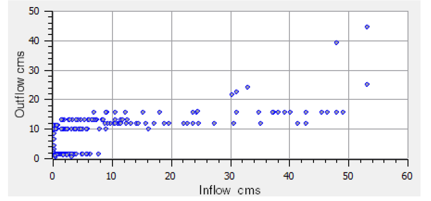
Parametric Curves
A parametric curve is used to plot one set of series data against another set of series data. The user selects a series slot for the x-axis and another series slot for the y-axis. In Figure 2.18, Inflow is plotted against Outflow to see if there is any relationship between the two.
Figure 2.18
Adding Associated Snapshot Curves
Snapshots are way to preserve results between runs; see Snapshots in Output Utilities and Data Visualization for details. For comparison, it is useful to plot both the slot and one or more of its snapshots. The plotting utility allows you to quickly add curves for the associated snapshots. Given a plot that contains curves for a slot of interest, there are the following ways to add curves for the associated snapshots from the Plot Editor.
• Right-click the legend for the slot and select Add Associated Snapshot Curve and then select the desired snapshots. In this case, only the snapshots of the given slot are shown.
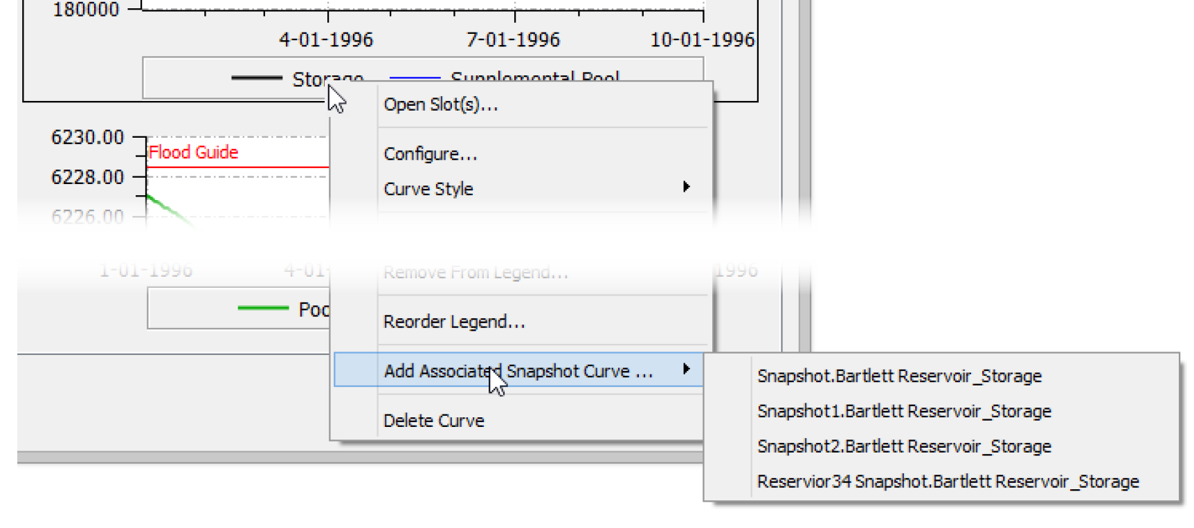
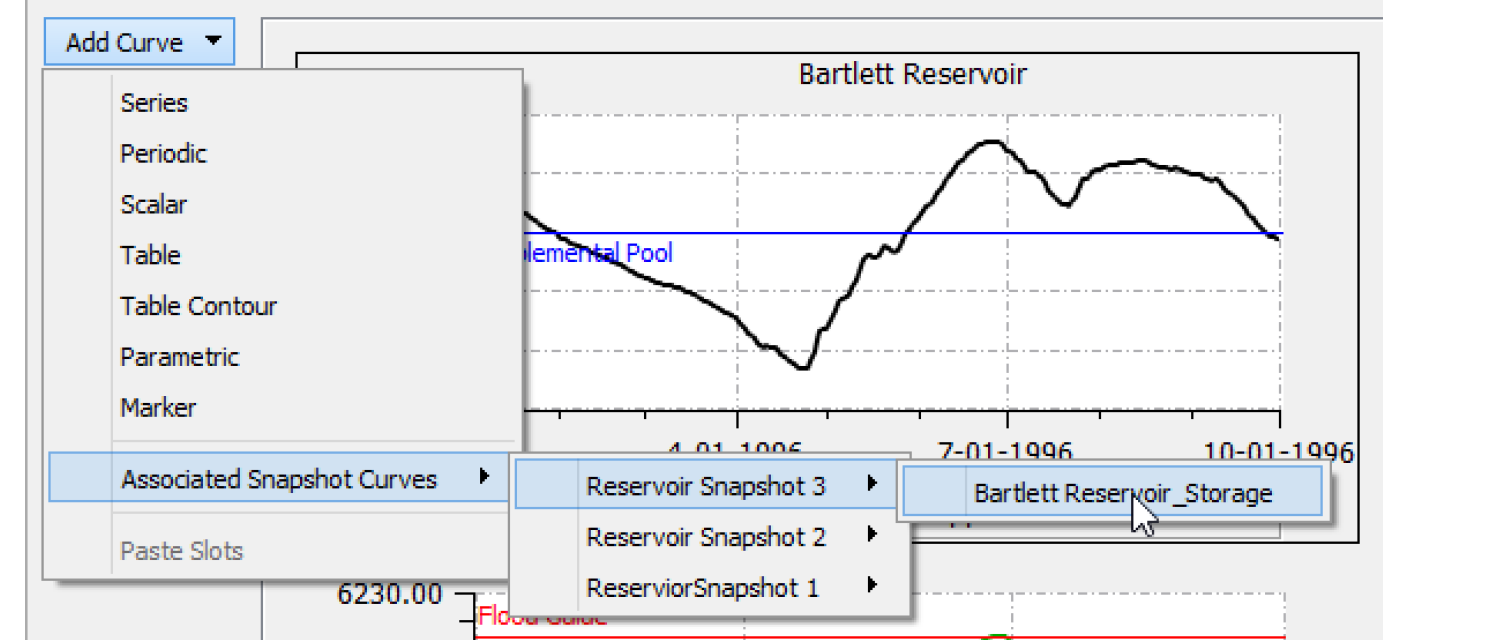
• Select Add Curve and select Add Associated Snapshot Curve and then select the desired snapshot and slots. In this case, snapshots of all slots on the selected plot are shown in the menu.
• Right-click the plot area (or use the Data menu) and select Add Associated Snapshot Curve and then select the desired snapshot slots. In this case the snapshots of all slots on the selected plot are shown.
In all cases, the Add Associated Snapshot Curve only is shown when there are snapshots of the plotted slot and there is not already a curve for that slot. Once added, the curves of snapshot slots are no different than other curves. The labels are SnapshotName.OrginalObject_Slot.
Configuring Multiple Plots and Curves
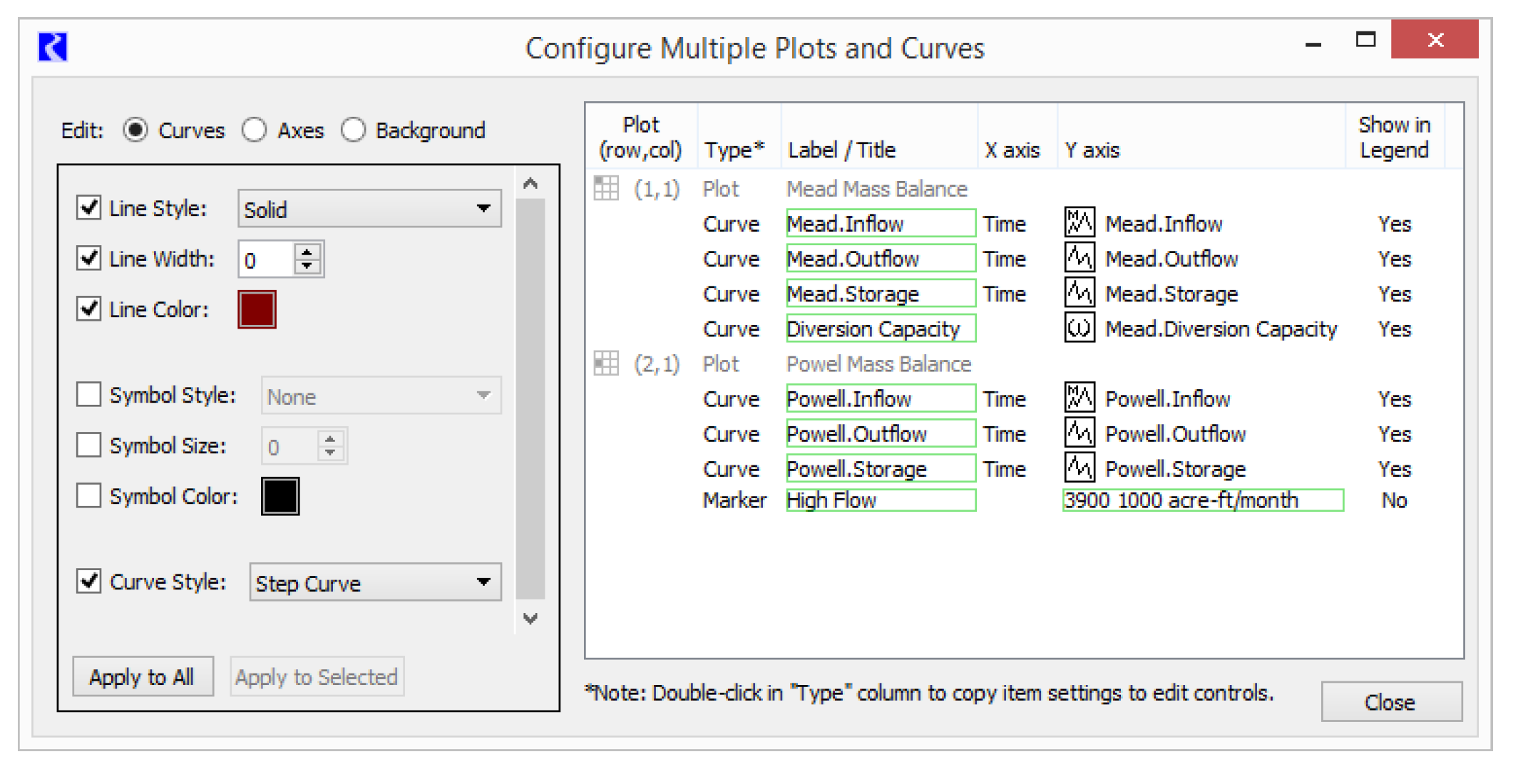
The Configure Multiple Plots and Curves dialog allows you to Edit the appearance of multiple plots or curves in one location. Most plot settings for the optional nine separate plots within a plot page are editable within the dialog. The user can select multiple items within a plot page, e.g. curves and markers, and apply selected settings to those items in a single operation. The dialog is shown in Figure 2.19.
Figure 2.19
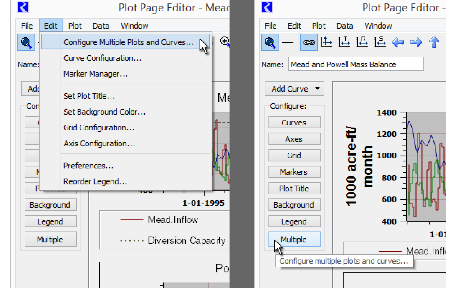
Accessing the Configure Multiple Plots and Curves Dialog
The Configure Multiple Plots and Curves dialog is accessible from the Plot Page Editor dialog via the Edit menu operation and the Multiple configuration. See Figure 2.20.
• Select Edit, then Configure Multiple Plots and Curves from the menu bar of the Plot Page Editor.
• Select Multiple on the left side of the Plot Page Editor dialog.
Figure 2.20
Tour of the Configure Multiple Plots and Curves Dialog
This dialog has three major panels as follows and noted in Figure 2.22.
• Edit modes for Curves, Axes, and Background
• Setting Editing Controls that provides controls based on the mode
• Plot Item Table with items for plots, curves and markers.
Figure 2.21
Directly editable cells within the plot item table are indicated with a green border. Double-clicking such cells starts an edit. These are typically used for editing labels, titles, and marker values.
Figure 2.22
Selecting Apply to Selected or Apply to Alls applies the checked or enabled settings in the left panel to the selected (or all) items selected in the right panel.
Note: Edits made to this dialog are applied to the plot page being edited in the Plot Editor Dialog. In that dialog, you can either accept those changes (OK or Apply) or Cancel those changes.
Curve and Marker Editing
In Curves edit mode, the curve and marker items within the plot item list are active. Double-clicking an item either starts an in-cell edit within the selected cell or copies that curve or marker's setting values to the editing controls panel. Curves' and markers' label text and markers' values can be directly edited.
Figure 2.23
All of the setting operations provided in the Curve Configuration dialog are provided in the Configure Multiple Plots and Curves dialog. See Curve Configuration for details.
Various operations for curves and markers are supported with a context (right-click) menu:
• Edit Label -- initiates an edit in the Label / Title column. Double click a label to edit, as well.
• Copy Setting to Edit Controls -- copies the values of the selected item to the Setting Editing Controls panel. This is the same as double-clicking a non-editable cell.
• Copy Slots -- copies the selected plot items' slots to the RiverWare slot clipboard. The full names of those slots are also copied to the system clipboard.
• Open Slot -- shows the Open Slot Dialog for the selected slot.
• Select Slot -- shows the general slot selector to replace a curve's slot with a different slot. Only a slot of the same type (e.g. Series Slot) and unit type (e.g. Flow) can be used.
Note: Current support for marker editing is limited to the settings that are also available for curves. This includes all setting operations provided by the Marker Configuration dialog and the Plot Marker Manager. See Marker Configuration for details. The following edits are not yet supported:
• Marker Type: Horizontal / Vertical / Cross
• Label Alignment: Left, Center, Right / Top, Center, Bottom
• Axis Assignment: Lower/Upper X Axis, Left/Right Y Axis.
Figure 2.24
Axis Editing
In the Axes edit mode, the plot items (not curve and marker items) within the plot item table are enabled for selection.
Select which of the four axes are to be modified (Left Y, Lower X, etc) among the selected plots.
Only those settings appropriate for the selected axis are presented. I.e. DateTime axes support different settings than numeric axes.
All setting operations supported in the Axis Configuration dialog are supported in the Configure Multiple Plots and Curves dialog. See Axis Configuration for details.
Background Editing—Background Color and Plot Grid
As with Axes edit mode (see Axis Editing), in Background edit mode, the plot items (not curve and marker items) within the plot item table are enabled for selection. Changes to plot background color and grid configuration can be applied to the selected plots, or to all plots in the plot page.
All setting operations supported in the Grid Configuration dialog are supported in the Configure Multiple Plots and Curves dialog. See Grid Configuration for details.
Revised: 07/05/2022